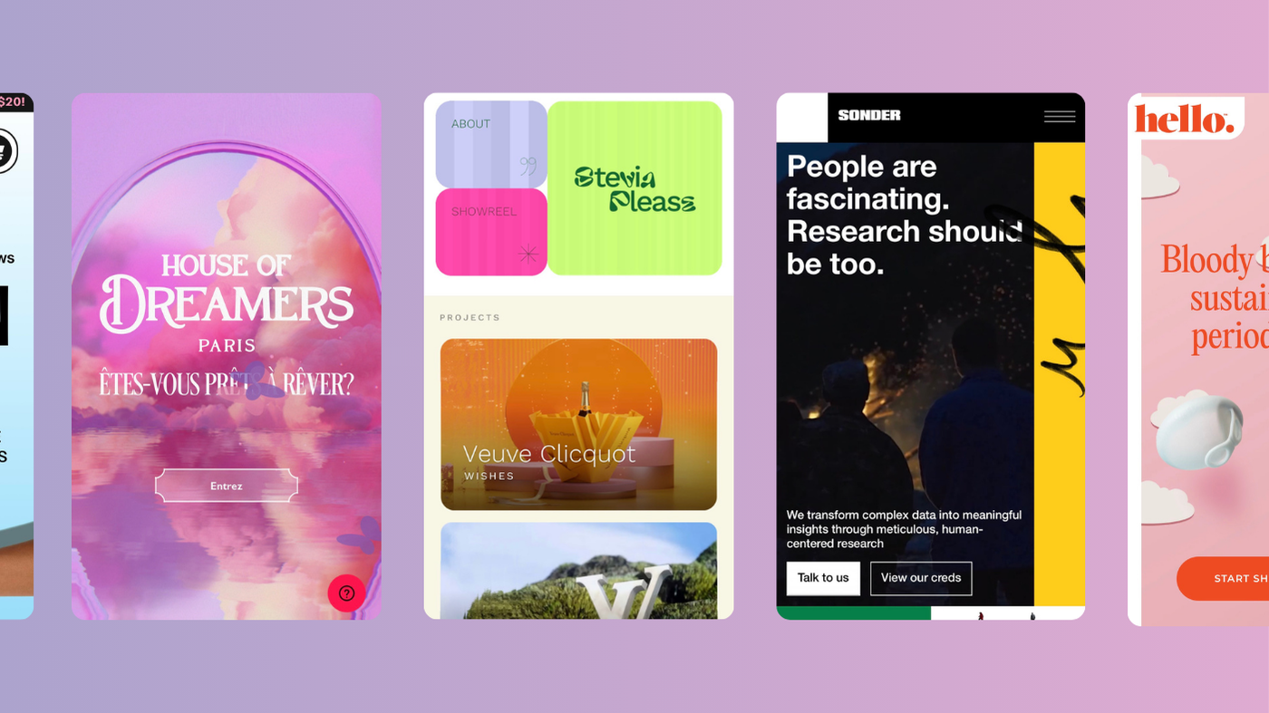
Beyond responsive: 5 great examples of interactive mobile web design

Creating an interactive mobile website isn’t just about shrinking your desktop version to fit a smaller screen. It’s about flipping the script and designing an experience that’s custom-built for touch, swipe, and smaller screens—without losing any of the magic.
A great mobile website doesn’t just look good; it works hard to keep users engaged, from lightning-fast load times to thumb-friendly navigation that feels effortless. The trick is striking that sweet spot between style and substance—where beautiful design meets functionality, and every element is dialled in for mobile users who expect nothing less than seamless, immersive experiences. It’s about creating something that doesn’t just work on mobile but thrives on it, without cutting corners on creativity or usability.
We’ve handpicked five standout examples that show exactly how it’s done. These mobile sites take interactivity, design, and usability to the next level, proving you can be bold, playful, and highly functional—all at once. Let’s dive in.
1. House of Dreamers
This promotional site for an immersive exhibition is as dreamy as the name suggests. On desktop, fluid mouse interactions provide an ethereal browsing experience, and on mobile, thumb gestures replicate that fluidity. The immersive soundscapes and visually stunning design translate beautifully across devices, making the mobile version as compelling as its desktop counterpart.
What we like:
- Touch interactivity: Smooth touch gestures mimic their desktop version’s fluid effects. And it’s seriously addictive.
- Immersive sound design: Their audio elements work seamlessly on mobile, giving a multi-sensory experience.
- Visual aesthetic: Dreamlike visuals set the tone, reflecting the installations folks can expect to encounter at the exhibition.
2. Hello Period
Hello Period’s site combines bright colours and minimalist design with bold branding, and the tagline “Bloody brilliant sustainable period care” immediately establishes its tone. On mobile, the persistent burger menu enhances navigation, while the on-scroll animations maintain visual interest without overwhelming users. By balancing this clean design with bold branding, Hello Period ensures their mobile site’s user journey is intuitive, all while reinforcing their personality.
What we like:
- Bold, clear CTA: Their call-to-action buttons are pretty much unmissable, guiding users towards the next step effortlessly.
- Persistent navigation: A burger menu that stays visible as you scroll ensures seamless navigation.
- Subtle animations: On-scroll effects add a dynamic layer to the mobile experience, keeping it engaging without sacrificing simplicity.
3. Sonder
Sonder is another nice example of a vibrant site that carries its playful energy from desktop to mobile. The auto-playing video immediately grabs attention, while micro-animations add a sense of discovery as users scroll. Keeping this mobile version as rich and interactive as the desktop experience really helps build a cohesive brand story across all platforms. The result? A mobile design that feels cohesive, engaging, and distinctly Sonder.
What we like:
- Video integration: The auto-playing video content draws users in from the get-go.
- On-scroll animations: The subtle effects guide users, making exploration feel fun and intuitive.
- Cohesive design: The colourful, vibrant design translates seamlessly across devices, maintaining Sonder’s brand integrity.
4. Stevia Please
The mobile version of Stevia Please’s portfolio simplifies the desktop design, while still offering unique interactions of its own. A standout feature is the bulging scroll effect, which creates a playful, tactile experience as users move through the homepage. This minimal yet interactive design encourages exploration without overwhelming.
What we like:
- Scroll effects: The bulging sections create a sense of depth and movement, inviting users to interact.
- Simplified design: Sometimes less is more—streamlining interactions for mobile ensures the experience remains fun to use, without sacrificing functionality.
- Encourages discovery: The layout and effects guide users naturally through the content.
5. Ramen Bae
This visually rich e-commerce site really makes the most of its mobile space. While the desktop version is packed with interactive scrolling effects like ingredients that explode from the product, the mobile version dials it down while retaining vibrant design and strong CTAs. Subtle micro-animations keep the experience dynamic, focusing mainly on the product visuals. This one shows us that dialling down interactivity for mobile doesn’t mean sacrificing engagement. If you’re after a more lightweight design for your mobile e-commerce site, just focus on what matters most: clear navigation, product visuals, and an intuitive user journey.
What we like:
- Product-focused design: A must for any e-commerce site! The visuals take centre stage, with colourful images drawing attention.
- Clear call-to-actions: Bold, visible buttons make navigation and purchasing straightforward.
- Micro-animations: Small interactive touches elevate the experience, preventing the design from feeling flat.
Go beyond responsive–be unforgettable.
These examples prove that interactive mobile websites can be both functional and stunning. Whether it’s through fluid animations, bold CTAs, or seamless navigation, these designs demonstrate how to captivate users on smaller screens without overwhelming them. By prioritising interactivity, accessibility, and aesthetic harmony, these sites offer a masterclass in how to do mobile right.
Interested in working with KOTA?
Drop us a line at
hello@kota.co.uk
We are a Creative Digital Agency based in Clerkenwell London, specialising in Creative Web Design, Web Development, Branding and Digital Marketing.


