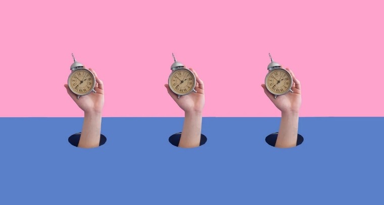
Rebelling against the grid: unconventional layouts in web design

February 28th 2024
By Emily
In the vast digital expanse where websites are the new frontier towns, there’s a rebellion brewing. Not against the lawmen or the outlaws, but against the grid — that invisible lasso that’s held web design in a tight, predictable grip since the birth of the internet.
But as any good rebel knows, it’s not enough to break the rules; you’ve got to do it with style.
Why go rogue?
Let’s face it, the internet is cluttered. Standing out means not just stepping off the beaten path but creating your own. Conventional grids have their place: they’re reliable, user-friendly, and they get the job done. But sometimes, the job demands more. It calls for a dash of audacity and a pinch of panache. That’s where unconventional layouts come into play. They break the monotony, challenge the status quo, and whisper seductively to the user: “There’s more to me than meets the eye.”
The art of organised chaos
Going unconventional doesn’t mean throwing all sense of order out the window. Think of it as organised chaos. It’s about mastering the rules just so you can bend, twist, and occasionally break them. This approach beckons the user into an experience, not just a website. It’s the difference between a handshake and a captivating story told over a campfire.
The grid is dead, long live the grid
Before you grab your pitchforks, let’s get one thing straight: the grid is not the enemy. It’s our launchpad. To truly ‘innovate’, we start with understanding the grid, then we dance around it, over it, and sometimes, when the moon is just right, we leap right off it. The result? Layouts that not only defy expectations but redefine them.
Examples of unconventional web design
The point is, design can and should take you on a journey. Here are some more examples of that:
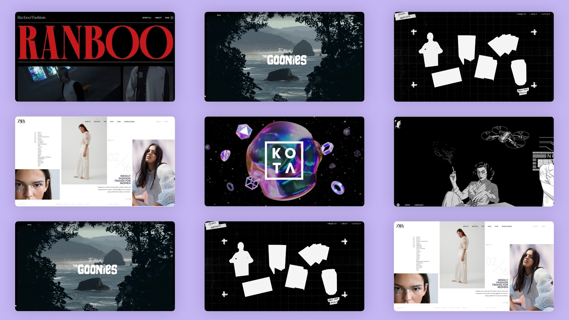
The 3D immersive experience
The KOTAVERSE is a prime example of unconventional web design — our immersive 3D digital universe that transcends the traditional grid, inviting users into a realm of work, play, and artistic exploration.
And it’s getting us noticed, with award recognition across the CSS Design Awards, Awwwards, and The FWA, as well as being featured across countless design inspo sites, feeds, and publications. Even the Digital Agency Network is shouting about it!
Consider it a window into our creative brains and explore it for yourself, here.
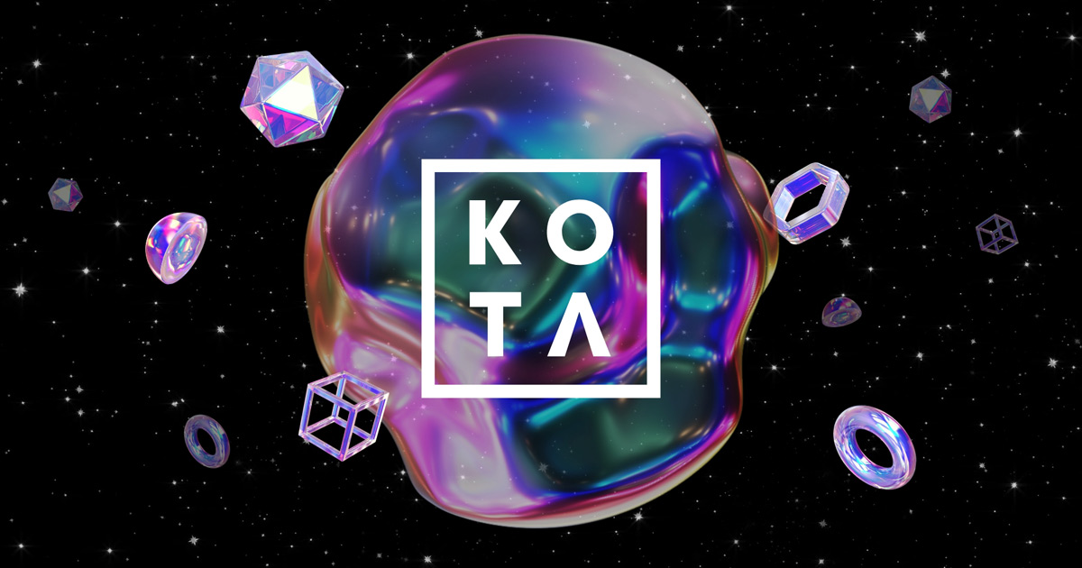
The infinite canvas
Imagine scrolling through a site that feels endless, where content appears dynamically as if conjured from the digital ether. No page reloads, just an immersive journey.
With black and white graphic novel illustrations and a noir-feel, LONGSHOT FEATURES ― Arthouse Cult x Production Company founded by Joe Talbot, Jimmie Fails and the team behind the A24 x Plan B film, The Last Black Man in San Francisco, features some of its best work using an infinite side-scroll through iconic scenes.
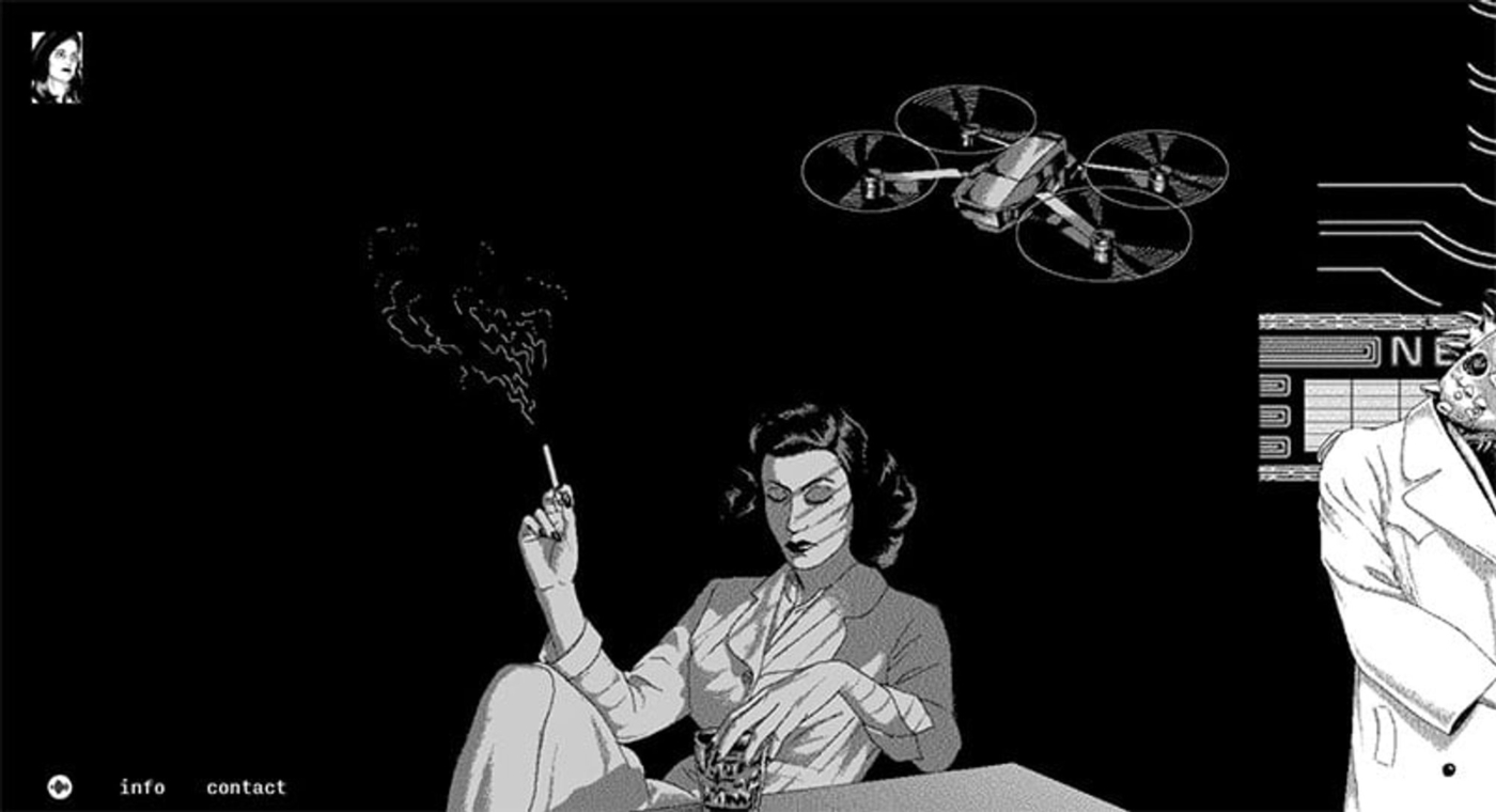
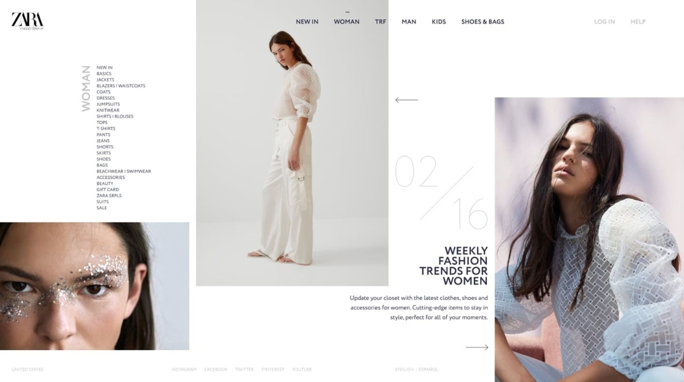
The collage effect
Where projects are presented not in a neat grid but as a collage of images, texts, and videos. Each piece invites exploration, turning the portfolio into a narrative adventure.
Zara does a nice job of this technique on their site, shown below. Notice how each column varies in width, and the occasional overlap between column elements:
The zine look
Picture a website that mimics the anarchic layout of underground punk zines of the 80s—text overlapping images, erratic typography, and a cut-and-stick feel. It’s a digital rebellion against the clean, sterile look of conventional sites.
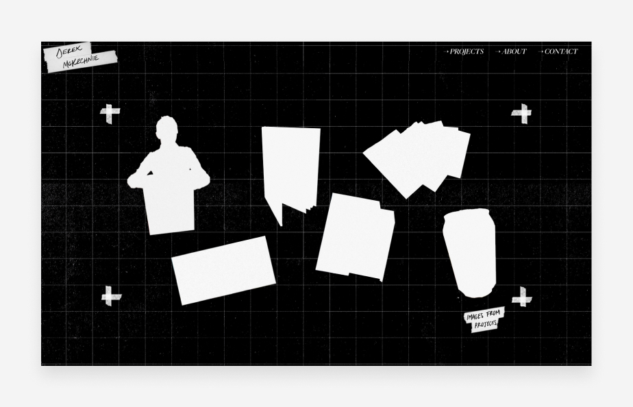
Derek McKechnie practices communication design, and his website showcases his experiments in printing. The website is full of geometric components with sharp edges, but once visitors start clicking around, they’ll notice that these objects are interactive. Silhouettes transition into images on mouse hover. This is an excellent website example of how you can use micro-interactions to enhance the user experience of a brutalist design.
The broken grid
Elements align in unexpected ways, creating a sense of movement and dynamism. Images cut across columns and text boxes tilt, drawing the eye across the page in a deliberate dance.
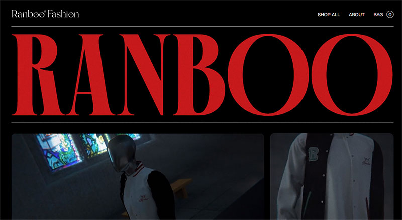
If you’re designing a website for a luxury fashion brand, visit Ranboo Fashion as an example of this. High-end products, photos, and videos are displayed in broken grid sections as you scroll down, making it a truly unique navigation experience.
The narrative scroll
A storytelling site where scrolling down pulls you deeper into a narrative, with visuals and text intertwining in a choreographed performance that unfolds the story layer by layer.
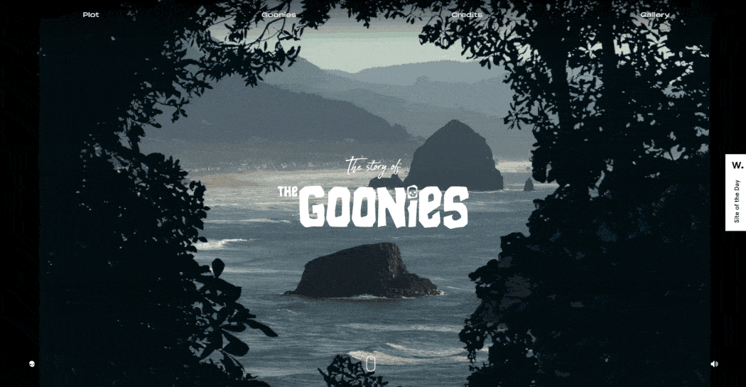
For example, Joseph Berry decided to take one of his favourite movies, the 1980s classic The Goonies, and turn it into a promotional-style website. A fellow winner of the Honorable Mention and Site of the Day award from Awwwards, The Goonies is a great example of scrollytelling — transforming a longform story into an interactive experience.
Navigating the uncharted
Diving into unconventional design isn’t without its perils. There’s a fine line between innovative and incomprehensible. The key is to keep the user’s journey at the heart of your rebellion. After all, these sites still need to adhere to web design principles, despite their creative liberties.
But you don’t need to give up a good user experience in order to stand out. No matter what, your site should be simple, mobile-responsive, accessible, and easy to navigate for your users. Every audacious layout choice must be a stepping stone, not a stumbling block, on their path through your website.
Join the rebellion
So, where do you stand? Are you content with the status quo, or is there a fire in your belly urging you to break free? If it’s the latter, welcome to the rebellion. Together, let’s redefine what’s possible in web design, one unconventional layout at a time.
About KOTA
KOTA is a global branding agency and creative web design studio. Our brand-to-build approach brings strategy, identity, creative web design, development and growth marketing into one connected process. We help ambitious businesses find brand clarity, turn it into creatively confident work and build digital systems that create commercial momentum.


Interested in working with KOTA?
Drop us a line at
hello@kota.co.uk
We are a Creative Digital Agency based in Clerkenwell London, specialising in Creative Web Design, Web Development, Branding and Digital Marketing.