KOTA’s UI design process: The power of good user interface

April 29th 2020
By Matt
Originally published April 2020, updated May 2025.
User Interface (UI) design is way more than just choosing a nice font and picking a few buttons. It’s about crafting the visual language your users interact with — one that feels intuitive, clean, and unmistakably you.
From websites and apps to digital products and touchpoints, UI is how your brand looks and feels in motion. And when it’s done right, your interface doesn’t just look good — it works harder, converts better, and leaves a lasting impression.
At KOTA, we follow a clear set of principles to make sure every UI project feels unified, intentional, and user-first. Let’s break them down.
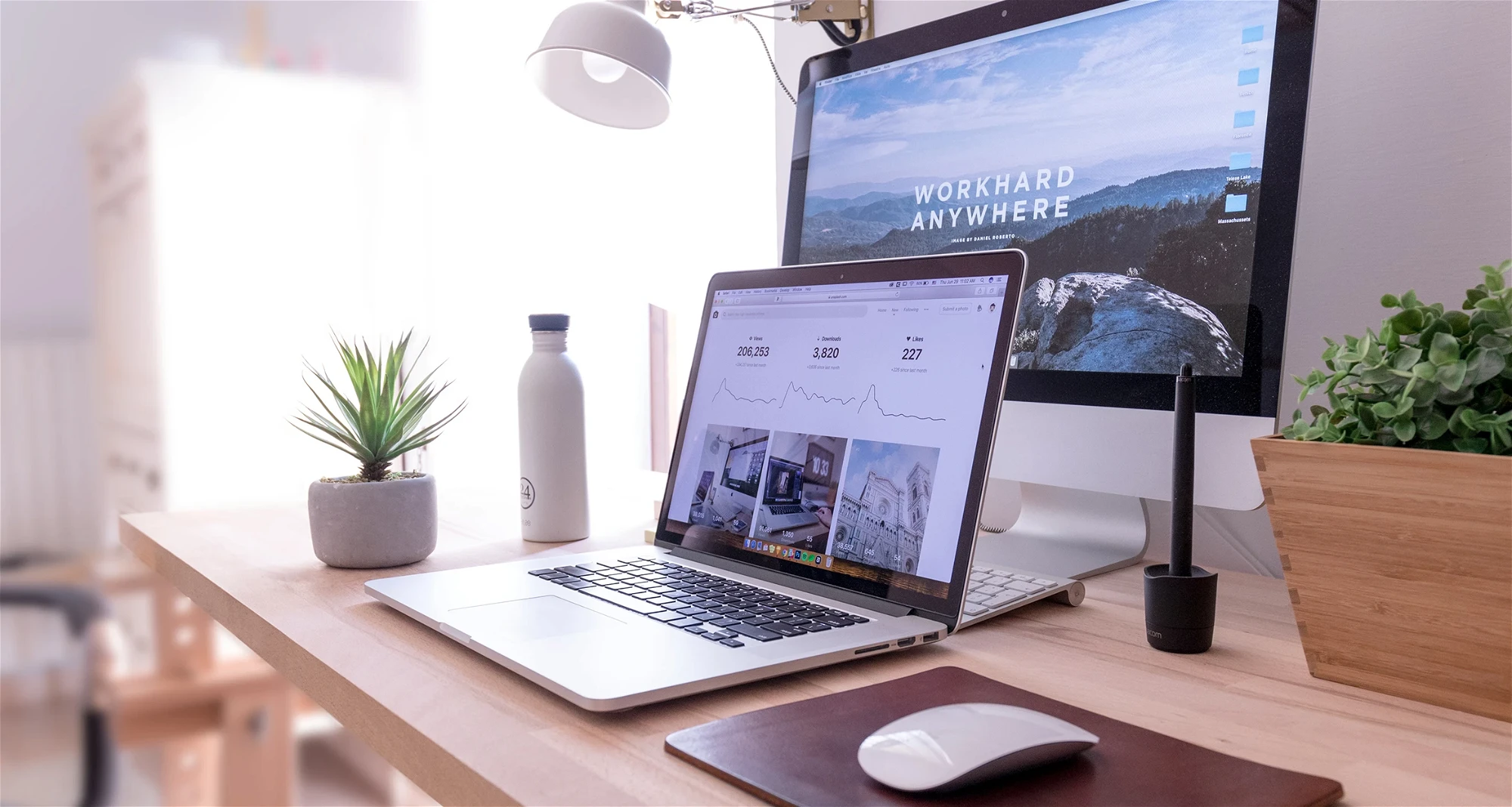
First, what is UI design?
UI (user interface) design is all about the visuals. Fonts. Colours. Layouts. Buttons. Scrollbars. Sliders. Every on-screen element is carefully crafted by a UI designer to ensure it’s not only functional, but beautiful and on-brand.
It’s often confused with UX (user experience) — which focuses on usability and user flow — but the two go hand-in-hand. Where UX is the blueprint, UI is the personality. You need both for a website that sings.
The 5 UI principles we never ignore
1. Consistency is clarity
Inconsistent UI slows people down — and not in a thoughtful way. If your buttons change style from page to page or layouts feel disjointed, users will get frustrated and bounce.
Consistency builds trust. It creates a rhythm. When visitors know what to expect, they can focus on your content, not figuring out how to use your site. We use design systems and grid structures to keep that experience tight.
🧠 Tip: Consistency doesn’t mean uniformity. It means deliberate variation with rules.
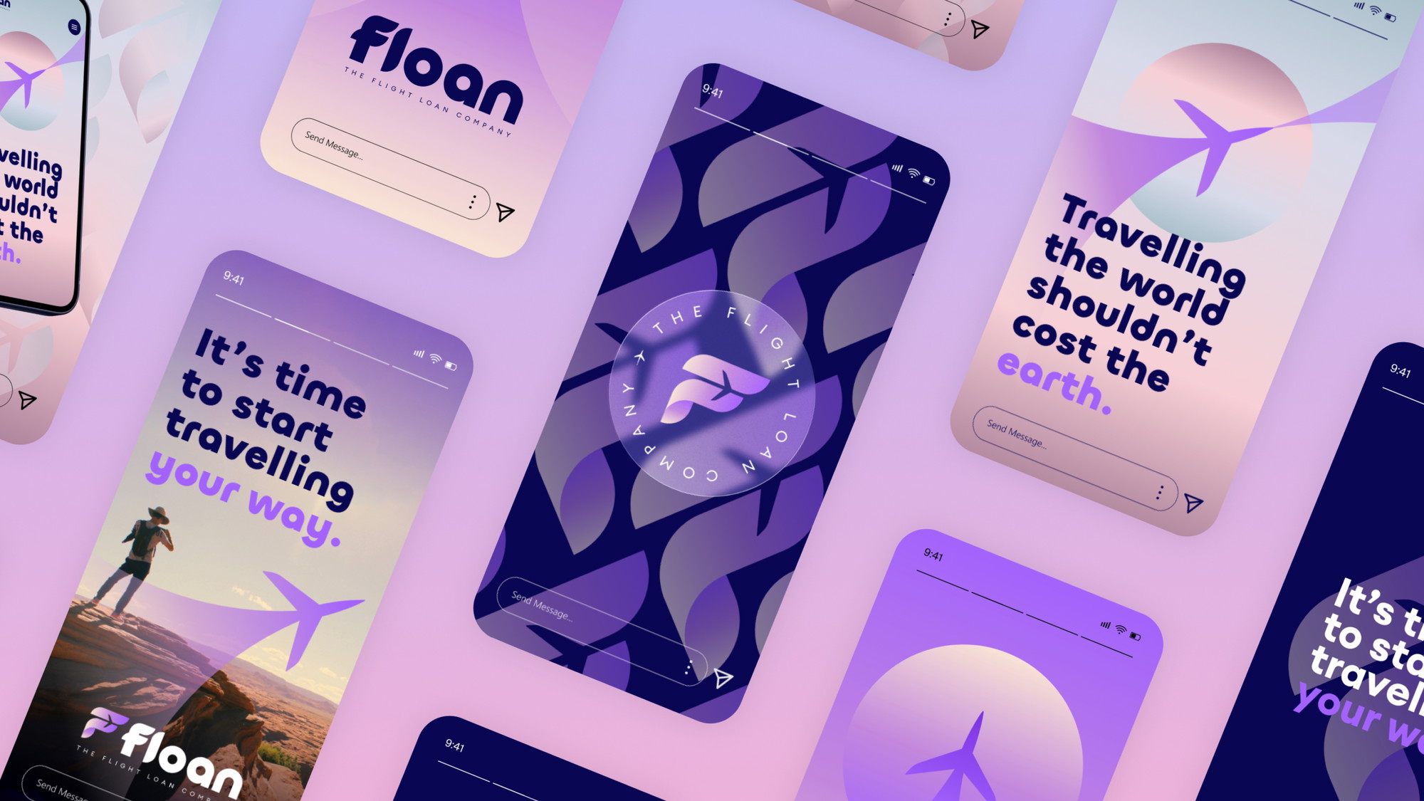
2. Typography isn’t just about reading — it’s about feeling
Your typeface choices shape how your brand is perceived. Are you sleek and modern? Playful and human? Editorial and bold? Fonts communicate tone long before your words do.
Legibility is key — especially on mobile. But good typography also uses hierarchy, spacing, and contrast to make content scannable and engaging.
📚 Think of your text like a voice: calm, confident, and on-brand.
3. Colour is emotional shorthand
Colour palettes don’t just “look nice” — they do heavy lifting. They guide attention, shape perception, and evoke emotion. Used well, they create a visual world your users want to spend time in.
We treat colour with strategy. From primary brand hues to subtle micro-interactions (like hover states or alert messages), every shade earns its place.
🎨 Red for errors. Green for confirmation. Neutrals for clarity. Colour is never random.
4. Hierarchy makes things make sense
Visual hierarchy helps people know what to read, click, or ignore — fast. By playing with contrast, size, layout and colour, you guide your users naturally through the interface.
Without hierarchy, everything competes for attention. With it, your site becomes easy to skim, digest, and act on.
📐 Good hierarchy isn’t about shouting — it’s about leading.
5. Layouts should feel invisible (in a good way)
The best layouts go unnoticed because they just work. They give content room to breathe. They create balance. They feel structured, not stiff.
We design with grids to ensure rhythm and flow. It’s how we connect elements visually, even when they sit apart. It’s also how we keep interfaces flexible, especially across devices.
🧱 A strong layout is the skeleton of a strong experience.
Final thoughts: UI is more than surface deep
Digital design is always evolving — but the foundations of good UI remain the same: clarity, consistency, and creativity.
Whether you’re building a new product, revamping your site, or just tightening up your visual identity, UI plays a huge role in how your audience experiences your brand.
And while trends will come and go, the power of thoughtful interface design? That’s timeless.
Want your digital interface to look as good as it works?
Let’s talk UI →


Interested in working with KOTA?
Drop us a line at
hello@kota.co.uk
We are a Creative Digital Agency based in Clerkenwell London, specialising in Creative Web Design, Web Development, Branding and Digital Marketing.