We created the visual and verbal brand for this new flight loan company.

Floan is a flight loan company, that helps travellers find low-cost, no strings credit facilities that can be paid back over time, on terms they decide. We created their entire brand from scratch, including copywriting, tone of voice, brand strategy, visual identity, and website design.
An extremely visual and engaging brand, our brief was create a modern. commercial. familiar look and feel that would appeal to a wide range of audiences.
Industry
Travel
Location
International

Brand strategy and tone of voice.
A brave new brand needs a brave new voice, so that’s precisely what we sought about defining. Delving deep into Floan’s USP and personality traits, we got to the heart of the brand before turning it into language. By finding the balance between informative and relaxed, we positioned Floan as the straight-talking disruptor who’s always got your back.
What we did:


Visual identity.
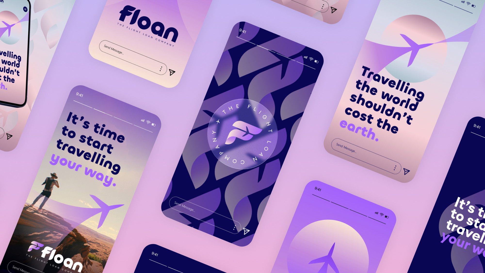
Inspired by boundless skies, we crafted a visual identity based on the beauty and the colours of the Earth’s atmosphere. The brand look and feel needed to feel inspirational but familiar. Starting with a gradient colour palette, we created a core brand gradient of a pink and yellow sky that would be ultra modern and distinctive in the industry. We then created a series of supporting gradients based on the colour of the sky at different times of the day. The concept being that we can utilise these colours on the website to appear at the correct time of day depending on the user. This also gave us a strong colour palette to use for varying types of imagery in the marketing.
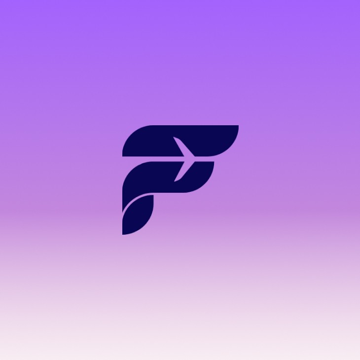
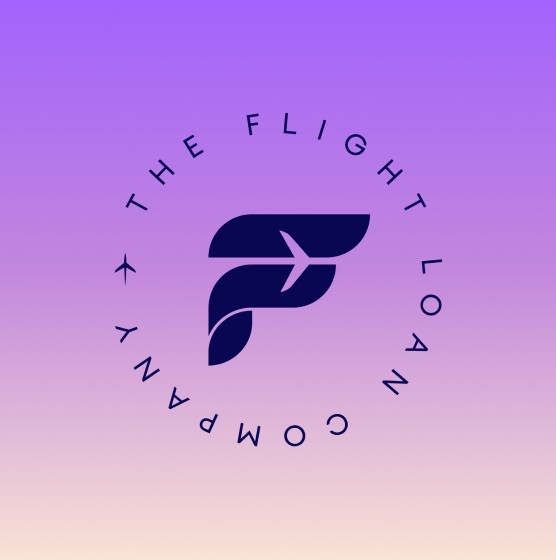
We wanted the logo mark and brand visuals to feel simple but epic. Inspired by retro space race imagery from the 60’s, we used the familiar image of a plane silhouette but created beautiful graphics of the plane cutting through the sky and symbolised the jet stream as a parting of the air. This made for various visuals either using the gradients, or instead masking travel imagery into the shapes.
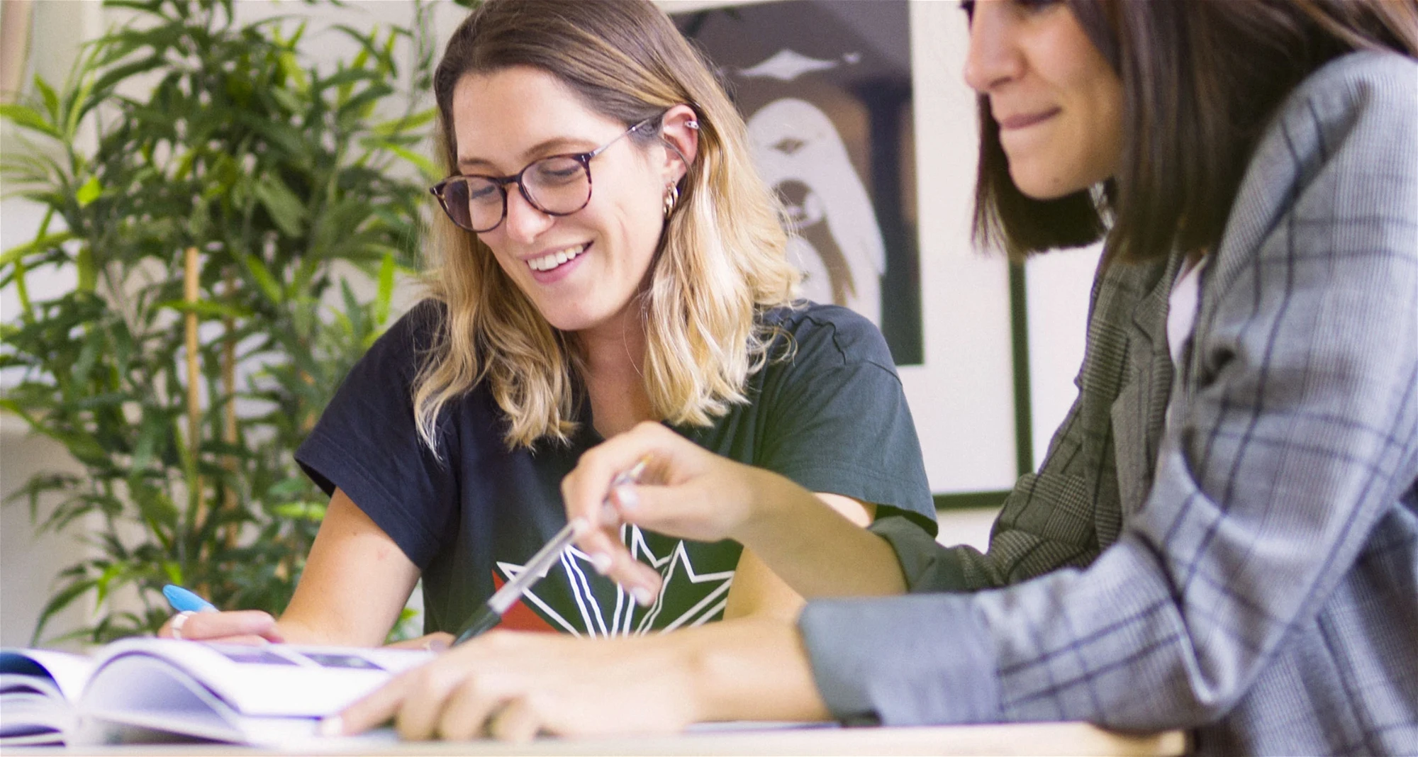
Usage for the travel imagery itself was a concept of adventure and exploration, with the guidelines of always being of travellers looking out on to grand landscapes, never to camera, always venturing ahead.


I cannot recommend KOTA more highly. They are such amazing, designers. Nothing was too big of a task, idea or feat for them to try and make work. Their ideas were fresh and exciting and every round of notes came back with yet more exciting ideas, vision and concepts.
Finn Bruce

Have a new project you'd like help with?