10 creative websites to inspire your next design (2025 update)

January 28th 2025
By Emily
When it comes to creative web design, striking the right balance between flair and functionality can feel like walking a tightrope. On one hand, you want your website to be memorable, unique, and full of personality. On the other, sticking to certain design patterns ensures your layout is intuitive and easy to navigate.
But great interactive web interfaces don’t just look beautiful — they tell stories and create memorable experiences. The key is finding the sweet spot – a website that’s visually engaging while still user-friendly and functional.
So, what makes a creative web layout that strikes this balance? Let’s start by identifying some key elements:
- Thoughtful scrollytelling: Scrollytelling is a smarter way to guide users through your story. Think of it as a visual narrative where timeline animations and parallax effects unfold as you scroll, making the experience feel more like a journey. Done well, it turns your website from a flat page into something that feels natural and immersive, keeping users hooked without overwhelming them with info.
- Subtle animations: A bit of movement can work wonders. Whether it’s rolling waves, colour-shifting shapes, or layers that pop up when you least expect them, subtle animations add a touch of magic to your site. The key is to surprise and delight without going overboard — creating moments that encourage users to keep scrolling and exploring. It makes the whole browsing experience feel dynamic and engaging, like your site is alive and ready to interact.
- Unique interactions: Interactive features like explorable maps or custom galleries give users a reason to get hands-on with your content. It’s a way to invite them into the experience, making them active participants rather than passive observers. These unique interactions let users dive deeper into your site, creating a more immersive and memorable connection with your brand.
- Real-world immersion: Take your website beyond the digital realm by incorporating elements that mirror real-world interactions. Think lifelike 3D designs or features that mimic physical behaviours. This level of immersion helps users connect with your brand on a more authentic level, making the experience feel less like browsing and more like engaging with something tangible.
When all these elements come together, your site transforms from a simple digital space into an experience that’s engaging, interactive, and impossible to forget. It’s all about balancing style with usability to create something that not only looks great but also works like a charm.
So now that we’ve covered the key elements that make a creative layout stand out, let’s build on our last inspo list and take a look at some of the best examples of websites in 2025 that embody this balance of creativity and functionality.
1. Bored Cow
Bored Cow’s cartoon-inspired design has just the right touch of motion. On-scroll animations keep things moving (literally), making the browsing experience feel like you’re part of the action. But the real highlight is that dress up your own cow feature.
It’s fun, interactive, and super memorable. Bored Cow’s website proves that when your product is as lighthearted as plant-based milk, there’s no harm in adding a little playfulness. It’s a clever, refreshing design that knows exactly how to make an impression – without taking itself too seriously.
2. Ingamana
Igamana’s website introduces a scroll effect that’s unlike anything we’ve seen before. If you’re tired of the usual scrolling experience and have a lot of visuals to showcase, this could be the solution you didn’t know you needed.
As you scroll, the image-based case studies gradually expand in a funnel-like motion, creating a distorted, almost warped effect that draws your focus in. It’s an innovative way of guiding the user’s attention, making the visuals feel dynamic and immersive while breaking away from the traditional scroll pattern. Definitely a fresh take on showcasing content.
3. Immersive Garden
This one takes interactive design to the next level with a stunning, super slick 3D background that reacts as you move your mouse over it. The effect feels almost alive, adding depth and dimension to the experience.
Then, as you scroll, the copy appears seamlessly, creating a fluid, engaging journey through the site. It’s a clever mix of subtlety and wow factor, making the entire browsing experience feel like you’re diving deeper into a world rather than just skimming through a page.
4. Clearstreet.io’s
Clearstreet.io’s homepage hero is a masterclass in displaying software and charts in an engaging, visually appealing way. As you scroll, the screens move seamlessly into place, transforming a standard interface into an interactive storytelling experience.
This clever use of scrollytelling—where the narrative unfolds as you move through the page—turns what could be dry, data-heavy content into something dynamic and engaging. It’s a brilliant way to bring the complexity of modern brokerage systems to life, guiding users through the platform’s capabilities with style and fluidity.
5. Ctrl Wallet
Ctrl.xyz showcases its crypto wallet interface in a way that’s both fun and engaging. The site features a section displaying the app’s interface, using a bold, vibrant bento-box layout that instantly draws you in.
As you scroll, on-screen animations and smooth motion design bring the interface to life, creating a dynamic experience that’s both visually satisfying and intuitive. It’s a great example of how to make a complex product, like a crypto wallet, feel interactive and user-friendly, all while keeping things visually appealing.
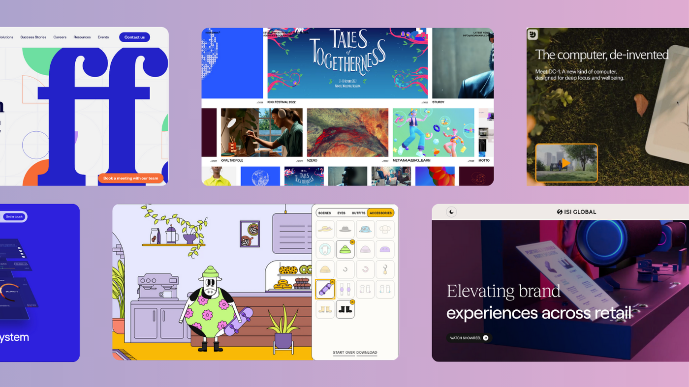
6. Daylight Computer
Daylight Computer’s hero video absolutely nails it. It smoothly transitions from day to night, instantly showing how the screen performs in both lighting conditions. It’s a clever, engaging way to highlight the product’s standout feature from the get-go – no need for long explanations, just show and tell. It’s a perfect example of how a simple visual can immediately demonstrate a product’s benefit in a way that feels fresh and interactive.
7. ISI Global
ISI Global’s new website nails the balance between maturity and creativity, bringing the brand’s evolution to life while staying true to its roots. The black-and-white design feels sleek and sophisticated, but it’s the mix of serif and sans serif fonts that really makes it pop. We carefully selected two fonts with matching X heights to create that seamless, effortless vibe.
The ‘Pathed’ graphics are a clever nod to ISI Global’s refreshed logo and their comprehensive retail design services. The two ends of the path represent the full customer journey, from start to finish. Paired with the carefully chosen fonts, these paths evolve into organic, minimalist visuals that stand out on their own, yet complement the retail imagery seamlessly. Minimal yet striking, these visuals work in perfect harmony with the site’s imagery, resulting in a site that’s as smart as it is visually engaging.
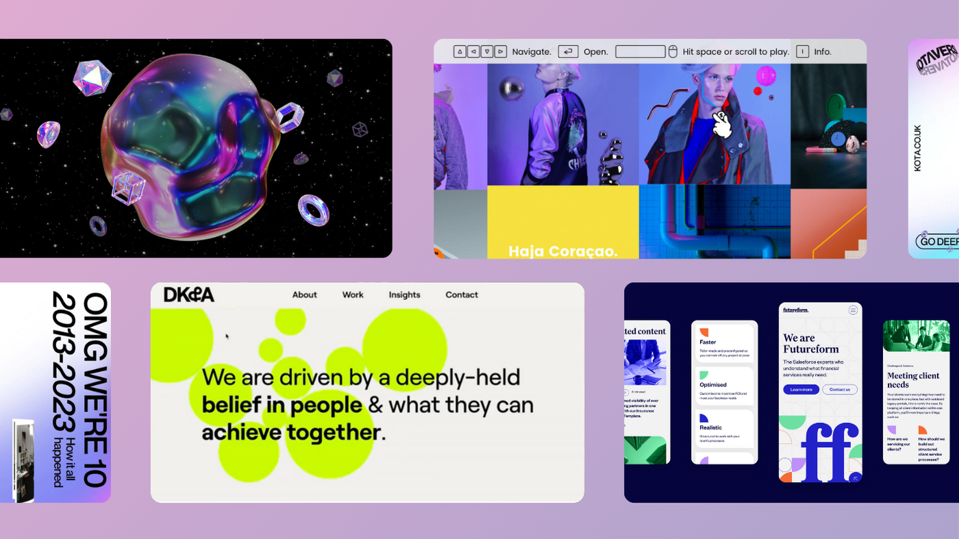
8. Futureform
Futureform, the Salesforce experts transforming financial services, came to us with a challenge: create a polished, professional site that reflects their growing capabilities, without falling into the corporate vibe typical of their industry.
The new website had to be sleek, dynamic, and visually engaging—showcasing their offerings, customer stories, blogs, and careers while delivering a cutting-edge user experience. It also needed to be easy for their team to manage as they scaled.
So, what did we do? We delivered a site that’s bold, sophisticated, and anything but formulaic.
9. Arcturis
Arcturis just got a serious upgrade. Their new site is sleek, smart, and designed to match the precision of the real-world-data they use to help improve patient outcomes.
We kept it clean, minimal, and medical—but with a creative twist. Think interactive dotted backgrounds that nod to their updated logo, using mono type as indicator text to enhance that data feel, and animated illustrations inspired by data infographics.
With tons more detail on their services and expertise, Arcturis now has a site that’s as sharp as the data they deliver.
10. Paffi
Paffi’s website takes interactive design to a whole new level with its mind-bending 3D scroll effect. As you scroll, blocks twist and shift, adding depth and dimension to the experience. The use of different colours to distinguish between works adds a playful yet organized touch, guiding you through the content with ease.
The animated background enhances the sense of movement, making the entire site feel dynamic and alive. But the real showstopper? The subtle magic when you hover over the ‘About Us’ button. The lettering twists as your cursor glides over it, adding a delightful interactive element that elevates the whole experience.
Summing up…
These creative web design trends show that in 2025, websites are all about creating experiences that stick. From playful scrollytelling to immersive animations, the sites we’ve highlighted show how creativity and functionality can work hand in hand. They’re perfect examples of how websites don’t have to be so limited, these days.
Whether it’s bold visuals, clever storytelling, or seamless interactivity, these designs prove one thing: the best websites don’t just tell stories—they pull you into them.
We’re all about creating artistic, immersive experiences here at KOTA. If you’re looking to create something like this, get in touch today!


Interested in working with KOTA?
Drop us a line at
hello@kota.co.uk
We are a Creative Digital Agency based in Clerkenwell London, specialising in Creative Web Design, Web Development, Branding and Digital Marketing.