5 cool brands in characteristically boring industries

Certain sectors can often seem as dry as a day-old bagel, but there are a handful of daring brands that have looked at the yawn-inducing norms of their industries, and laughed.
In The Freaks Shall Inherit the Earth, Chris Brogan champions the unconventional, the misfits, and the rebels who disrupt the status quo. It’s within this spirit that these brands have flipped the usual script in unexpected ways.
Banking, insurance, file sharing, and even toilet paper – areas once cloaked in the drab garb of necessity – now shine with vibrant possibility. Let’s take a look at some examples of that.
Monzo – Banking
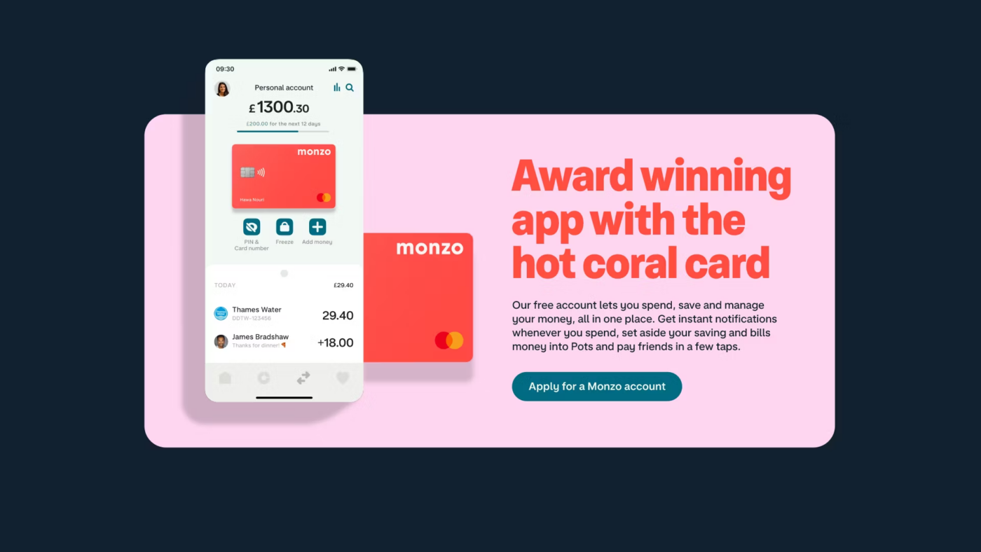
The banking sector, often seen as the epitome of traditional and tedious, was ripe for a shake-up. Enter Monzo, a digital-only bank that has made personal finance cool and colourful.
With features like instant notifications, budgeting tools, and the ability to freeze a lost card with a tap, Monzo has made managing money not just easy, but enjoyable. And their branding reflects that.
From the colours they use evoking energy and warmth, to the charming analog-style typeface and no-nonsense, accessible tone of voice.
They also worked with illustrator Ola Dobrzyńska to bring personality, movement and energy into a new illustration style that draws you into their vibrant brand.
Their iconic neon ‘hot coral’ debit cards have even become something of a status symbol among millennials & zoomers, proving that even banking can be stylish and fun.
Slack – Corporate Communication
Corporate communication is a field littered with outdated email chains and clunky software. Slack, however, has transformed workplace conversations into something far more dynamic and enjoyable. Their mission is to ‘make people’s working lives simpler, more pleasant and more productive’.
As such, their branding is all about team collaboration and easy-going communication. Their font, Slack Circular, sports generous curves instead of regimented corners, matching their goal to make work chats less of a chore. They also use bright colours to spark creativity and brighten your work day.
With its intuitive interface, integration capabilities, and playful use of emojis and gifs, Slack has made team communication something to look forward to. It’s all about making work feel like anything but.
Lemonade – Insurance
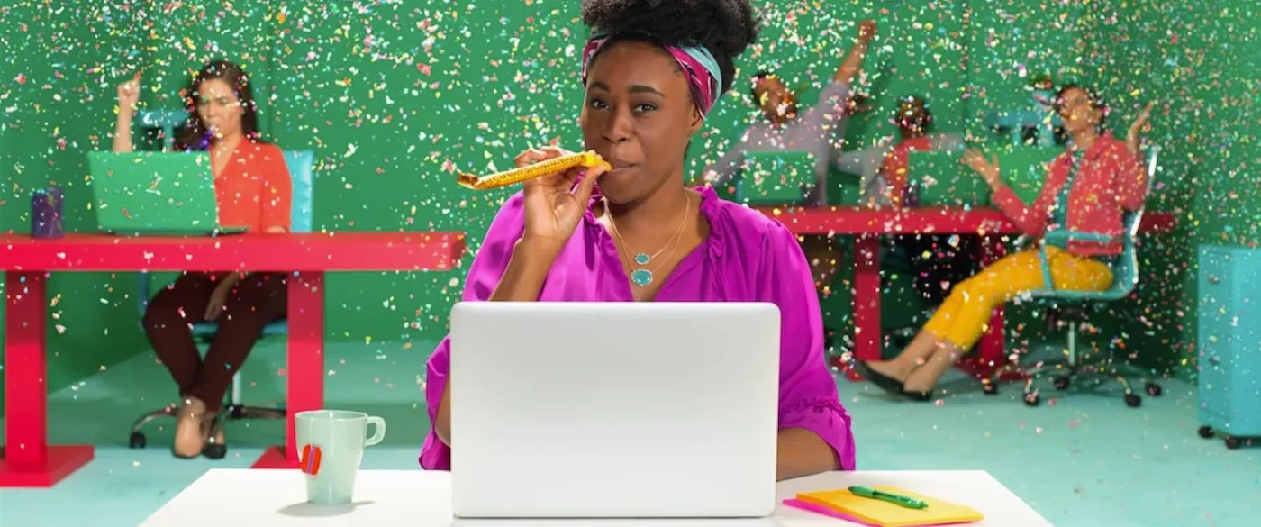
Insurance is often synonymous with complicated policies and endless paperwork, but Lemonade has injected fun and simplicity into the process.
They’ve cut through the red tape, offering renters and homeowners insurance that’s easy to understand and even easier to sign up for. Their transparent claims process and giveback program prove that insurance can be cool, caring, and cutting-edge.
In that vein, Lemonade embarked on a creative journey to engage its audience in a way that insurance companies seldom do. Everything about their brand and how they position themselves online screams ‘community’. Think: vibrant hot pink, simple illustrated micro-animations on their website, and a tone of voice reflects their big heart.
Lemonade’s journey showcases how daring to be different, using creative freedom, and focusing on community can not only redefine a brand but also connect it more deeply with its audience.

WeTransfer – File sharing
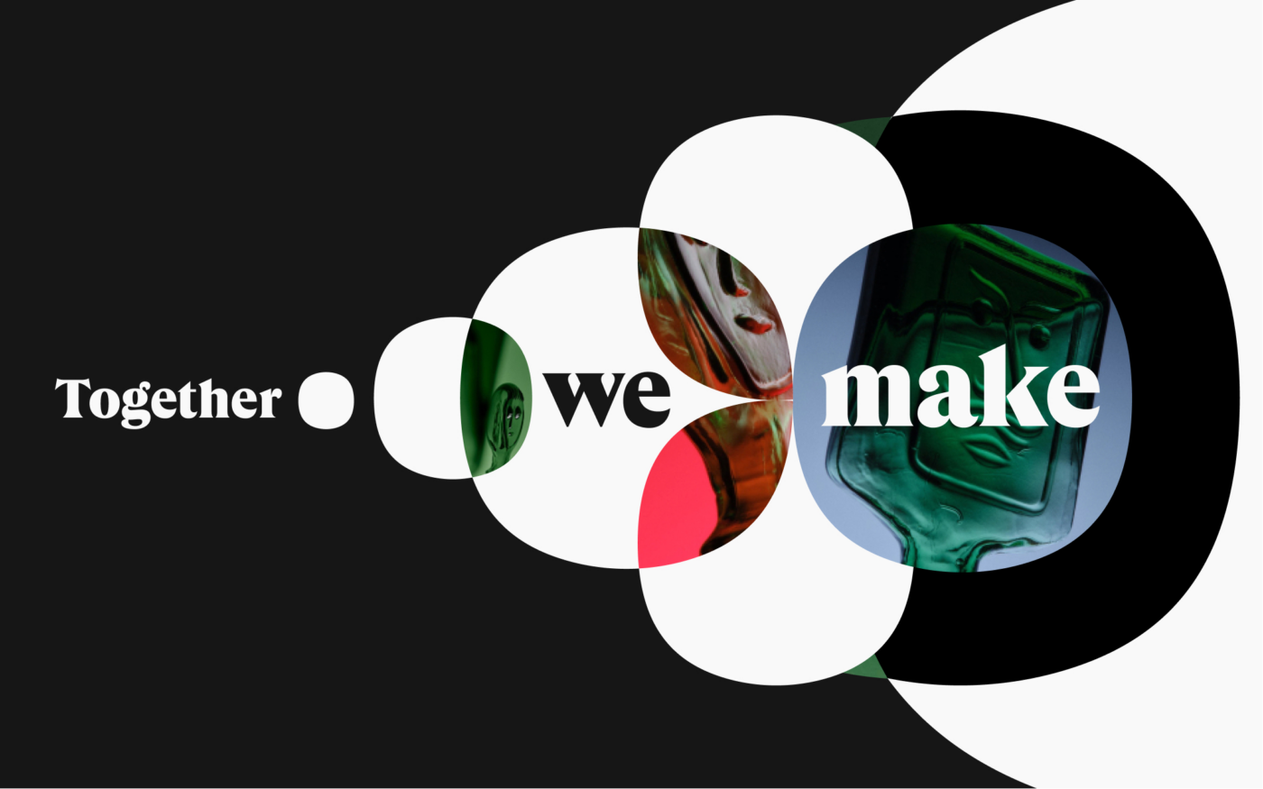
By crafting an interface that’s more art gallery than mailbox, WeTransfer knows its audience to the core. They’ve built not just a brand but a cool, cultural hub for the creative community (you know, those with all the obscenely enormous files to share).
They speak design fluently, making every interaction feel less like a transaction and more like a contribution to a bigger, bolder creative collective.
By redesigning the boring interface of ‘uploading’ and ‘downloading’ with sweeping gallery-scapes, WeTransfer doesn’t just understand its market of creatives; it reveres them.
Who Gives A Crap – Toilet paper
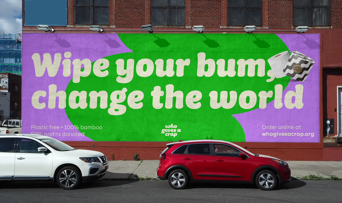
Who would have thought toilet paper could be exciting? Who Gives A Crap did. By selling environmentally friendly toilet paper and donating 50% of their profits to build toilets for those in need, they’ve turned a mundane purchase into an act of global charity.
Not only have they ditched plastic wrapping for paper, but they’ve also made that packaging bright and bold with unexpected combinations and shapes inspired by nature, sanitation, and bums (they couldn’t help themselves).
Their fun branding, humorous marketing, and commitment to sustainability have shown that even the most unglamorous product can be a force for good, as well as a brand fave amongst its purely functional competitors.
Duolingo – Education
A lone owl has led the education sector to question what they’ve been doing all along. Is learning a new language to be confined to the stone walls of somber education? Not according to the book of Duolingo.
The Duolingo app has transformed language learning from a tedious task into an addictive game. With its friendly owl guide and game-like lessons, their aim was to make learning a new language feel more like playing and less like studying.
But when the internet started buzzing with memes about the owl’s… let’s call it ‘persistent’ nature in reminding users to keep up with their language lessons, Duolingo didn’t shy away. Instead, they embraced the narrative with a wink and a nudge.
Leaning into the playful portrayal of their mascot as a slightly overzealous coach, Duolingo has cleverly incorporated this aspect into their branding, especially on platforms like TikTok. This approach not only showcases their willingness to listen and engage with their audience but also highlights their brand’s personality: fun, a tad quirky, and deeply committed to making language learning addictive.

To sum it all up…
These brands serve as a vivid reminder that so-called ‘innovation’ isn’t just about technology or products; it’s about seeing the world differently and having the courage to act on that vision.
By turning the mundane into the extraordinary, they embody that ‘freak’ spirit, showing us that with a bit of creativity and a willingness to break from the norm, even the most characteristically boring industries can be cool.
Interested in working with KOTA?
Drop us a line at
hello@kota.co.uk
We are a Creative Digital Agency based in Clerkenwell London, specialising in Creative Web Design, Web Development, Branding and Digital Marketing.

