Website design for tech & SaaS done right.
December 7th 2021
By KOTA
Introduction.
We get that it’s a bit of a battleground out there for tech companies right now. Every single software company seems to have a handful of direct competitors going after the same market. At the same time, standing out from the crowd without alienating your target audience can be hard.
When it comes to web design, it’s not all about appearances though – marketers and company owners are demanding more flexibility from their sites than ever before. They need to react quickly in response to the ever-evolving software landscape for both their competitors and their users. The days of static websites with yearly updates are over!
At KOTA, we’ve done our fair share of tech, software and general SaaS websites over the years. We’ve heard all the problems before and (think!) we’ve got solutions to most of the big issues. In this blog post, we’ll share the recipe for good web design in the tech sector.
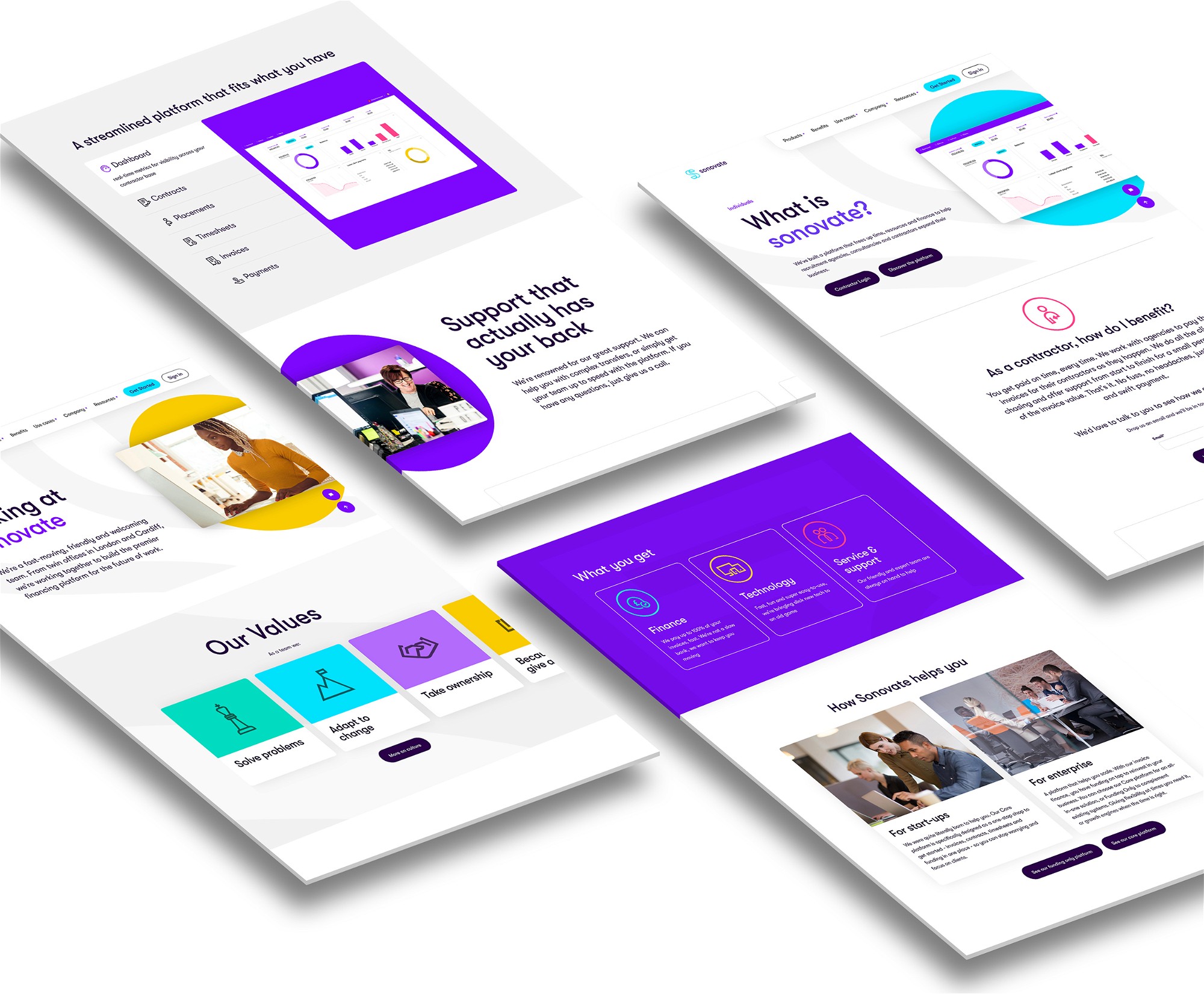
1. Intuitive user journey.
The #1 worry most software companies have is their potential customers not understanding what the product or service even does. If you can’t quickly and effectively communicate exactly what you offer at the very start of the user journey, it’s pretty difficult to navigate through the website. Many users would simply give up and leave the site.
Users need context and basic understanding to underpin their journey. Once they understand why you exist, they will know what information they need from you. Then it’s just a case of laying down the ‘bread crumbs’ to guide them and signpost their journey.
We like to use streamlined top-level navigation with dropdown ‘mega menus’ to help in this regard. By splitting out your content into the most basic/essential categories at this top-level you can quickly allow users to delve deeper into the site. We also don’t like to hide software complexity, we just place the more detailed content at the suitable level of user journey and engagement. The shop window approach always holds true, get customers engaged and excited first then leave the detailed chat for when they’re fully inside.

2. Build with flexibility in mind.
Problem #2 for most of our tech clients is needing to rebuild their entire website due to a previous agency effectively locking them out. This is often because the site is too complicated to update easily or without the developer’s input. So after years of getting by with content starved pages, clients are desperate for the ability to make regular, quick updates (after all, the tech industry moves quickly). At KOTA, we design everything with an updateable CMS approach in mind.
We normally create websites with a WordPress backend due to its great UI allowing clients to add and update content as they go. We also make sure we design with flexibility and scalability in mind. Depending on the needs of a client we can go as far as making every single component reusable alongside any other in a custom page build site. This component-based flexible design approach requires a lot of careful planning but allows for complete flexibility our clients value so much.

3. Balance between copy and visuals.
We love crafting super bold and exciting layouts, but we also understand that some businesses need a more subtle approach for their customers. We always find a good balance between those large bold hero messages alongside the smaller technical info.
The same logic applies to imagery, overloading pages with too much large imagery can really slow down users trying to get to essential information. We try to sprinkle the fun messages/imagery just in the right places and at the right sizes. It always comes down to balance. Understanding how your target demographics content requirements might differ during the Discovery project phase really helps us figure out this aspect.

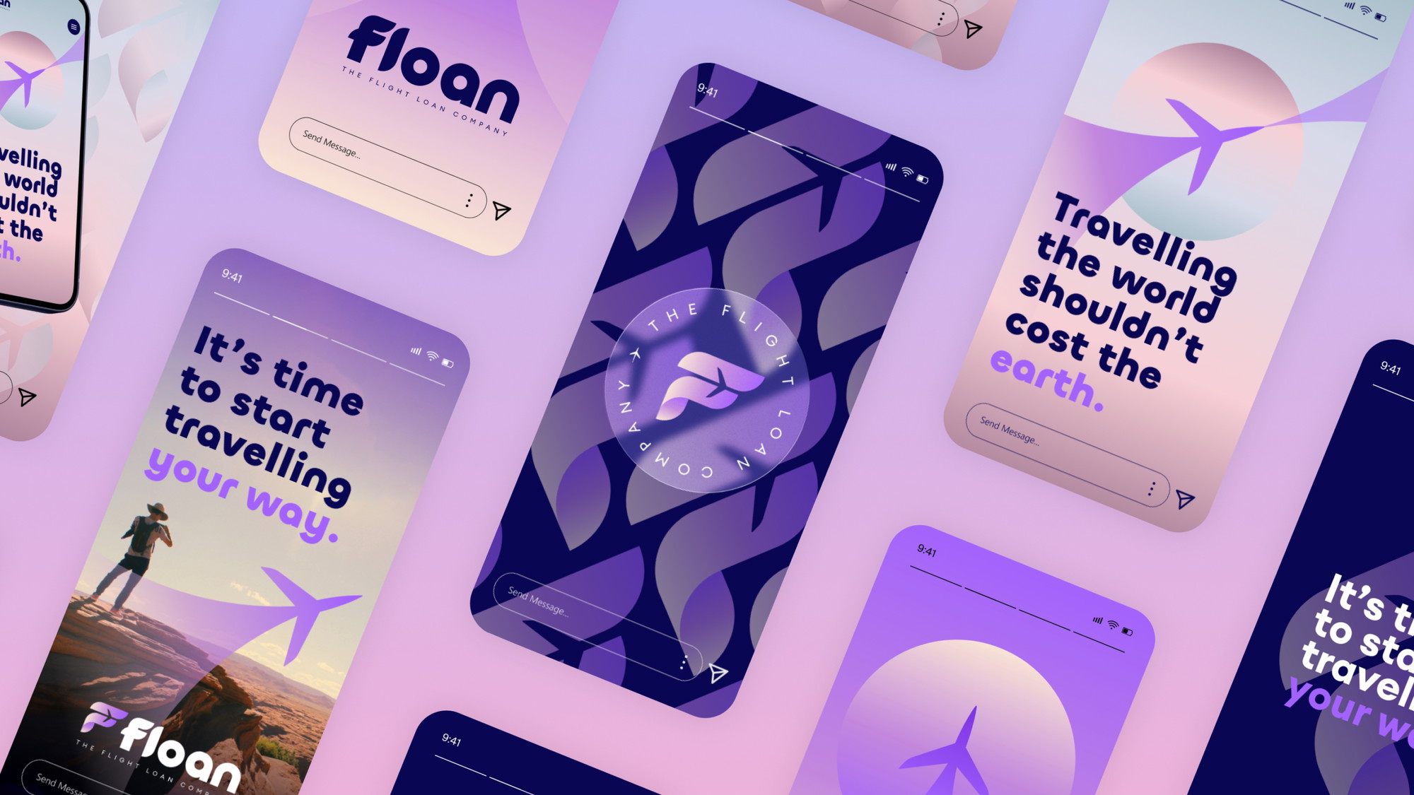
4. Remember to stand out.
Standing out from the crowd is something every single business wants to do, regardless of the sector they operate in. With tech companies it gets a little harder as, no matter the niche, there’s someone else offering a similar service.
To help avoid visual similarities with competing firms in the same space we like to look further afield for our visual inspiration. It could be fashion, art, cosmetics or even music. Getting your head into a different visual space really helps.
Colour is normally a massive sticking point with clients as they’re afraid of anything too bold, too feminine, too masculine, too childish, too bright, too dark, the list goes on. Obviously, every single one of these is subjective! Unless clients want another shade of corporate blue, we like to push them out of their comfort zone and help them accept that nowadays anything can work if you know how to apply it.

5. Simplify the content.
We always like to help our client streamline their content. It’s incredibly difficult to step back and appreciate just how complicated software content can be when you already understand your product. With fresh eyes, it’s often bloated, overly complex or too technical. A simple human sense check on feature and technical descriptions can make a massive difference to users comprehension as well as dwell time.
We like to really dive into what a software company offers to fully understand everything. However it’s not just about the content itself, it’s about how you split it up to allow users to navigate, digest and continue exploring through the site. Giving users little moments of breathing space with some big images or animations can help ensure you don’t overload them with information.

6. Use relevant imagery.
It’s very difficult to get real images of customers using any business software and it’s rare for our clients to come to us with a bank of images ready to illustrate everything. To get around this problem we tend to use a combination of relevant stock lifestyle imagery and real UI screenshots. Bad stock can look really awful, but if you’ve got the right eye it’s not so hard to find relevant images of a target audience.
For the more specific software elements, we sometimes make abstracted graphics using extracted UI elements and simplified software visuals as showing an entire app screen can take up too much space. A blend of all these styles normally helps add some variety to the overall site.

8. Enhance the brand.
Often our clients don’t know how to make their websites more interesting as they don’t have the large brand toolkits of design assets that allow for experimentation or fun visuals. This means we often start with nothing but a logo and have to build out the brand from there.
We have to create a design system that will spread across the new site and give our clients the visual collateral they need to scale. We often look to add accent colours to signpost content, bold background visuals to illustrate the intangible tech elements and nice graphic styles. This way even the most basic website components have a designated style fitting into a wider consistent brand system.
Conclusion.
Websites will only need to get more flexible in the future as businesses have to be more competitive and more innovative to keep up with their competitors. In this ever-changing landscape, it seems inevitable that every previous convention of what a tech company should look like will fall by the wayside as users tire of the usual tropes.
Why not get ahead of the curve right now and do something different? Don’t be afraid to add character and fun to your user experience, even if you’re selling the most technical software imaginable. We’re happy to help.


Interested in working with KOTA?
Drop us a line at
hello@kota.co.uk
We are a Creative Digital Agency based in Clerkenwell London, specialising in Creative Web Design, Web Development, Branding and Digital Marketing.