5 examples of playful design in branding

January 13th 2025
By Emily

Need to create a brand identity that feels approachable, human, and memorable—without losing the trust and credibility that professionalism demands? When done well, playful design can disarm scepticism, spark curiosity, and foster genuine connections between brands and their audiences.
In this blog, we’ll explore brands that have struck the perfect balance between quirky creativity and polished professionalism, and share insights on how you can infuse a bit of playfulness into your own brand identity.
1. Mailchimp: a masterclass in quirky professionalism
Mailchimp is one of the most recognised examples of playful design done right. Known for its bold colour palette, offbeat illustrations, and the ever-charming Freddie the Chimp mascot, Mailchimp manages to inject fun into every touchpoint—from its website to email templates.
But make no mistake: behind the fun visuals lies a powerful and professional marketing automation platform. Mailchimp’s design choices are intentional, helping users feel comfortable navigating complex tools without feeling overwhelmed.
Takeaway: Playfulness doesn’t mean sacrificing clarity or functionality. Mailchimp uses quirky visuals to reduce friction and make technical tools more approachable.
2. Slack: professional meets playful communication
Slack’s brand design manages to bridge the gap between serious productivity and casual camaraderie. Its logo is clean and professional, while its UX design includes playful touches like friendly illustrations, whimsical loading messages, and a liberal sprinkling of emoji.
Slack’s playful personality shines through in its tone of voice as well—messages are conversational, human, and full of personality, even when tackling technical issues.
Takeaway: Playful design isn’t limited to visuals. Slack demonstrates how language and micro-interactions can make digital experiences feel friendly without undermining professionalism.
3. Duolingo: learning made playful
Duolingo has turned language learning into an experience that feels fun, engaging, and refreshingly human. Its bold green mascot, Duo the owl, adds a touch of personality across the app and marketing campaigns, while playful push notifications encourage users to keep up their streaks.
Duolingo’s design balances light-hearted visuals with an interface that’s functional and user-friendly. Learning a new language can be daunting, but Duolingo’s playful approach makes the experience feel less like homework and more like a game.
Takeaway: Playfulness can make challenging tasks feel less intimidating. Duolingo uses humour, visuals, and clever reminders to keep users motivated without compromising on usability.
4. Dropbox: simplicity with a creative twist
Dropbox leans into playful design through abstract illustrations, soft colour palettes, and approachable UI design. While their core offering is a serious one—file storage and collaboration—the brand never feels overly corporate or cold.
Dropbox demonstrates that playful design doesn’t always mean loud or bold—it can be subtle, minimal, and still leave a memorable impression.
Takeaway: Playful design can be understated. A touch of creativity in otherwise utilitarian design can go a long way.
5. Figma: creativity at the core
Figma is a design tool, so its branding reflects the creativity of its user base. The playful colour blocks in Figma’s logo, paired with a clean and minimal interface, strike a balance between creative energy and professional utility.
Figma’s playful side also shows up in delightful micro-interactions, tooltips, and onboarding flows, adding personality to what could otherwise be a purely functional product.
Takeaway: Playfulness can be integrated into user experience. Small design details can create moments of delight without overwhelming functionality.
How to bring playful design into your brand
Not every brand needs a cartoon mascot or neon colours to feel playful. Here are some practical tips for adding playfulness to your brand without losing professionalism:
- Focus on micro-moments: Add personality to tooltips, error messages, or loading screens.
- Use illustration thoughtfully: Quirky visuals can break up heavy content and guide users through complex information.
- Play with tone of voice: Don’t be afraid to let some personality shine through in your copy.
- Experiment with colour and typography: Playful design can come through in bold colours or unexpected font choices.
- Stay consistent: Ensure that playful elements are integrated seamlessly across all brand touchpoints.
Summing up
Playful design doesn’t mean sacrificing credibility—it means embracing creativity in a way that feels intentional and aligned with your brand’s core values. The brands we’ve highlighted prove that you can be fun without being frivolous, and engaging without being overly casual.
Whether it’s a friendly illustration, a witty headline, or a delightful micro-interaction, a touch of playfulness can make your brand unforgettable.
Ready to add some playful energy to your brand? Let’s chat.
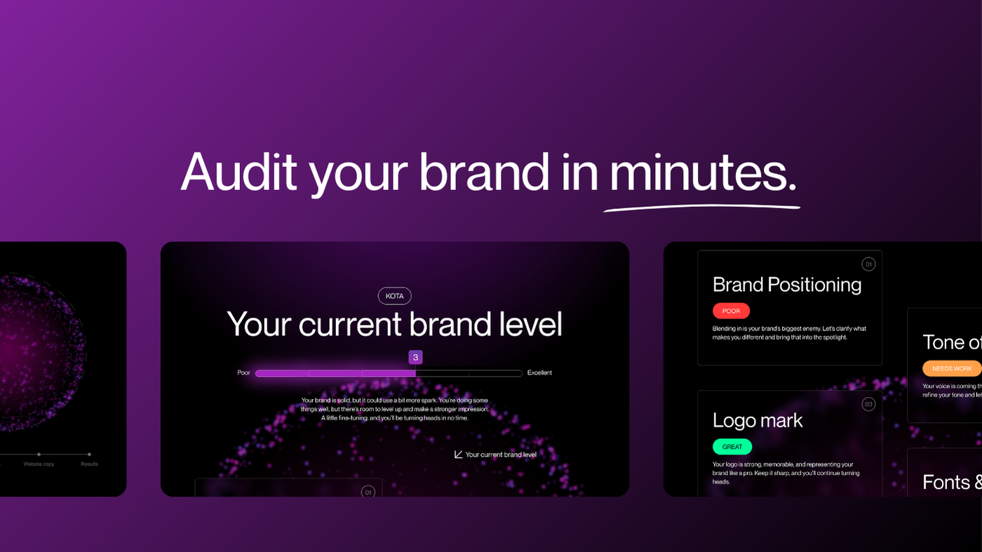


Interested in working with KOTA?
Drop us a line at
hello@kota.co.uk
We are a Creative Digital Agency based in Clerkenwell London, specialising in Creative Web Design, Web Development, Branding and Digital Marketing.