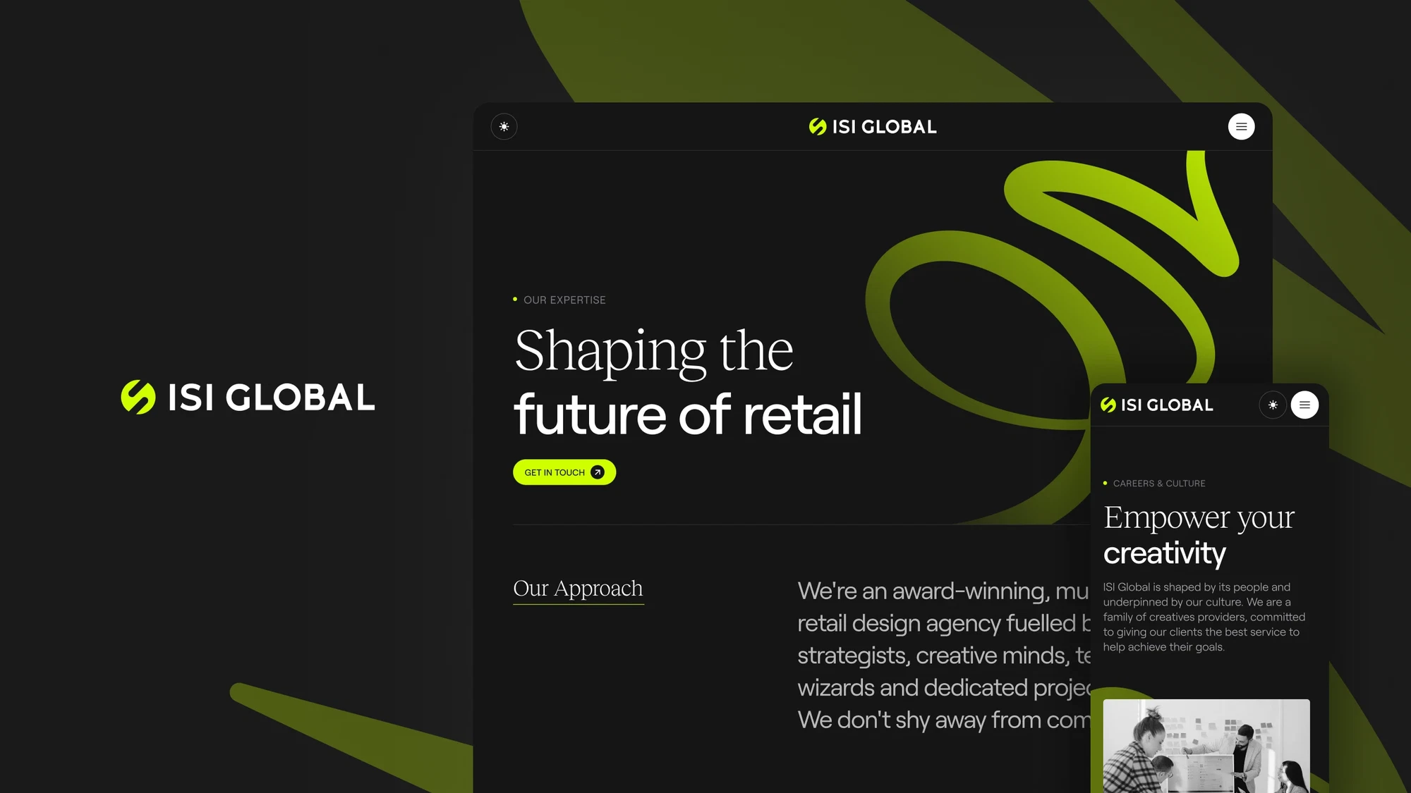
The best uses of motion in web design (and when to hold back)

June 19th 2025
By Emily

Motion in web design is a bit like garlic. Get it right, and everything’s elevated—more flavour, more depth, more impact. But overdo it, and suddenly you’ve overwhelmed the dish. Or in this case, the user.
When used with intent, animation can guide, delight, and help bring your brand to life. Used badly? It slows everything down, frustrates users, and risks tanking performance (and rankings).
Here’s when motion works—and when to hit pause.
When to lean in: motion that makes your site better
1. To guide users without them realising
Good motion feels invisible. A hover that shifts slightly, a menu that unfolds smoothly, a field that expands as you type—it’s the little things that make a big difference to how intuitive your site feels.
Think of it as UX body language. Subtle cues that say “you’re in the right place.”
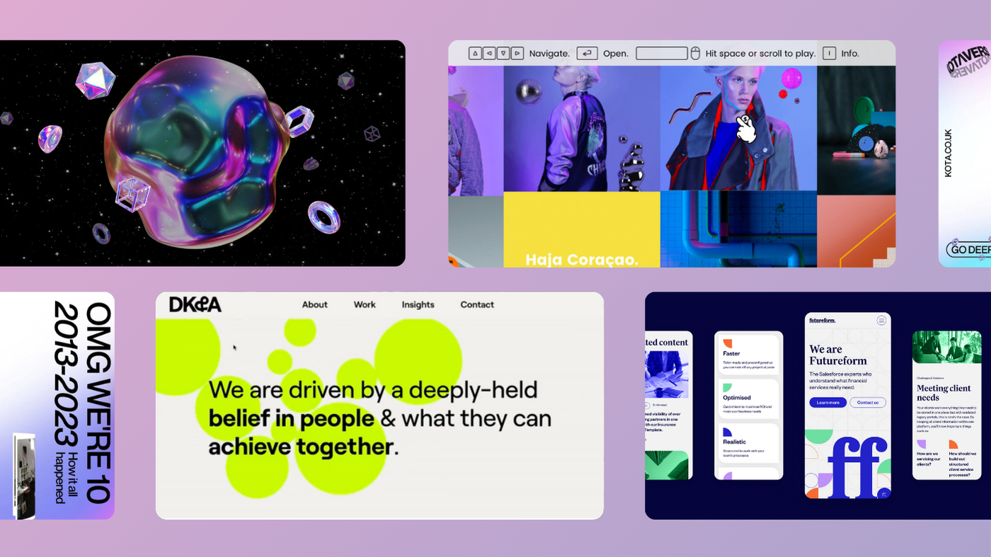
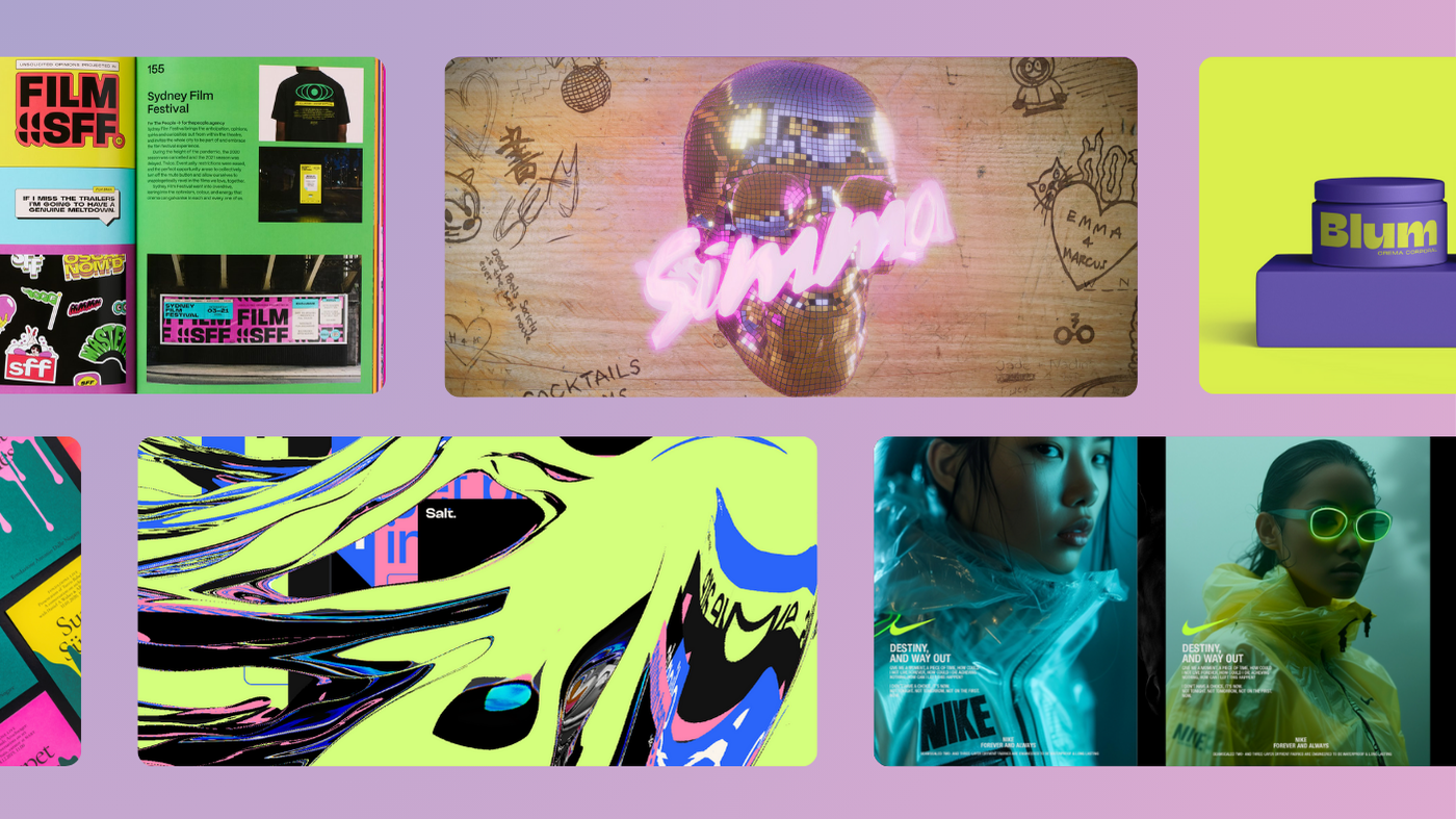
2. To show off your brand’s personality
Static design can only take you so far. Motion adds depth, emotion, and story. Whether it’s playful bounce or slow, elegant fades, the right movement makes your brand feel more alive—and more memorable.
Especially for creative or tech-led brands, it’s a chance to show what you’re made of.
3. To keep users interested
Users are curious creatures. Give them something worth scrolling for. Scroll-triggered reveals, animated section transitions, responsive hover states—when done well, motion encourages exploration and rewards interaction.
Just make sure there’s purpose behind the polish.
4. To ease the pain of loading
Nobody likes waiting. But smart motion—like loading animations or skeleton screens—can make it feel faster, even when it’s not. It buys you just enough time to keep users from bouncing.
Bonus points if it’s on-brand and visually satisfying.
When to hold back: motion that gets in the way
1. When it slows people down
Long transitions, over-engineered effects, animations that make you wait… no thanks. Users are here to get something done. Don’t put style over speed.
Your motion should keep up with your users—not make them wait for it to catch up.
2. When it drags performance down
Heavy JavaScript animations and unoptimised effects can be a site killer. Especially on mobile, where users are less patient and bandwidth is tighter. If motion starts to mess with load times, it’s time to strip it back.
Speed isn’t just a UX issue—it’s an SEO one too.
3. When accessibility gets ignored
Not everyone experiences motion the same way. Fast flickers, loops, or aggressive animations can cause real discomfort for some users. If your site makes someone dizzy, it’s not a vibe—it’s a problem.
4. When it’s just… there
If an animation doesn’t serve a purpose—helping users, supporting the story, or enhancing the brand—cut it. Decorative motion with no function is just clutter. The best sites know when to show restraint.
The bottom line
Motion should make your site feel effortless. The best interactions are the ones users don’t even notice—they just feel slick, seamless, and smart.
So next time you’re planning that epic scroll effect or animated splash, ask yourself: is this helping the user, or just showing off? If it’s not doing anything meaningful, maybe it’s one to let go.
At KOTA, we believe in cinematic design—but never at the cost of experience. Strategic motion. Beautiful execution. No unnecessary fluff.
Want help using motion the right way?
We design sites that move people—literally and emotionally. Let’s chat →

Interested in working with KOTA?
Drop us a line at
hello@kota.co.uk
We are a Creative Digital Agency based in Clerkenwell London, specialising in Creative Web Design, Web Development, Branding and Digital Marketing.