We created a brand new identity and website for this data analytics consultancy.
Cynozure was founded in 2016 with the ambition to reshape how we think about data and analytics. A people first, business-first and outcome-focused consultancy, their refreshing and transparent approach has brought them success with brands from Kondor to Soho House.
Cynozure approached us to completely transform their brand identity and brand proposition. We created a brand strategy and proposition that differentiated them from the competition in the industry, focusing on a people-centric organisation that collaborates with brands to transform the power of data, contributing to a better future for all.
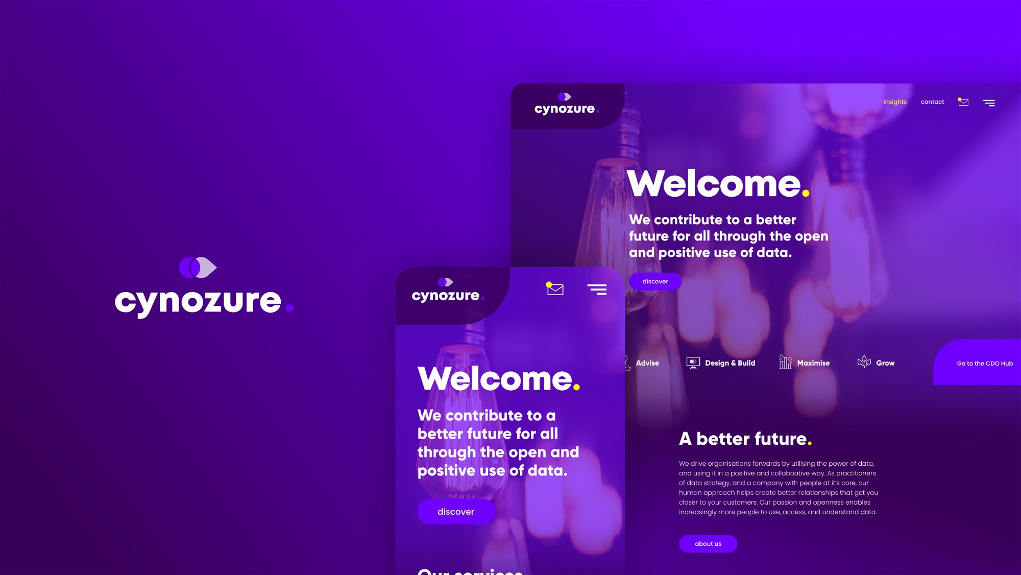
We completely evolved the visual identity of the company’s three branches; the main Cynozure brand; CDO Hub professional meet-ups; and the Hub and Spoken podcast. We then translated this new brand identity into a fresh looking website to house these key areas, plus their services and regular spokesperson insights.
Industry
Data Management Consultancy
Location
UK & USA
Featured by

Brand Identity
Visually, the new branding worked across three logo marks, but also as a group identity as a whole. Each aspect of the brand had its own icon mark, gradient and spot colour to be visually recognisable as part of the same company, but with a distinct message. The colour palettes were selected for their psychological association (Cynozure – Purple; Power, Royalty, Elegance / CDO Hub – Turquoise; Intelligence, Trust, Professionalism / Hub and Spoken – Pink; Stimulation, Joy, Life, Kindness).
The icon marks themselves focused on the direction of moving forwards into the future, and the transparency the company prides itself on. Then each branch has its own distinct shape to accompany (Cynozure – Circle; Being at the centre or heart / CDO Hub – Hexagon; The Hive of activity / Hub and Spoken – Triangle; Symbolising the audio play icon). These work either together, as combined logos, or each on their own, with the icon marks symbolising each brand as stand-alone marks themselves.


The Website
The website styling translated the branding work we produced using the gradients and spot colours in a modern and innovative way. It had to feel quite humanised due to the company’s focus on being a people-centric and personable organisation. Therefore, we implemented lots of lifestyle shots of Cynozure’s crew populate the imagery on the site.
Structurally the website was very large, with in-depth content about their varying services, client case studies and a large regularly updated content hub that has a filter functionality.
We designed bespoke iconography for Cynozure’s various services and styled related insights and podcasts to the CDO Hub and Hub and Spoken branding where necessary.
A great in-depth transformative project from start to finish. We call it Data Plus!


Results after 3 months


What a cracking result we’ve ended up with….the effort was well worth it and we couldn’t be happier with the outcome. Thanks for all your work, efforts and energy on this. Let’s celebrate soon!
Jason Foster


Have a new project you'd like help with?