10 signs you probably need a new website

Introduction.
So you have a website – welcome to the Internet! But how happy are you with it, really?
Your customers’ habits are evolving quickly and new technologies take the Internet by storm. Your bare presence online is the first step but keeping up with the new is just as important. With billions of sites on the web, how do you make sure you stand out and, most of all, reach the right people?
At KOTA we know that there is so much more to a successful website – it doesn’t only need to look nice but most importantly, work well and meet your business goals. Lucky for you, we’re here to help.
If you’re still feeling unsure, here are 10 obvious signs you probably need a new website.
1. Your website is not responsive
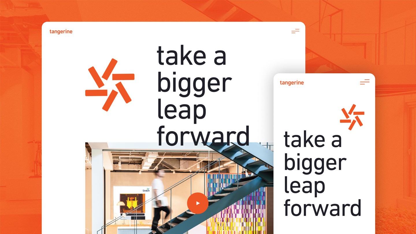
While this list is not organised in terms of importance, your website not being responsive is quite a major reason for you to start thinking about a new one. A responsive web design should ensure your website renders correctly across different devices and that a memorable user experience is translated to every screen, whether it is a desktop PC, laptop, tablet or a mobile phone.
What’s most important, according to recent data, mobile usage is quickly surpassing desktop usage as the way of surfing the web with now over 60% of users doing it from their smartphones. Now more than ever, you can’t afford steering your customers away only because on an unresponsive website. Can you?
See here how KOTA made sure Optomen’s website smoothly translates to mobile (yes, we even won awards for it).
2. Loading takes forever
According to this research, 47% of consumers expect a page to load in 2 seconds or less. It’s also worth noting that 40% of consumers will decide to abandon a website that takes more than 3 seconds to load. The solution is obvious – in order to keep your visitors on the site, you have to make sure it loads instantly. If your website takes ages to appear on screen, it’s high time for you to think about a new one. Fortunately, here at KOTA, it’s one of our biggest priorities to make your site speed is one of the key performance indicators.
If your site is too slow, let’s be honest – you’re missing out big time. You’re most probably losing potential customers and harming the Google algorithm result. And we all know Google is king.
See here how we built an ultra-fast website for Meta.
3. Your bounce rate is sky high
First things first, what the heck is bounce rate and why should you care about it? According to Google, a bounce is a single-page session on your site. Is it a bad thing? Well, if the success of your site depends on users viewing more than one page, then, yes, a high bounce rate is bad.
There are numerous reasons for your bounce rate being high, such as confusing user experience, unreadable content, unattractive design or faulty functionality. Lucky for you, a fresh redesign of your website can help with all that. Magic!
See here how the new website reduced Opta’s bounce rate by 25%!
4. It doesn’t align with your branding
Have you recently gone through rebranding and your current website doesn’t showcase it? That’s a no-brainer, really. You need a new one.
For most businesses these days, digital is a primary way of communication. If your website doesn’t match with your brand you might be sending a confusing message to your potential customers and well, that’s never good.
See here how we helped Design4Retail represent their brand on the site.
5. It just doesn’t look good
The most important thing: are you happy with your website? Are you proud of it? Do you think it gives a correct impression of your business? No? Then there’s no running away from it – you do need a new one.
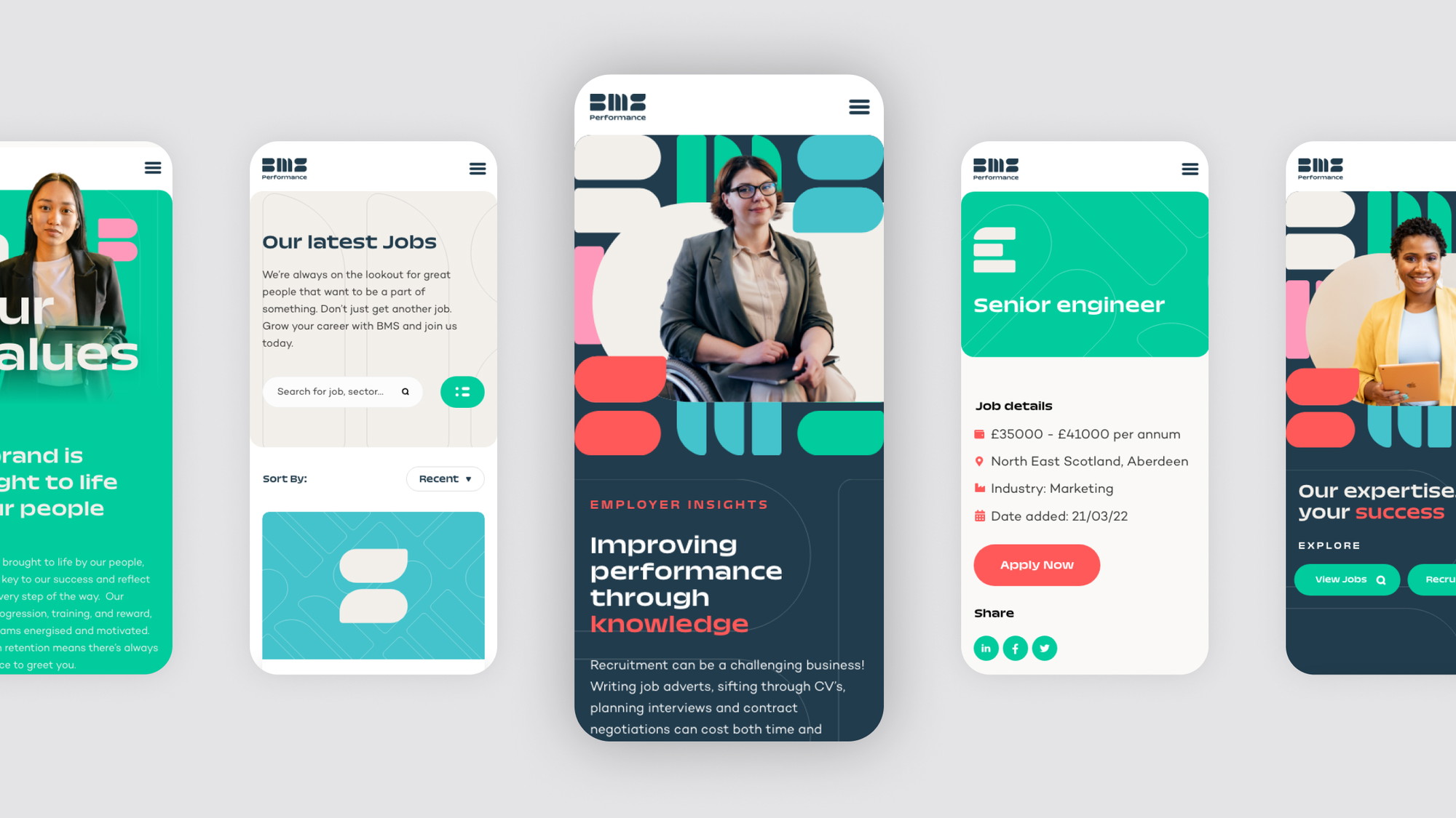
It comes as no surprise, but according to Adobe, 66% of consumers would prefer to view something beautifully designed vs. simple and plain. Even more so, the research suggests that as many as 68% of viewers choose overall good design such as appealing layout and photography as one of top three factors of content viewing experience. Wow.
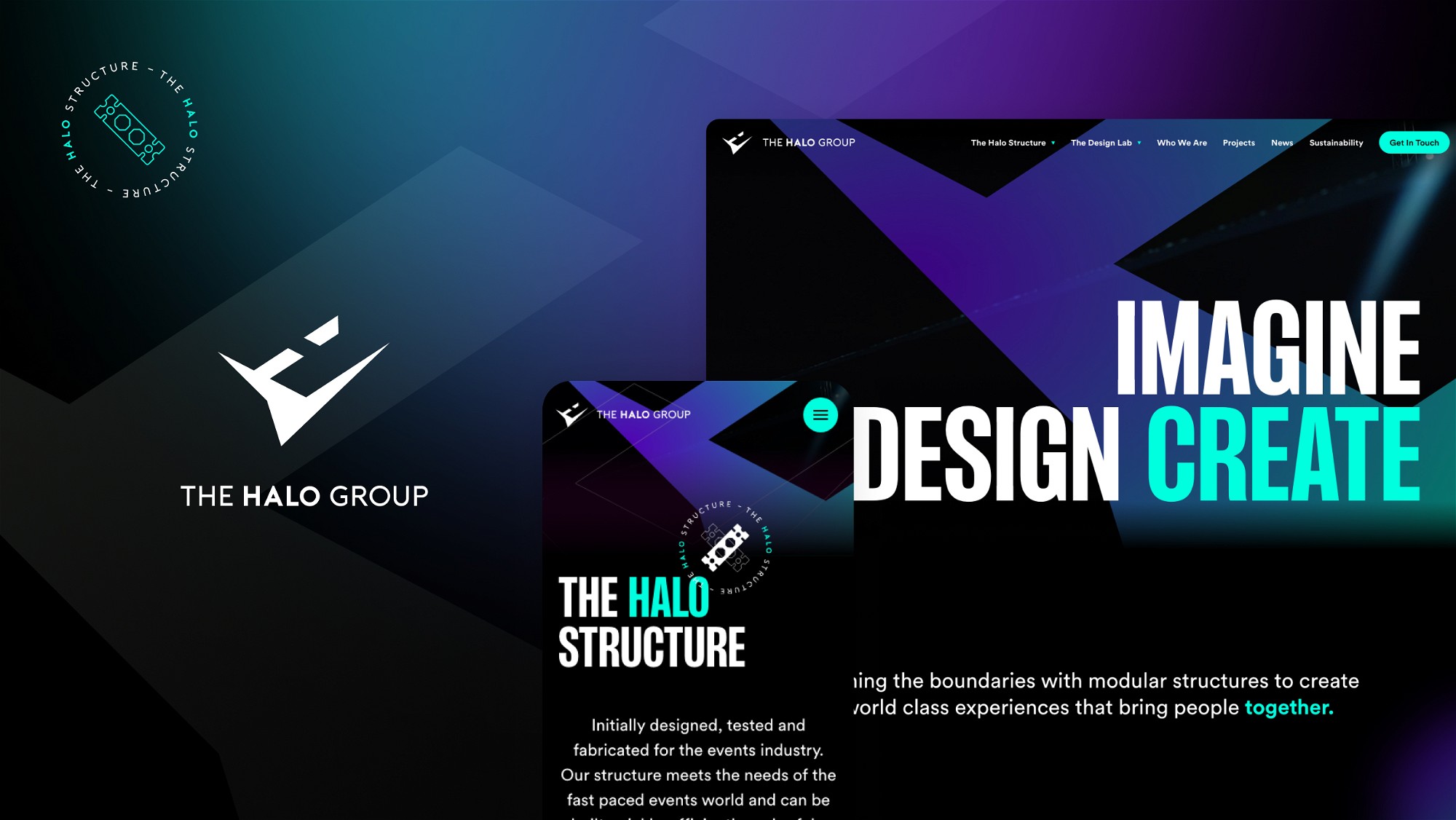
See here the cutting-edge design we delivered for Linden Staub.
6. The navigation and site map are confusing
We call it bad User Experience (UX) and we see it a lot: over-complicated site navigation, hidden and inaccessible content, lack of call to actions or clear section hierarchy. If all this sounds familiar, there’s no time to waste and you should be thinking about a redesign right away. Upgrading your website to its more intuitive self with a seamless flow of information will bring you profit in no time.
Check out our project for Cynozure and see how we focused on a smooth user experience.
7. You can’t update your own content
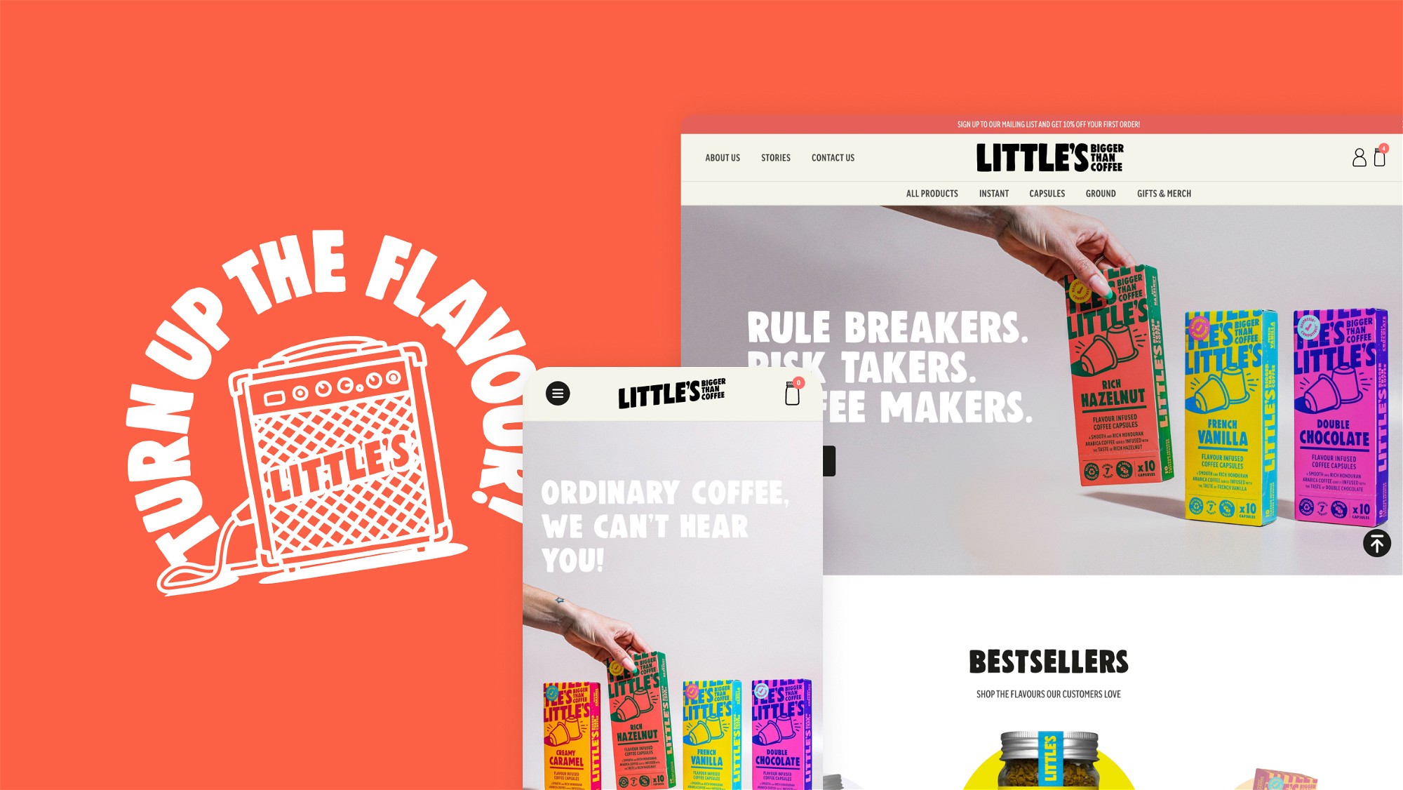
We can’t imagine anything more excruciating than that – not being able to make updates to your website without emptying your wallet to pay an IT guy is just not right. Even if only to avoid this frustration, it’s worth considering a new website with a proper content management system behind it.
At KOTA, we make sure the backend of every website we build is simple and intuitive. We also offer complimentary training sessions so in no-time you can become a WordPress virtuoso yourself.
Records Bars is one of our happy clients who can now update their websites more quickly and efficiently.
8. You’re behind your industry
Maintaining your brand image on every channel can go a long way to helping you stay ahead of the competition. When it comes to your website, keeping it up to date and in live with recent trends will definitely help you stay ahead of the game.
See here EHA Group’s leading industry website we are proud to have worked on.
9. You’re not ranking well in Google
You must have heard by now about the mysterious SEO. As Google explains, Search Engine Optimisation is often about making small modifications to parts of your website. When viewed individually, these changes might seem like incremental improvements, but when combined with other optimisations, they could have a noticeable impact on your site’s user experience and performance in organic search results.
The truth is, a lot of the points covered above will affect how your site ranks in Google. However, this is something that can be easily improved with a new website, as at KOTA technical SEO is one of our top priorities.
See here how we built a website for HollandGreen and helped them with the overall Google ranking.
10. You just feel it in your gut
Most importantly, you have to trust your gut. If you have this nagging feeling that your website needs a refresh, it most probably does.
Go ahead, and give us a call.
Interested in working with KOTA?
Drop us a line at
hello@kota.co.uk
We are a Creative Digital Agency based in Clerkenwell London, specialising in Creative Web Design, Web Development, Branding and Digital Marketing.

