7 must-have features for E-commerce websites.

August 19th 2021
By Bekah
Originally published August 2021 | updated June 2025
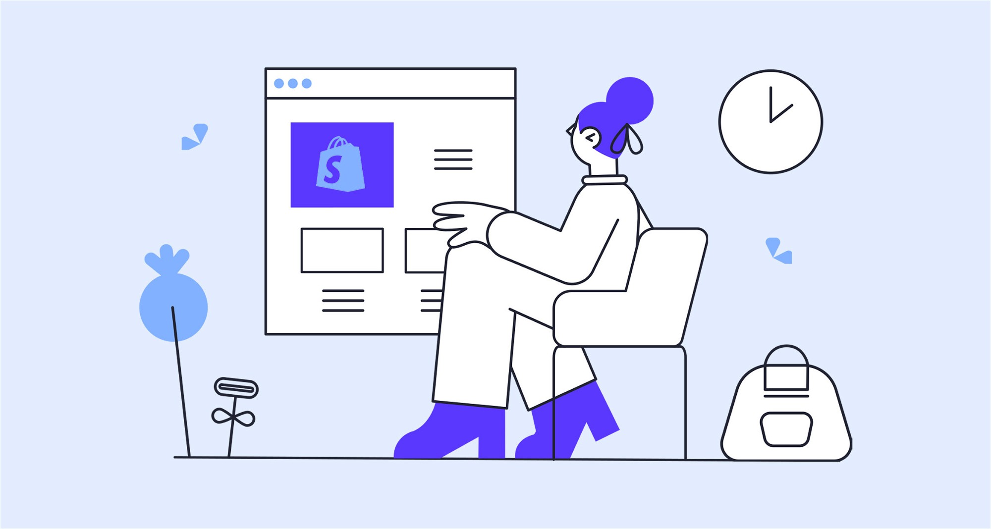
Let’s be honest — online shopping isn’t what it used to be. These days, if your website can’t deliver a seamless, trustworthy experience from click to checkout, you’re toast. In a saturated market of slick interfaces and TikTok-hyped trends, it’s the fundamentals — not the flash — that set the best e-commerce sites apart.
We’ve rounded up 7 non-negotiables every online store should get right. Think of them as the digital equivalent of good lighting, flattering mirrors, and friendly staff — except all baked into your UX.
1. High-quality photography
Looks do matter. Nearly half of us judge a site’s credibility based on image quality alone, and 93% of online shoppers say product visuals are make-or-break when deciding to buy.
Our tips:
- Capture multiple angles and real-life context
- Use consistent lighting and backgrounds
- Compress images so they don’t tank your load time
If in doubt, hire a pro. It’s cheaper than reshooting your entire catalogue post-launch.

2. Product reviews that build trust
Shoppers trust other shoppers. Reviews increase conversions — even the not-perfect ones. In fact, products with a 4.2–4.7 average rating often convert better than those with perfect scores.
According to a study by Spiegel Research Centre, nearly all of us who shop online read reviews before making a purchase. We’re also 3x more likely to buy a product that has been reviewed, compared to a product with no reviews at all.
If you don’t have product reviews on your site, your customers will go looking for them. Don’t give your customers a reason to leave your website; display your product reviews right alongside your products.
Our tips:
- Add star ratings and reviews directly on product pages
- Ask for feedback post-purchase
- Avoid curating only the glowing stuff — authenticity converts

3. A frictionless path to purchase
Don’t make us work for it. Complicated checkout flows are conversion killers. The purchase process should be made as easy as possible by removing all potential barriers. Your call to action should catch the eye, making it easy to find and compelling to click. Stick to short, urgent wording – Buy Now or Add to Bag – and ensure the button colour has sufficient contrast with its surroundings.
But it’s not just about the Buy button. On average, 69% of all e-commerce visitors abandon their shopping baskets before completing the checkout process. A large chunk of these abandonments is inevitable. Many users who add items to their basket are still exploring their options, and aren’t ready to buy. But of those remaining, who have the purchase intent but abandon before paying, 43% cite complicated checkout processes as the reason.
Our tips:
- Use one clear, high-contrast CTA per page
- Offer guest checkout
- Reduce form fields to the absolute essentials
- Accept multiple payment methods (Apple Pay, Klarna, etc.)

4. A returns policy people can trust
Online purchases come with a leap of faith — especially for new brands. Clear, easy return policies build confidence and reduce the perceived risk.
And if your store doesn’t have physical locations where a customer can experience the product first-hand, it’s even more important that you can provide clear instructions on how items can be returned.
Driven by large retailers like ASOS and Amazon, consumers now cite hassle-free returns as a top reason for buying from a brand, with 96% saying they would shop again with a retailer based on an easy return experience.
Our tips:
- Promote returns messaging in key places (banner, product page, FAQs)
- Offer detailed instructions and timeframes
- If returns are free, shout about it — it’s a huge differentiator

5. Prominent, functional search
If a customer has to hunt for what they want, they’re gone. Search is essential, even if you don’t have hundreds of products.
Help customers find what they’re looking for by providing easy-to-use search functionality that’s not hidden behind a tiny icon. The larger your product range the more important a search bar is, but you shouldn’t neglect it just because you only have a small collection. Shoppers are often in a hurry and know exactly what they’re looking for, so if they can’t find it quickly and easily, they’ll look elsewhere.
Include FAQs and blog posts in your search results, but make sure your results page isn’t just a boring list of links. You should see your search results page as an opportunity to provide other engaging content related to their search.
Our tips:
- Don’t bury the search bar — make it big, bold, and obvious
- Include helpful content (FAQs, guides) in search results
- Make your results page scannable and image-rich

6. Loyalty and referral rewards
Returning customers cost less, spend more, and convert faster. Loyalty and referral schemes help lock that in.
Research shows it can cost five times more to attract a new customer than to keep an existing one. Existing customers are far more likely to make another purchase, with the average second purchase being within 16 days of their first, and they tend to spend more too.
Rewards programmes are a highly effective way of keeping your customers loyal, ensuring they come back to shop with you again and again. There are a couple of different types: loyalty and referral. Loyalty schemes offer customers points or similar towards a future purchase and help to drive up the average order value. Referral schemes offer a discount in return for sending customers your way, which increases your customer base. Which one you pick will depend on your products and your target demographic, but the two can easily work alongside each other.
Our tips:
- Reward purchases with redeemable points or exclusive discounts
- Encourage sharing with referral links or social bonuses
- Keep the mechanics simple — if it’s confusing, it won’t convert
7. Smart product recommendations
Done right, recommendations feel helpful — not pushy. Amazon claims 35% of its sales come from theirs.
Product recommendations are a great way to boost your average order value and increase overall sales, by creating natural, logical upsell and cross-sell opportunities.
The more relevant the recommendation the more effective it is, which is why many E-commerce platforms have predictive recommendation functionality built-in. For example, Shopify’s recommendation algorithm uses sales data and product descriptions to show the customer a variety of products that are alike or often bought together. The product recommendations improve over time as new orders and product data become available.
Many stores also offer personalised recommendations by asking the shopper to answer a few questions in the form of a quiz or calculator. The products suggested are tailored to the users’ specific needs, providing a more personal, customised experience that leads to higher conversion rates.
Our tips:
- Use sales data to suggest “frequently bought together” items
- Use quizzes or filters to deliver tailored results
- Test placement: post-cart, on product pages, or as exit-intent popups.

Final thought
E-commerce success isn’t just about getting people to your site — it’s about keeping them there long enough to click “Buy.”
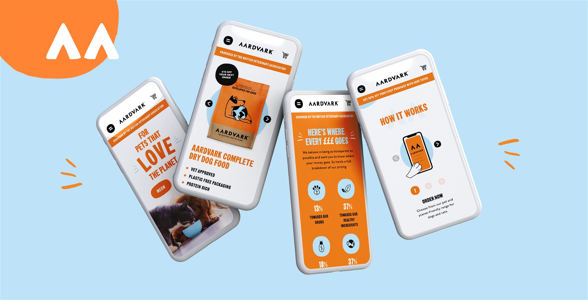
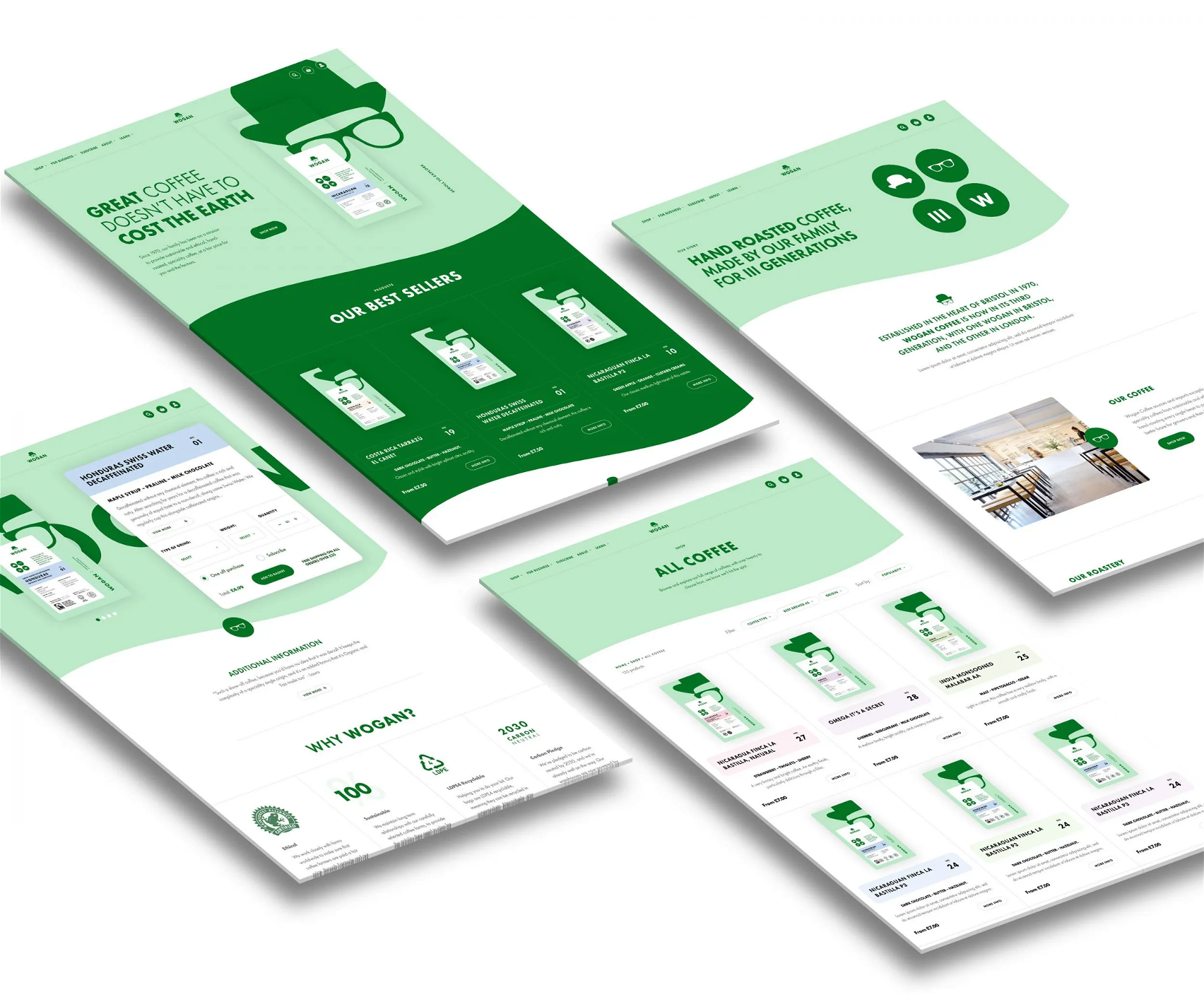
We’ve helped brands like Aardvark, Gatsby Jewellery and The Funky Appliance Co. optimise their online shops with thoughtful, high-performing design. Fancy a chat about yours?


Interested in working with KOTA?
Drop us a line at
hello@kota.co.uk
We are a Creative Digital Agency based in Clerkenwell London, specialising in Creative Web Design, Web Development, Branding and Digital Marketing.