Check It Off: The ultimate website revamp checklist

February 28th 2024
By Emily

Your website should be more than just a splash in the vast online ocean—it’s your flagship, waving your brand’s banner high and proud, so we know it can be overwhelming to know where to begin. But before you cannonball into redesigns or panic about adding the latest tech, we’ve created this handy checklist to make sure you’re focusing on the most important things. Let’s dive in.
1. CRO & data tools – the detective work begins
Before we dive into the nitty-gritty of website revamping, let’s talk about Conversion Rate Optimisation (CRO) and the wonders of data and heat map tools. It’s all about spotting where your site’s gold is buried and where the X marks the spot for improvement.
If you already have a website, keep reading. If not, you can skip this part.
Your first port of call is to play detective with your current site. Think of CRO as your website’s health check-up. It’s all about understanding what parts of your site are working (the gems) and what parts are, well, naff (the not-so-gems). We want to be making decisions based on cold, hard data, not guesswork.
Enter tools like Hotjar, which lets you see how visitors interact with your site. Where do they click? How far do they scroll? Where do they seem to get lost and leave?
The beauty of diving into CRO and using these tools lies in the empowerment it offers. By transitioning from guesswork to data-driven decisions, you’re not only enhancing your website’s performance but also tailoring your digital space to better meet the needs and preferences of your audience.
But the world of CRO is vast, encompassing various strategies and tests aimed at optimising every corner of your site for maximum conversion. From A/B testing different elements to refining the user experience based on feedback loops, the detective work in CRO is ongoing and ever-evolving.
2. Homepage – first impressions count
Think of your homepage as the cover of your favourite book – it needs to entice, intrigue, and invite.
This means every headline, every image, and every call to action on your homepage needs to work together seamlessly. It’s about crafting an experience that feels both intuitive and inspired, one that reflects your brand’s unique identity while speaking directly to the needs and desires of your audience.
Avoid the temptation to overload your visitors with too much information too soon. Instead, focus on key messages that resonate with your target audience, making sure every word and image is purposeful and impactful.
Your homepage should also be a beacon of your brand’s personality, radiating your ethos and values through every pixel. Whether it’s through bold colours, dynamic visuals, or compelling copy, make sure it screams ‘you’ in a language that’s not just heard but felt.
Essentially, you want to not just captivate but also communicate. It’s the beginning of a conversation, one that invites visitors into your world, encouraging them to explore, engage, and ultimately, connect with your brand.
3. Navigation – make it smooth like butter
Ever been in a hedge maze and felt that ‘I’m so lost’ confusion? Yeah, let’s not do that to your visitors.
Your site’s navigation is the map that guides users through the maze of content, leading them to their desired destination without a hitch. It should be as intuitive and seamless as butter melting on a hot pancake, providing a smooth journey from point A to B without any frustration.
The hallmark of stellar navigation is simplicity and clarity. Take a burger menu, for example: with its minimalist appeal, it can neatly tuck away options while keeping the interface clean—perfect for mobile users craving quick access without the clutter. On the other hand, a traditional navigation bar, when designed with clarity, can act like a well-organised directory, guiding users with ease and precision.
But smooth navigation goes beyond just the layout of menu items. It’s about creating a logical flow that anticipates the needs and questions of your visitors. This means categorising content in a way that’s instinctive, using language that’s straightforward and jargon-free. Each label should be a clear signpost, eliminating guesswork and leading users confidently towards their next step.
You might also want to consider the visual hierarchy of your navigation elements. Prioritise the most critical pages by giving them prominence, both in placement and design. This might mean featuring your flagship product or service front and centre or ensuring your contact information is impossible to miss.
Accessibility is another cornerstone of smooth navigation. Your site should cater to all users, including those with disabilities. This includes keyboard-friendly navigation, screen reader compatibility, and thoughtful colour contrast to ensure that navigating your site is a universally smooth experience.
Finally, you want to test and refine your navigation based on user feedback and behaviour. Tools like heat maps (here they are again!) can show you which navigation elements are getting the most attention and which might be causing confusion.
By prioritising intuitive design, clear language, logical structure, and accessibility, you create a welcoming digital space that invites exploration and interaction, turning the maze of your website into a straightforward path that leads to satisfaction and conversion.
4. Content – king, queen, and the whole royal court
Content sits at the heart of your digital strategy, acting as the mainstay that keeps visitors glued to your site. It’s about crafting a mix of engaging, relevant, and concise material that acts as your primary tool for capturing your audience’s interest and encouraging them to explore your site.
But achieving the right balance is key—you want to hit that sweet spot where your content is substantial enough to engage but not so overwhelming that it detracts from their user experience. Whether it’s through insightful blog posts, captivating videos, or interactive tools, each piece should add value, providing solutions and sparking curiosity.
In an online world brimming with information, content that speaks directly to your audience’s current concerns and interests will naturally stand out. This involves keeping a pulse on industry trends, understanding the unique challenges your audience faces, and weaving these elements into your content strategy with precision. The goal is to create material that’s both timely and timeless, offering immediate value while retaining its relevance in the long run.
Finding the “Goldilocks” balance in your content—neither too much nor too little—is essential for keeping your audience engaged without overwhelming them. With the average online attention span growing shorter, your content needs to make an immediate impact.
This doesn’t just mean cutting down on word count, but sharpening your message to ensure it’s clear, compelling, and easily digestible. The aim is to convey your key points effectively, making every word count and ensuring your audience takes away the intended message without having to sift through unnecessary fluff.
Diversifying your content is another strategy for keeping interest and engagement. Incorporating a variety of formats, like articles, infographics, podcasts, and videos, caters to different user preferences and learning styles, giving you a way more dynamic and engaging content strategy.
Basically, your content is crucial for drawing visitors in and keeping them engaged. By focusing on engagement, relevance, and conciseness, and by balancing the quantity and variety of your content, you’ll create a compelling online presence that resonates with your audience and encourages them to stick around.
5. Mobile responsiveness – don’t be a digital dinosaur.
Our smartphones are practically glued to our hands. So, if your website is still doing the digital dinosaur dance and not playing nice with mobile screens, it’s time for a wake-up call. Making sure your site looks awesome and works seamlessly on mobile is a must-have. No one’s got the patience for pinch-and-zoom gymnastics anymore. It’s all about the smooth swipes and easy taps now.
Think about it: when was the last time you waited around for a site to get its act together on your phone? Exactly. Mobile responsiveness means your site adjusts its look and feel to fit the palm-sized screens we’re all obsessed with.
Google’s also side-eyeing sites that aren’t mobile-friendly, and we all know you don’t want to get on Google’s bad side. Plus, making folks wrestle with links too tiny for human fingers or wait eons for pages to load on their phones is a one-way ticket to Nopeville. They’ll bounce faster than you can say “user experience,” heading straight to a competitor’s welcoming, mobile-friendly arms.
But making your site mobile-responsive isn’t just about dodging penalties or fear of missing out. It’s about inclusivity and reaching out to the entire spectrum of your audience. With more and more people relying solely on their smartphones for internet access, your site needs to be ready and waiting with open arms, no matter the device.
Getting there means embracing flexible layouts, pictures that don’t turn into pixel soup on smaller screens, and coding magic that makes your site play nice with any screen size. And don’t forget to test, test, test. Grab every phone and tablet you can find and make sure your site’s giving off good vibes across the board.
6. Speed – faster than a caffeinated squirrel
Nobody’s got the time to watch the grass grow or, worse, wait for a slow website to load. We’re talking about a global shortage of patience here, where every second your page hesitates to appear feels like an eternity. And let’s be honest, in the race for attention, if your site’s loading speed is on a leisurely stroll, you’re losing out big time.
We live in an age where people expect information at the speed of thought, and anything less can feel like a major letdown. So, what’s a website owner to do? First off, it’s time to give those images a diet. Optimise them, compress them, and for the love of load times, make sure they’re not bigger than they need to be. There are a tonne of tools out there that can help you shrink file sizes without turning your beautiful photos into pixelated mysteries.
Next up, let’s talk code. Streamlining your site’s backend is like decluttering your closet; it feels like a chore, but man, does it make a difference. Get rid of unnecessary scripts, clean up that CSS, and if you find stuff that’s not serving a purpose, toss it. Think of it as spring cleaning for your website. The leaner your code, the quicker your site gets its act together and shows up ready to impress.
And let’s not forget about the need for speed beyond just the front end. Choosing the right hosting solution, leveraging caching, and considering a Content Delivery Network (CDN) can all contribute to making your site zip along like a caffeinated squirrel. These are the unsung heroes of loading speed, working behind the scenes to make sure your site is there in a flash, ready to greet every visitor with open arms and quick, snappy content.
In the grand scheme of things, optimising your site’s speed isn’t just about making Google happy (though, let’s be real, that’s a pretty big deal). It’s about respecting your visitors’ time and giving them a smooth, frustration-free experience from the get-go.
7. SEO – get found
What’s the point of having a shit-hot website if it’s hiding in the dark alleys of search engine results? Sprinkling keywords throughout your site’s content is like leaving breadcrumbs for Google to follow. But it’s not just about tossing words into the mix willy-nilly; it’s about strategic placement, relevance, and making sure those keywords resonate with what your audience is searching for. Think of it as seasoning your content just right—enough to make it tasty for search engines and real people alike.
Then there are meta descriptions—those little snippets that show up under your site’s title in search results. These guys are your elevator pitch to the digital world. A well-crafted meta description doesn’t just describe what’s on the page; it entices, intrigues, and convinces someone to click through. It’s your chance to stand out in a sea of search results, so make every character count.
You also need to think about building a web of connections through backlinks, ensuring your site is mobile friendly, and keeping your content fresh and engaging. Google loves a site that’s alive and kicking, offering valuable content that’s regularly updated and shared.
And don’t forget about the technical side of SEO, either. Site speed, security, and user experience all play a role in how search engines rank your site. The more your site is clicked around on, the more likely Google will recognise it as a genuinely helpful resource to searchers.
8. Colours and fonts – they say more than you think.
Colours speak volumes, setting the mood and atmosphere of your website. A well-chosen palette can calm, excite, inspire, or reassure your audience, creating a backdrop that enhances the overall experience. So, whether you’re going for the professionalism and trust evoked by blues, the energetic pop of oranges and reds, or the calm vibes of greens, ensure your colours reflect your brand’s essence and message.
Then there are the fonts, the voice of your website. Just as the tone and volume of your voice affect how your words are perceived, the fonts you choose impact how your content is received. Fonts carry their own set of connotations and personalities. A sleek, modern sans-serif might convey innovation and efficiency, while a classic serif can suggest tradition and reliability. The key here is readability—your fonts should guide visitors through your content with ease.
Consistency in your use of colours and fonts across your website is crucial. It’s the thread that ties the entire experience together, creating a cohesive, harmonious environment that feels intentional and professional. Without consistency, your site risks becoming a disjointed carnival of chaos, leaving visitors confused and likely to leave. Every page, every button, and every section should feel like part of a unified whole, reinforcing your brand identity and enhancing user experience.
And always remember the importance of accessibility. Choosing colour contrasts that are easy on the eyes and fonts that are legible for everyone, including those with visual impairments, means your website is welcoming to all visitors.
If you’re looking for inspiration, we have tonnes. Here are some design trends to watch out for in 2024!
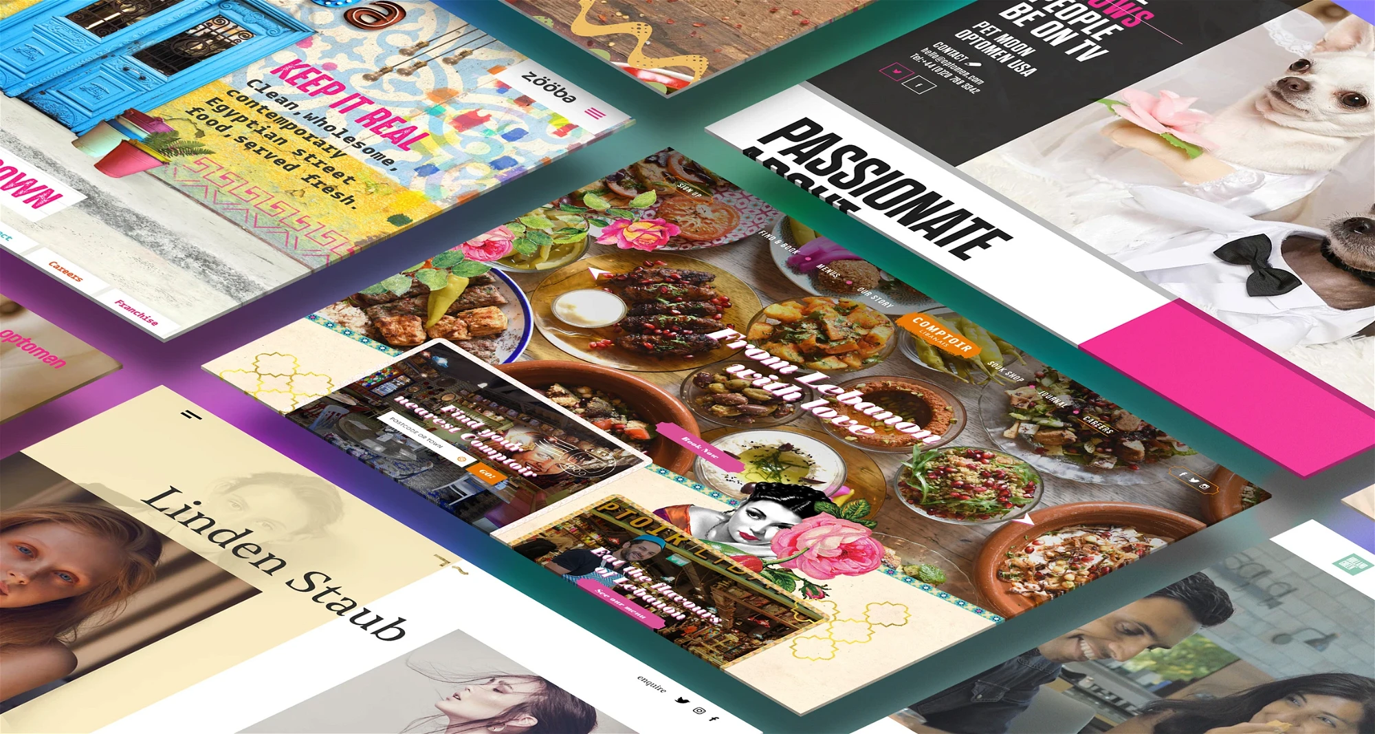
9. Images and videos – show, don’t tell
Humans are visual creatures. It’s why we stop to admire a sunset or why a well-plated dish can make our mouths water. When it comes to your website, leveraging high-quality images and engaging videos is not just an option—it’s essential. These elements do more than just make your site nice to look at; they communicate, engage, and convince in ways that text alone can’t.
Humans are inherently drawn to visual content; it’s why we stop to admire a sunset or why a well-plated dish can make our mouths water. When it comes to your website, leveraging high-quality images and engaging videos is not just an option—it’s essential. These elements do more than just beautify your space; they communicate, engage, and convince in ways that text alone cannot.
Then, there are videos, a dynamic medium that can dramatically enhance the user experience on your site. Videos have the unique ability to condense information and emotion into digestible, engaging snippets that visitors are more likely to consume and remember.
They can be used to introduce your brand, explain complex products or services quickly, share stories, and testimonials, or simply add an element of entertainment. They’re also highly shareable, increasing the likelihood of your content reaching a wider audience through social media and other channels.
Incorporating videos into your website also offers an opportunity to improve your SEO. Search engines value content that improves user engagement, and videos are known to keep visitors on your site longer, which can signal to search engines that your site offers valuable content. By including relevant keywords in your video titles, descriptions, and tags, you can further enhance your site’s visibility.
So, whether you’re showcasing your latest product with a crisp, clear image or sharing your brand’s story through a captivating video, remember that these visual elements are integral to how visitors perceive and interact with your website.
10. Call to Action – lead the way
Every page on your site should have a purpose, and that’s where your call to action (CTA) comes in.
Whether it’s to subscribe to a newsletter, make a purchase, learn more about a product, or get in touch, your CTA is there to lead the way. Making it irresistible, clear, and easy to find is the key to turning passive browsers into active participants.
An irresistible CTA is one that resonates with your audience’s desires and needs. It speaks in a language that appeals to them, offering value and promising solutions. This could mean highlighting the benefits of signing up for your newsletter or emphasising the satisfaction of making a purchase (“Start your journey to a healthier you”). The language you use should spark interest and evoke emotion, making the action you’re asking for seem not just logical but desirable.
Your CTA should stand out on the page, catching the eye of your visitors without overwhelming the surrounding content. This means thoughtful placement, contrasting colors, and a size that’s large enough to be noticed without disrupting the user experience. A well-placed CTA acts as a natural progression in the visitor’s journey, guiding them smoothly from interest to action.
11. Testing, testing, 1, 2, 3
Before you unleash your website to the world, test it like it’s a NASA space launch. Check for broken links, weird formatting issues, and typos that make you cringe. A smooth launch is a happy launch.
Start with the basics: broken links are the potholes of the digital highway. They disrupt the user journey and chip away at your site’s credibility. Employ tools and manual checks to scour your pages for any links that lead to the dreaded 404 error, ensuring every click takes your visitor exactly where they’re meant to go.
Next, turn your attention to formatting. In the diverse ecosystem of devices and browsers, weird formatting issues can creep in unnoticed, distorting your site’s appearance and functionality. This could be anything from text overflowing its container, images not aligning correctly, to responsive design elements that don’t quite adapt as they should. Cross-browser and cross-device testing tools are invaluable here, allowing you to see how your site performs across different environments and making sure your design translates well everywhere.
Typos and grammatical errors might seem small in the grand scheme of things, but they’re like speed bumps on your site’s road to success. They can make you cringe, yes, but more importantly, they can make your site seem unprofessional and rushed. A thorough review of your content, possibly with the help of proofreading software or an eagle-eyed editor, can help smooth out these wrinkles, ensuring your message is clear and polished.
But don’t stop there. Your testing phase should also include load time evaluations, ensuring your site not only launches smoothly but also swiftly. Site speed is a critical factor in user satisfaction and SEO performance. Tools like Google’s PageSpeed Insights can offer valuable insights into how your site performs under different conditions and provide suggestions for improvement.
Functionality testing is another crucial checkpoint. This involves verifying that all interactive elements of your site, like forms, sliders, and e-commerce checkout processes, work as intended. It’s about ensuring that when a visitor fills out a contact form or adds a product to their cart, everything goes off without a hitch, fostering trust and encouraging conversions.
Accessibility testing ensures that your site is navigable and usable for everyone, including people with disabilities. This means checking for proper use of alt text for images, ensuring your site is navigable with a keyboard, and confirming that your colour choices and font sizes meet accessibility standards. Making your website accessible not only broadens your audience but also reflects your brand’s commitment to inclusivity.
To sum up…
Remember, a website is a living entity, constantly evolving in response to new trends, technologies, and user expectations. The launch of your site isn’t the finish line; it’s more of a starting gate.
Implementing the strategies we’ve discussed is just the first step. At the risk of sounding cliche, the digital landscape is always changing, and staying relevant means being adaptable, willing to iterate, and refine your approach based on real-world performance and feedback. This cycle of continuous improvement—testing, learning, and enhancing—is what keeps your website effective and engaging.
So keep an eye on analytics to understand how visitors interact with your site, identifying both strengths to build upon and areas needing attention. Embrace new tools and technologies that can enhance your site’s performance and security, and always be prepared to update your SEO practices as search engine algorithms evolve.
Your site has infinite potential for growth and improvement. The commitment to nurturing, refining, and adapting your site over time is what will ultimately set you apart. With this checklist, you’ll be well on your way to evolving your website into a dynamic, effective, and above all enjoyable online presence.


Interested in working with KOTA?
Drop us a line at
hello@kota.co.uk
We are a Creative Digital Agency based in Clerkenwell London, specialising in Creative Web Design, Web Development, Branding and Digital Marketing.