Creative web design trends for tech startups

Venturing online with a tech startup? Amidst the cacophony of cookie-cutter websites and déjà vu designs, standing out is no longer just an option; it’s a necessity.
Here are some creative web design trends tailored for the ambitious, the disruptors, and, yes, the tech startups ready to carve their unique path in the silicon-laden landscape.
1. Bold and Experimental Typography
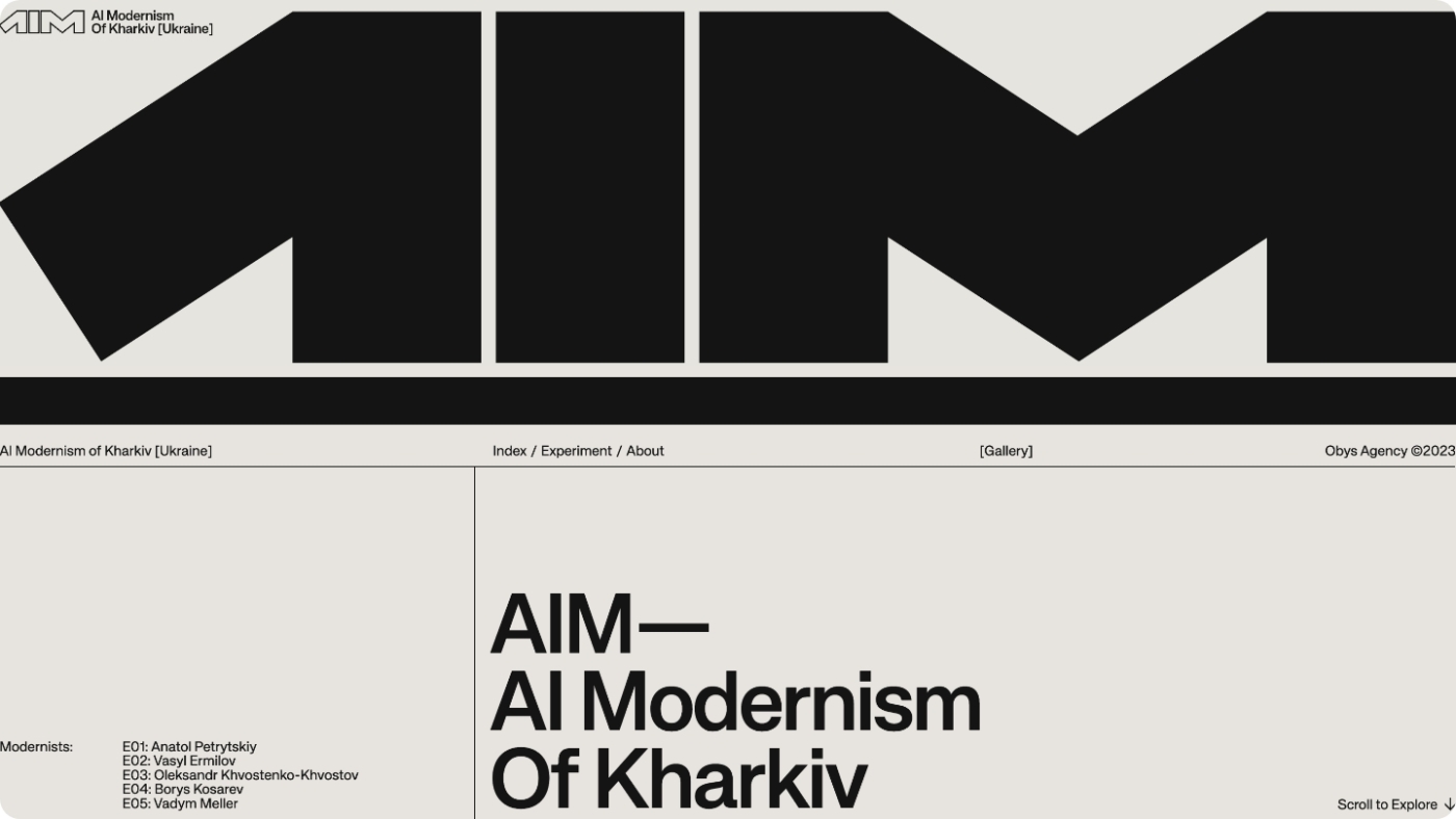
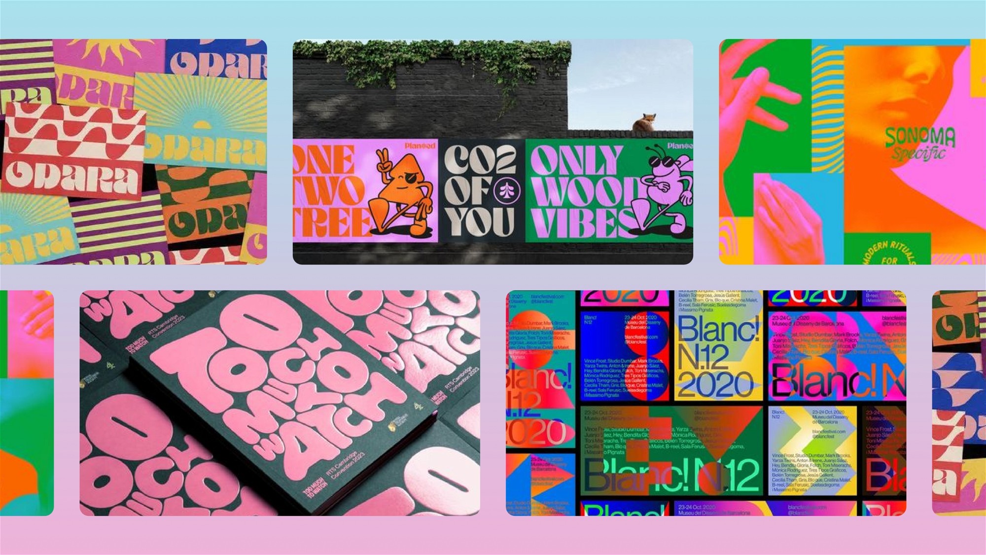
Forget the times when Arial and Times New Roman ruled the roost. Today, typography is not just a vehicle for text; it’s a statement piece. Think big, bold, and sometimes, downright anarchic. Playful typefaces that twist and turn, or elegant fonts that whisper sophistication – your choice of typography can set the tone for your entire site. But remember, with great font comes great responsibility; readability should never take a back seat.
2. Immersive 3D Elements

Why settle for flatland when you can dive into the third dimension? 3D elements offer an immersive experience that can elevate your website from a mere platform to a digital universe. From subtle shadows that add depth to full-blown 3D animations that tell your startup’s story, the possibilities are as vast as the digital sky.
3. Micro-Interactions: The Devil’s in the Details
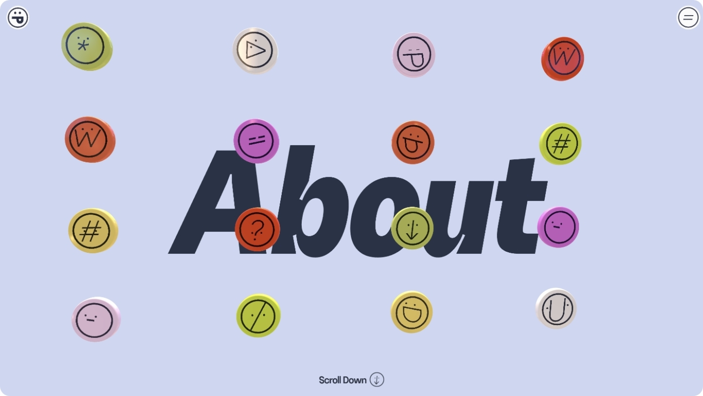
Ever hovered over a button and been delighted by a tiny, unexpected animation? That’s a micro-interaction. These small, interactive moments add a layer of engagement and personality to your website, making mundane tasks enjoyable. They’re like the digital equivalent of a friendly nod or a cheeky wink – small gestures that can make your brand more relatable and memorable.
4. Dark Mode: Welcome to the Dark Side
![]()
Dark mode isn’t just for your late-night coding sessions anymore. It’s made its way into the web design mainstream, offering a sleek, modern look while easing the strain on our screen-weary eyes. Plus, it makes colours pop and can give your tech startup’s website an instantly edgy, sophisticated vibe.
5. Brutalism: Breaking the Rules
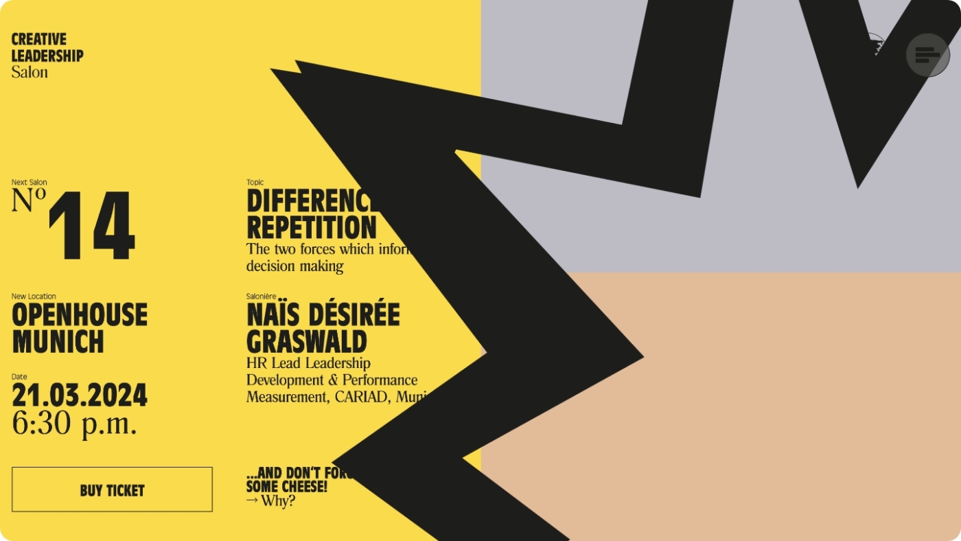
Once the preserve of stark, concrete architecture, brutalism has muscled its way into web design. It’s raw, it’s gritty, and it throws convention out the window. If your startup is all about shaking up the status quo, a brutalist design could be the flagbearer of your digital rebellion. But tread carefully; this trend is not for the faint-hearted or those with a penchant for minimalism.
6. Accessibility: Designing for All
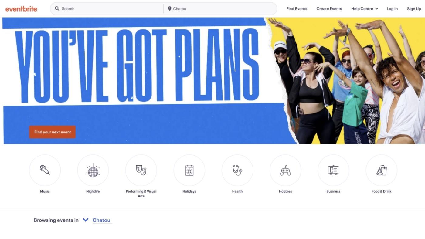
Inclusive design is more than just a trend; it’s a moral imperative. Ensuring your website is accessible to everyone, including those with disabilities, is not just about ticking a box. It’s about widening your audience and showing you care. From contrast ratios to keyboard navigation, making your site accessible is both a challenge and an opportunity to innovate.
The Takeaway
As you embark on your web design journey, remember that trends are not roadmaps but inspirations. Your startup’s website should be a reflection of your vision, values, and vibe. Mix and match these trends, experiment fearlessly, and, most importantly, don’t lose sight of who you are in the pursuit of what’s hot. After all, in the world of tech startups, being a trendsetter is infinitely more rewarding than being a trend follower.
Interested in working with KOTA?
Drop us a line at
hello@kota.co.uk
We are a Creative Digital Agency based in Clerkenwell London, specialising in Creative Web Design, Web Development, Branding and Digital Marketing.

