Design with guts: KOTA’s manifesto for creative bravery

December 3rd 2025
By Emily

Dolly Parton once said, “Find out who you are and do it on purpose.”
That’s a country music superstar delivering, in 10 words, what most brand strategists take 30-odd slides to approximate.
Because safe design comes from uncertainty. From not being quite sure who you are yet, so you hedge a little. You soften the edges. You keep a few options open. You try not to spook anyone in the room.
The result is familiar: work that’s polished, pleasant, broadly inoffensive—and strategically useless. It looks good in the deck. It launches without argument. And then, quietly, it disappears in the wild.
We just don’t think that’s enough anymore.
Brands don’t end up with bland creative because designers lack imagination. They end up there because nobody made the hard decisions upstream.
The brands that feel alive right now are resolved. Their work looks brave on the surface because the decisions underneath are already clear. They’ve drawn a line around who they are, what they stand for, and what they’re willing to leave behind. That clarity gives the creative work its nerve.
That’s what design with guts means to us. Not chaos. Not impulse. But clarity that’s strong enough to be carried all the way through without flinching.
Strategy is where bravery starts
Creative risk is usually framed as a visual act. Things like a bold layout, a strange interaction, or a brave colour choice. In reality, it starts much, much earlier than that.
It alway begins with the questions most brands would rather skip past. Who are you actually for? What do you want to be known for? What are you prepared to stop doing? And where, precisely, are you choosing to be different?
This is where hesitation creeps in, because clarity closes doors. It removes safety nets. It commits you to a position before the results are guaranteed. And that can feel risky in a boardroom.
Unclear target. Vague positioning. Elastic brand values. Everything left open “for flexibility”. What you get, inevitably, is work that tries to appeal to everyone and therefore lands with no one.
The irony is that this kind of safety feels responsible. It plays well in meetings. No one gets uncomfortable. No one feels exposed. Until the brand hits the market and discovers that indistinctness is not, in fact, a low-risk strategy.
Without that clarity, bold design is just surface confidence. It might look brave, but it isn’t anchored to anything. When strategy is resolved, everything downstream changes. Creative decisions gain weight. Design stops being decoration and starts becoming leverage.
Forgettable has become a strategic failure
We operate in overcrowded markets with collapsing attention spans. Buyers do not have the time (or the inclination) to decode vague brands.
You see it everywhere: technically proficient websites that communicate nothing. Brand systems built from the same references, the same tropes, the same soft-focus optimism. Everything functions. Nothing lands.
Distinctiveness is not a creative indulgence. It is a commercial advantage. Memory, recall, emotional association—these are how brands compound over time. Safety delivers none of them.
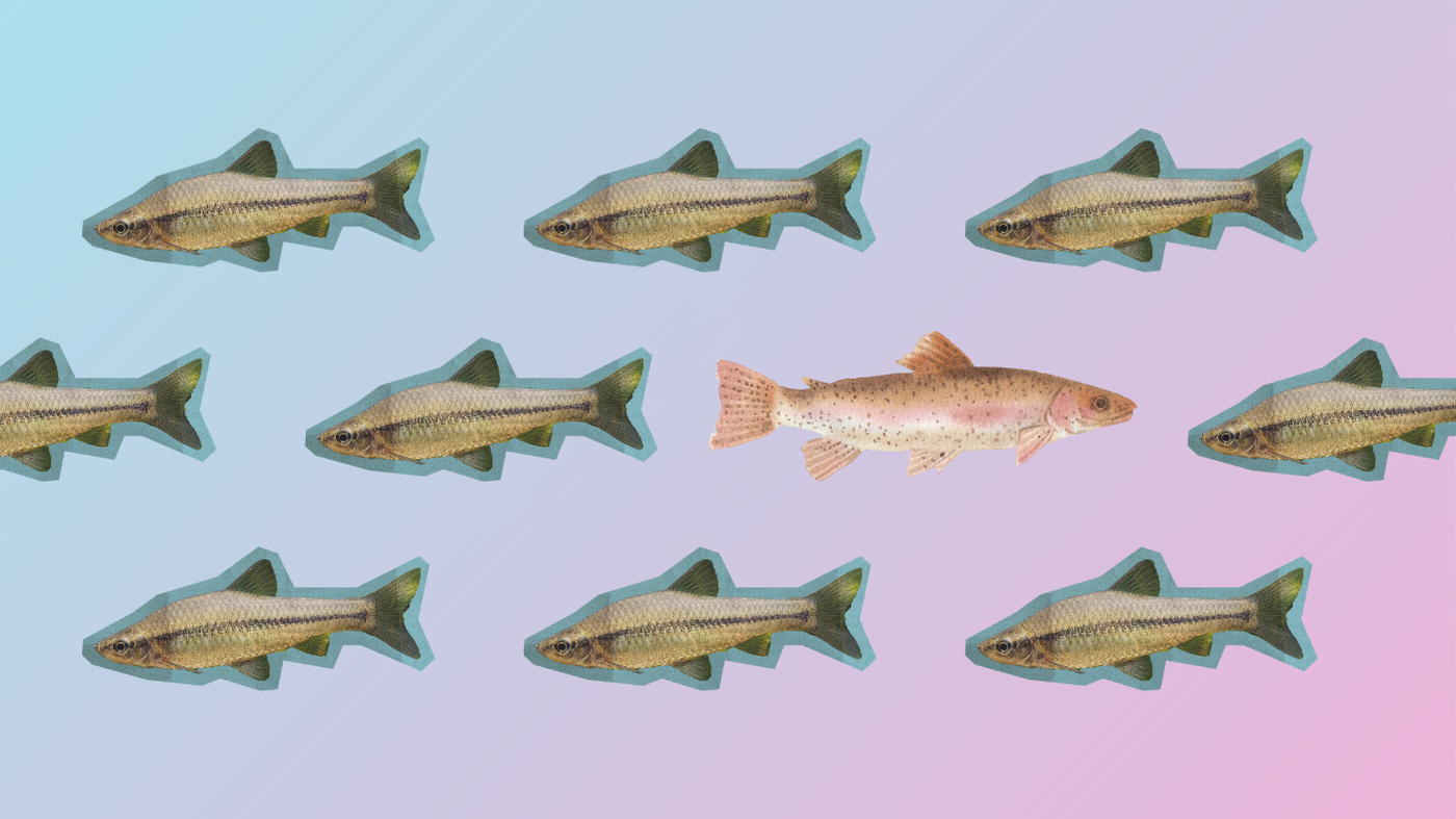
The bravest work is often the quietest
Bravery doesn’t always look loud. Some of the boldest brands we’ve worked with barely raise their voice.
They choose minimal identities that resist visual noise. Interfaces that slow people down instead of funnelling them. Motion that appears only where it sharpens meaning, not where it simply fills space.
That kind of restraint takes confidence.
It’s easier to add another flourish. Harder to stand by a single idea and let it breathe. It’s easier to decorate than it is to decide. But when strategy is clear, white space starts to feel confident. Limitation becomes focus. Simplicity becomes authority. When strategy is vague, everything has to shout just to make itself felt.
Creative bravery is strategy made visible
At KOTA, bravery shows up across three connected layers.
It starts with the decisions. Long before identity, interface, or motion, the real work is in asking what the brand must make easier, what it must stop signalling, and what truth it needs to make unavoidable. Until those questions are answered with clarity, visual boldness is just styling.
From there, it moves into the system. Type, colour, layout, behaviour — none of it is arbitrary. These are structural choices; each one exists to hold the strategy in place.
And finally, it shows up in the execution. Motion, interaction, and depth as carriers of meaning. Used with intent, they shape trust and pace attention. Used without it, they’re just garnish.
The commercial reality of clarity
There’s a pattern you see again and again.
Brands that avoid decisions in the name of safety tend to launch politely, report decent engagement, and then quietly brief a refresh 18 months later.
Brands that decide cleanly settle faster. They attract better-fit audiences. They build momentum between launches instead of starting from scratch each time. And they spend far less energy explaining who they are.
Short-term comfort feels safe. Long-term indistinctness is expensive.
Design with guts means standing by what you clarified
This way of working means choosing a position and letting it hold. Refining without retreating. Resisting the urge to blur the edges back in the moment discomfort appears. Trusting the system long enough for it to take root.
We didn’t drift into our current position. It wasn’t plucked out of the air. It was felt. We chose to be brand-first because that’s who we are. We chose to treat strategy as the engine, not the preamble. We chose to let creative craft serve meaning, not spectacle. And we chose to resist boring.
Those choices narrowed the room before they widened it. Some work fell away. Better work followed. And that trade keeps paying off.
We believe distinctiveness is built through decisions, not decoration. That strategy exists to remove uncertainty. That taste has commercial consequence. That motion should carry meaning. That brand is infrastructure, not surface. And that safe ideas often cost the most in the long run.
We design with guts because we design with clarity first.
Somewhere along the way, we realised Dolly had it nailed all along: find out who you are — and then actually have the nerve to do it on purpose.
Creative bravery is strategic conviction, made visible.
And in crowded markets, that’s pretty much the only way to be chosen on purpose.

Branding inspiration: design trends for 2026

What your 2026 website brief should include

Creative websites we’re obsessed with this month

Brand-First vs Dev-First: What actually sets KOTA apart (and why it matters)
Brand building: How to lean into what makes you different
Branding inspiration: brand design trends for 2025


Interested in working with KOTA?
Drop us a line at
hello@kota.co.uk
We are a Creative Digital Agency based in Clerkenwell London, specialising in Creative Web Design, Web Development, Branding and Digital Marketing.