Branding inspiration: design trends for 2026

If 2025 was the “oh god, AI is everywhere” panic phase, 2026 is the year brands have to answer a harder question:
When everything can be generated, what makes your brand feel like it was made on purpose?
Across trend reports, awards annuals, and case studies, the same signals keep popping up: tactility, motion, locality, and a calmer, more intentional relationship with AI. The brands that win are the ones that feel the most human inside a very digital world.
This is our tour through those shifts.
Why 2026 feels different
The 2026 trend roundups don’t always agree on terminology, but they do agree on tone. The era of weightless, frictionless, over-polished branding is fading fast. In its place: texture, specificity, mood, and brands that feel like they belong to real places, real people and real histories.
VistaPrint’s latest logo and graphic design trends point to the same fatigue — generic minimalism is losing cultural grip in favour of identities that feel personal, tactile and clearly owned by someone. Over at AI Goodies, the mood sharpens into something closer to revolt: designers deliberately pulling in noise, glitch, collage and nostalgia as a refusal of algorithmic smoothness.
At the same time, branding thinking is shifting underneath the visuals. 2026 isn’t just about how things look, but how they behave — purpose-led positioning, humanised visual language, and immersive experiences (XR, AR, 3D web) becoming everyday tools rather than “innovation theatre.” Orange & Teal frame it as a move away from one-off rebrands towards identities that evolve, stretch and adapt over time.
So instead of one big “2026 look”, we’re dealing with a cluster of overlapping shifts:
- Tactile, imperfect brand worlds
- Hyper-specific, heritage-coded visuals
- Brands that behave like films and products, not PDFs
- AI as co-pilot, not creative director
- Colour and nostalgia doing heavy emotional lifting
- Anti-branding and controlled chaos for brands that can carry it
- Purpose, sustainability and long-term systems thinking running quietly underneath
Let’s zoom in.
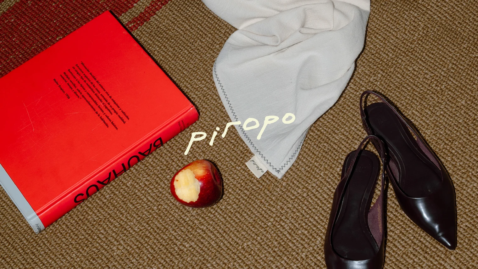
Source: Branding by María Centeno via Behance
1. Tactile, imperfect, and visibly “made by someone”
After a decade of immaculate interfaces and frictionless branding, roughness has become a signal of intent. In 2026, tactility is a credibility marker. Grain, noise, scuffed edges, hand-drawn type, visible assembly: all of it says a human made this on purpose.
From grain, noise, paper-like textures, and analogue-feeling surfaces woven into digital layouts, to photo trends like Candid Camera Roll that favour unstaged, imperfect shots over polished, posed imagery, brands are choosing their rough edges deliberately.
This aesthetic is everywhere — blurry photos, flash glare, chaotic crops — all the messy honesty that makes a brand feel human again.

Source: Branding by Davy Denduyver via Behance
Oliver Li’s illustration work is all soft edges, fuzzy textures, and rich colour—exactly the kind of “digital but touchable” art direction brands are gravitating towards for campaigns and hero visuals.

Source: Creative Boom – Oliver Li
Dutch illustrator Ellis Tolsma’s riso prints are a perfect example of tactile, imperfect graphics: misregistration, heavy grain, and overprinted colours that feel more like a screen-printed gig poster than digital art.
Collage has caught the same bug, messy in all the right ways. Tyler Upchurch’s work, for instance, mixes ripped textures, jagged layers, fractured photos and surreal cut-and-paste in a way that feels closer to a DIY zine than a neat layout.

Source: Illustrations by Tyler Upchurch
Orange & Teal’s 2026 branding forecast doubles down with “humanised visual identity” as a key theme: hand-drawn typography, organic textures and expressive photography as authenticity signals. But AI Goodies frames it slightly more aggressively: designers deliberately re-introducing irregularity, noise and tactility as “a refusal of total automation.”
From a brand-design point of view, the question becomes:
- Where should your brand be imperfect? Illustration? Layout? Image treatments? Micro-stickers and annotations on pages?
- Where do you keep things clinically tight? Data visualisation, product UI patterns, navigation, legal / regulated content?
The brands that will feel convincing in 2026 are the ones that choose their rough edges on purpose. You want people to feel: “Someone cared enough to make this,” not “someone clicked ‘generate’ and shipped it.”
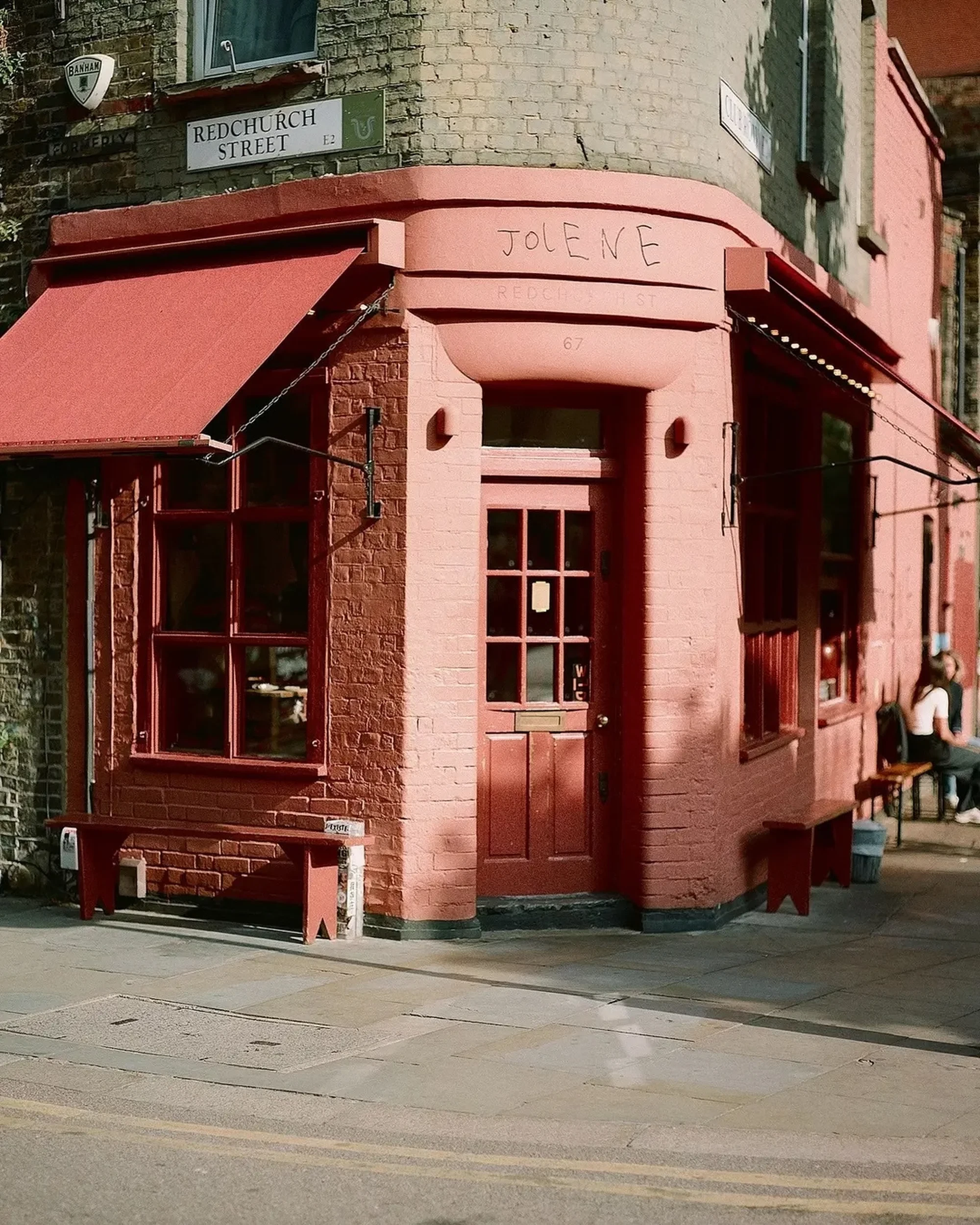
Source: Studio Frith’s identity for Jolene Bakery embraces childlike anarchy – The Brand Identity
2. Hyper-local, folk and heritage-coded identities
A second 2026 signal: brands are getting very specific about roots, context and visual heritage.
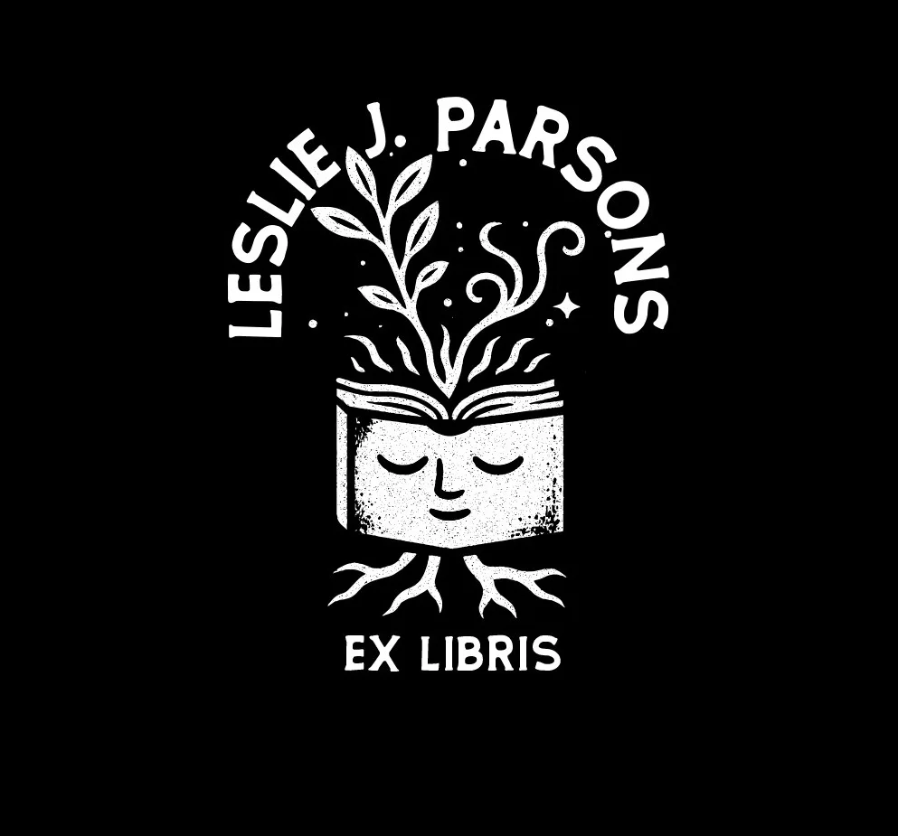
Logo and graphic trend reports are full of folklore, “elemental folk” motifs, and story-led marks. VistaPrint’s 2026 logo-trends piece opens with “Storybook Gothic”: moon phases, enchanted flora, medieval letterforms and talismanic seals.
Source: logo by eva.fontana via 99designs

Source: Hellebore Magazine
The graphic-trend roundups are circling two big moods: Elemental Folk, with its nature-soaked motifs, folklore references and craft-driven textures; and hyper-individualism, where visuals lean into personal histories, local symbols and those “only we would choose this” design decisions that make a brand feel unmistakably its own.
The Albert Hall’s wordmark is a perfect example of modern heritage branding: history remixed rather than reverently preserved. It pulls from the building’s Victorian foundations, then threads in the bold typography of the ’60s and ’70s. It’s honouring its history without getting stuck in it — contemporary, but with the dust left on in all the right places.


Source: Creative Boom
For brands, this means:
- Mining your actual origin stories – the building you started in, the city you came from, the tools you use, the in-jokes from your category – and turning them into visual assets.
- Creating alt logos, seals, patterns and icons that feel rooted somewhere, not designed in a vacuum.
- Using photography that shows real context and community, not default stock.
In a world where AI can fake generic “cool”, the assets that land are the ones with specificity baked in: a tiny mascot tied to a local myth, a pattern lifted from real machinery or street signage, a secondary logo that only makes sense if you know your history.
3. Brands that move: motion, space and cinematic behaviour
Scroll-triggered storytelling, animated typography and “Dial-Up Delight” nostalgia is now being seen as standard. And ZarmaType has put kinetic graphics, retro OS references and broken grids right at the centre of their 2026 list.
You see it in the details like headlines that behave like main characters, flexing and shifting as you scroll; layouts that feel more like opening titles than static pages; nostalgia-driven motion that borrows from VHS fuzz, pixel-art games and early-web pop-ups to tell a story rather than just decorate it.
And AI Goodies’ 2026 aesthetics piece picks up the same thread from another angle: 3D, WebGL and spatial interfaces are no longer novelties, they’re simply part of how brands are expected to show up online.

For us, this isn’t theoretical. When we built the site for UPP, one of Hollywood’s leading VFX studios, the brief was never “make a nice brochure site”. It was “build a portal into our world”. That’s why time-of-day lighting shifts as you move through the experience, why scenes unfold like shots in a reel, and why the interface feels closer to a game than a grid of boxes. The whole site runs on the idea that narrative is just as much in how the brand moves, reveals, hides, lingers, as it is in the copy.
Once you start working this way, you stop thinking in pages and start thinking in sequences. How does the brand arrive on screen – abruptly, like a jump cut, or slowly, like a fade-in? Does the typography glide, snap, or jitter as you scroll? When you introduce depth – parallax, 3D objects, layered planes – is it there to clarify the story or to show off?
Treat the interface like a shot list, not a flat layout. That’s what we mean by cinematic web design. Not “stick some 3D in the hero and call it immersive”, but choreographing the whole experience so every scroll, hover and transition feels like it belongs to the brand. In 2026, if your identity only exists as a static logo and a colour palette, it’s half-finished. The rest of the work is behaviour: how it moves, how it occupies space, and how it makes someone feel as they travel through it.

Source: Polina Dubenko on Dribbble.
4. Modern gothic
In 2026, we’re seeing a full-bodied return to romance, ruin and theatrical emotion in design: spired silhouettes, thorny typography, candlelit chiaroscuro, and a renewed obsession with beauty that’s allowed to be a little haunted. It’s cinematic, literary, and emotionally loaded.
Visually, it shows up in high-contrast blackletter and serif revival type paired with unexpectedly soft palettes — bruised lilacs, bone whites, blood reds diluted into rose. There’s a fascination with texture again too: blur, fog, velvet grain, stone, lace, dust. Digital surfaces are starting to feel physical, even decaying.
You can trace the influence straight back to film and pop culture — from the stormy romanticism of the upcoming Wuthering Heights adaptation to the hyper-stylised Charli XCX’s House. And after Frankenstein, Guillermo del Toro’s brand of “beautiful monster” storytelling looms large over the whole movement, of course.

Source: Nylon
What makes this revival feel distinct in 2026 is that it isn’t about darkness for darkness’ sake. It’s about heightened feeling. Tragedy, longing, danger, devotion — all the big, messy emotions that ultra-clean tech design spent a decade scrubbing out. Gothic gives brands permission to be dramatic again. To be strange. To be deeply felt.
Think Gothic type layered over soft, dreamy pastels — romantic, eerie. It taps into that wider gothic rebirth happening right now, where design is in that sweet spot between beauty and unease.
5. Colour, nostalgia and emotional palettes
Neon-Noir bleeds together high-contrast reds, blacks and electric neons to create that moody, cinematic grit you’d normally find in a rainy-night thriller. In the same breath, we’re also seeing glossy gradients, bubble-like highlights and blue-sky optimism borrowed straight from the early-2000s techno-utopia era, and a sugary remix of Y2K sparkles, system fonts and nostalgic glitch motion.

Source: Polina Dubenko on Dribbble via Vistaprint
There seems to be a broader retro & nostalgia revival — pixel art, Windows-95-era UI fragments, and early-web interface quirks used consciously to trigger warmth and cultural memory rather than cheap throwback kitsch.
We’re talking 8-bit graphics, restricted palettes and crunchy UI textures being used not for gaming nostalgia alone, but as a deliberate anti-gloss statement.
Across these perspectives, three clear currents emerge for 2026:
- Hyper-chromatic and cinematic: Deep blacks, saturated blocks, dramatic gradients — colour doing the storytelling, not just embellishing it.
- Warm, tactile neutrals: Mushroom tones, soft blues, chalky off-whites and rusted neutrals — palettes that feel editorial, textured and handcrafted, especially when paired with grain or diffused shadows.
- Smart nostalgia: 70s hues set inside modern layouts, tiny flashes of Y2K gloss, or OS-era greys and blues reinterpreted for high-end UI.
So for 2026: if you’re going bold, commit. Let colour take over the stage, not just accent the edges. If you’re going quiet, make typography and imagery do the charisma work. And if you’re playing with nostalgia, be specific: nostalgic for who, and nostalgic for what?

Source: Website design by vyncadq via Vistaprint
6. Controlled chaos: anti-design, broken grids and zine energy
Controlled chaos is having a moment. It’s the sort of thing that looks feral at first glance but, on closer inspection, is running on a very intentional pulse. Brutalism, anti-design and collage-driven layouts are a major thread, especially for culture, youth and experimental brands.

Source: It’s Nice That. Wieden+Kennedy Amsterdam: Foam Talent Call, (Copyright © Wieden+Kennedy Amsterdam, 2025)
We keep seeing these trends through default system fonts, harsh asymmetry and layouts that feel purposely unpolished. Even broken grids that we’re seeing in web design — snapping away from perfect centring to create tension and momentum — capture that broader shift away from immaculate modernism.

Source: Ghia’s Collage-like layout on Dribbble
We’re also seeing a collage-heavy aesthetic where type tangles with imagery, tape and staples become compositional elements, and pages feel closer to protest posters or DIY zines than anything you’d find in a corporate brand book. It’s the visual language of brands that want to feel a bit ungovernable.

Designs for The Social, a two-storey bar in central London, by Insect (Image credit: Luke Insect) Source: It’s Nice That.
Beneath the ripped edges and off-kilter grids, there’s almost always a defined type stack, a tight colour system, and non-negotiables for legibility and accessibility. The riot is aesthetic — the infrastructure is still calm.
So if you’re flirting with anti-design in 2026, get specific. Where does the chaos live — campaigns, editorial content, event microsites, merch? And where must calm prevail — logo handling, checkout flows, contrast ratios?
Most importantly: will your audience read this as confident disruption, or as a brand that hasn’t ironed its shirt? A beautifully designed riot is absolutely on-trend for 2026, but it needs to be one you can control.
7. Surveillance Aesthetic / CCTV Tech Dystopia
Running parallel to this is the growing surveillance and CCTV-tech aesthetic — harsh compression artefacts, timestamp overlays, infrared green, lens distortion and security-interface typography.
Fashion and culture brands are already tapping into this visual language of paranoia and control. Balenciaga’s digital campaigns regularly simulate security camera footage and corrupted livestreams as part of their brand world.

Source: Luxury Daily

Source: ngr.ev on Instagram

Source: Serpentine
In the world of art-meets-tech, Hito Steyerl’s digital installations remain a core reference point for glitch, compression artefacts and surveillance politics feeding directly into contemporary visual culture.
This is a visual reflection of algorithmic life, data capture, and constant recording.
8. AI as co-pilot, not creative director
By 2026, AI is a colleague.
The debate has moved on from: should we use it? to the more interesting question: who’s actually steering the ship?
As Orange & Teal put it, AI excels at personalisation and content flow, but without strategy it starts to splinter brands into a dozen near-miss versions of themselves. At the same time, AI Goodies frames 2026 aesthetics as a direct reaction to machine polish — designers using AI for raw material, then roughing it up with collage textures, glitch artefacts and mixed-media chaos to put the human mess back in.
You can already see both sides playing out at scale. Brands like Nike and Spotify use AI-driven personalisation to deepen emotional connection — tailoring content, campaigns and recommendations with incredible precision. Under the hood, AI is streamlining performance marketing, optimising product feeds, and quietly lifting conversions and ROI.
But here’s also a fascinating counter-signal cutting through all of this: the hot new trend in marketing is hating on AI. Even the new Apple TV ident was built with glass and shot entirely on camera. Pure practical effects. No AI, no CGI.

Source: Jon Fernandes
When high-profile studios like Pentagram publicly embraced generative AI in parts of their creative workflow, the backlash was immediate, exposing what happens when authorship, craft and intent feel diluted. It landed as a warning shot: use AI without a clear creative hierarchy, and you risk undermining the very value clients come to you for.
ZarmaType flags AI-generated layouts and hyper-personalised journeys as defining web trends for 2026 — while simultaneously calling for stronger brand clarity and accessibility. In other words: if you’re going to let the machines move fast, your foundations need to be rock solid.
So where does AI actually belong in the workflow?
- Exploration and sketching, for one. It’s perfect for moodboarding, throwing extreme typographic tests at a wall, or spinning up quick 3D mockups you’d never have time to model manually.
- Production scaling, too — resizing, localising, reformatting: all the heavy lifting that turns a design system into a content engine.
- And then there’s stress-testing: feeding your brand tokens into generative tools to see where the system warps across languages, layouts and edge cases.
Where it absolutely doesn’t belong is in the big calls: defining your visual identity, shaping your core palette, or spitting out assets without a designer’s hand sanding down the edges.
The best 2026 work makes it obvious: the human is still the art director. AI fills the sketchbooks — the brand guidelines stay firmly in human hands.
9. Purpose, sustainability and the “slow brand” mindset
Beyond aesthetics, and building on last year’s trend report, 2026 branding trends lean heavily on purpose, sustainability and long-term systems thinking. Designers are reading the room. We’re seeing purpose-led branding as “non-negotiable,” pairing it with ethical production, circular thinking and a growing preference for refreshes over start-from-scratch rebrands. Deloitte even reports that companies with clear purpose grow faster and enjoy stronger brand loyalty.
We’re also seeing sustainability-focused UX — lighter codebases, dark-mode energy savings, accessible interfaces — as explicit web-design trends rather than “nice-to-have” extras. And across the board, forecasts point to a shift from big-bang identity launches to ongoing evolution; brands treating their identity as a living organism rather than a logo that gets swapped every five years.
In practice, this means fewer one-season gimmicks and more long-term systems built to flex. It means visuals that quietly express values like repair, care and circularity instead of slapping them into a manifesto paragraph. And it means UX rooted in clarity, inclusivity and honesty, not a dopamine-chasing funnel.
You can still be bold, weird, maximalist, cinematic, whatever suits your world, but the energy is different. The brands that stand out in 2026 feel intentional, steady and built to last.
What 2026 really wants from brands
2026 is about intentional presence. The design world is embracing imperfection, soul, and specificity.
Brands that rise above the noise will be the ones that feel like they were built with care. A crack in the varnish, a flicker in the animation, a fingerprint on the type, that’s where trust lives.
Because when AI can generate anything, the brands that pick their rough edges, polish the moments that matter, and give their identity room to breathe are the ones standing out.
Your final checkpoint: 7 questions every 2026 brand brief should answer
When you sit down to plan your next rebrand or rebuild, these are the questions that separate a timeless identity from a trend-chasing mess:
-
Where do we show the human hand?
What gets grain, scuffs, collage or illustration — and what stays clinical and UI-clean? -
What makes our brand visually specific?
Which stories, objects, places or histories make this identity uniquely ours? -
How do we behave in motion and space?
Scroll behaviour, transitions, 3D, hover states — is this just a website, or is it an experience? -
Where is AI invited — and where is it banned?
Use it to accelerate. Ban it from authorship. -
Where do we sit on the calm ↔ chaos spectrum?
Are we minimal and composed — or bold and disruptive? And how do we stay consistent across touchpoints? -
Which aesthetic choices are “core” for the next 5–10 years?
What’s our foundation — and what’s just play? -
What should someone feel after a minute inside our brand world?
Reassured? Intrigued? Challenged? Inspired?
Answer those, and all the 2026 trend noise suddenly becomes much easier to navigate. You’re not trying to bolt “Neon-Noir” onto the side of your brand because a report said so; you’re choosing how your brand should look, move and feel in a world where AI can generate anything — but only you can be you.
Interested in working with KOTA?
Drop us a line at
hello@kota.co.uk
We are a Creative Digital Agency based in Clerkenwell London, specialising in Creative Web Design, Web Development, Branding and Digital Marketing.


