Designing a Memorable Brand Identity
June 1st 2022
By KOTA

Introduction.
A brand identity focuses on a brand’s personality and the values it wants to convey to consumers. It is a combination of what your brand says, how you intend to communicate your product, and how you want people to feel when interacting with your company. Ultimately, it is the personality of your business and a commitment to your consumers. However, every day, people interact with dozens of brands, so what makes some of them more memorable than others?
In this blog post, we’ll share the most important aspects behind designing a brand identity that stands out.
1. Understanding your target audience.
The first step in creating a brand identity is completing market research to really understand your target audience in order to position your product or service as the best solution to their needs. It is also important to showcase what makes your brand different from those already on the market. Knowing how you stand out against your competitors in the industry is vital in developing a successful brand.
Having a strong personality for your brand will also go a long way in making it memorable to customers. Are you fun and playful? High end and expensive? Using type, colours and imagery will help you to achieve the best representation of your brand.
A great example to look at is the meditation app Headspace. Its mission to bring less stress and more joy can be seen through its calming colour palette and characterful illustrations. Their identity spans across the app, website and Instagram, ensuring a cohesive experience for users across all digital touchpoints.

2. Creating a strong logo.
While a logo isn’t the entirety of a brand’s identity, it is the most recognisable element of your brand. Your logo will be visible on all aspects of your brand, from website to packaging, and social media to business cards.
There are many routes you could take in your logo design as it’s very dependent on your brand and how you want to present it to the world. One option is exploring a more conceptual icon to emphasise what it is your company does. For example, the iconic Nike “swoosh” portrays a feeling of movement and speed, which is very fitting for a sportswear brand. It is highly visual and arguably one of the most recognisable logos to date.
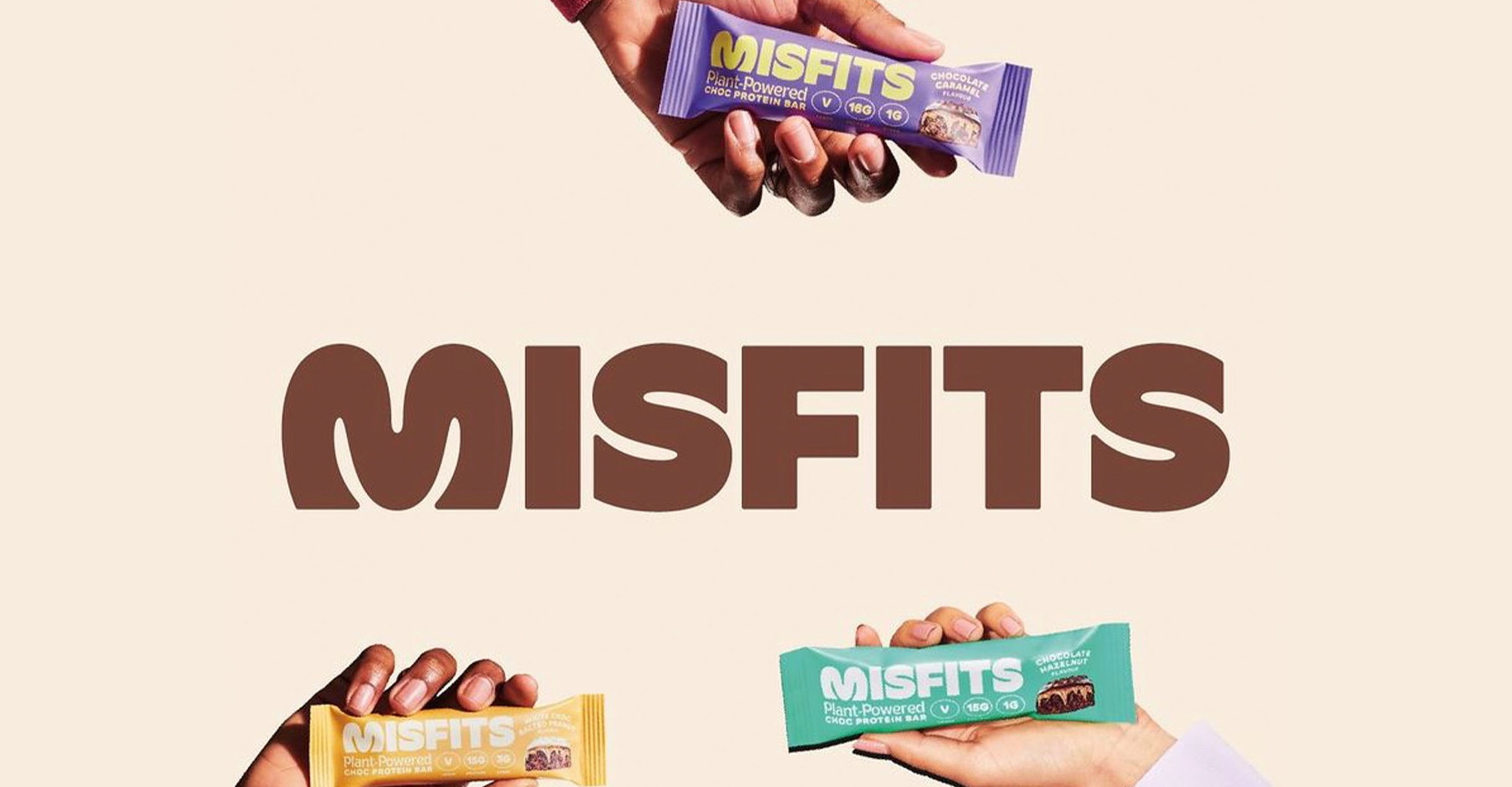
When going down a typographic route for your logo, choosing the right font is extremely important. Creative typography remains one of the most popular logo design trends. The new logo for Misfits Health is a great example of a simple typographic logo, but the quirky ‘M’ displays the fun, youthful vibe of the brand.
3. Translating across all touchpoints.
These days a brand reach has multiplied due to the digital experience such as websites, mobile apps and digital platforms. They open up a whole swathe of brand touchpoints that enable brands to inject their values, personality and tone of voice.
A straightforward way to bring your brand identity into digital experiences is by taking aspects of your core visual identity such as colour palette, typography, icons, and photography style and applying them across digital touchpoints.
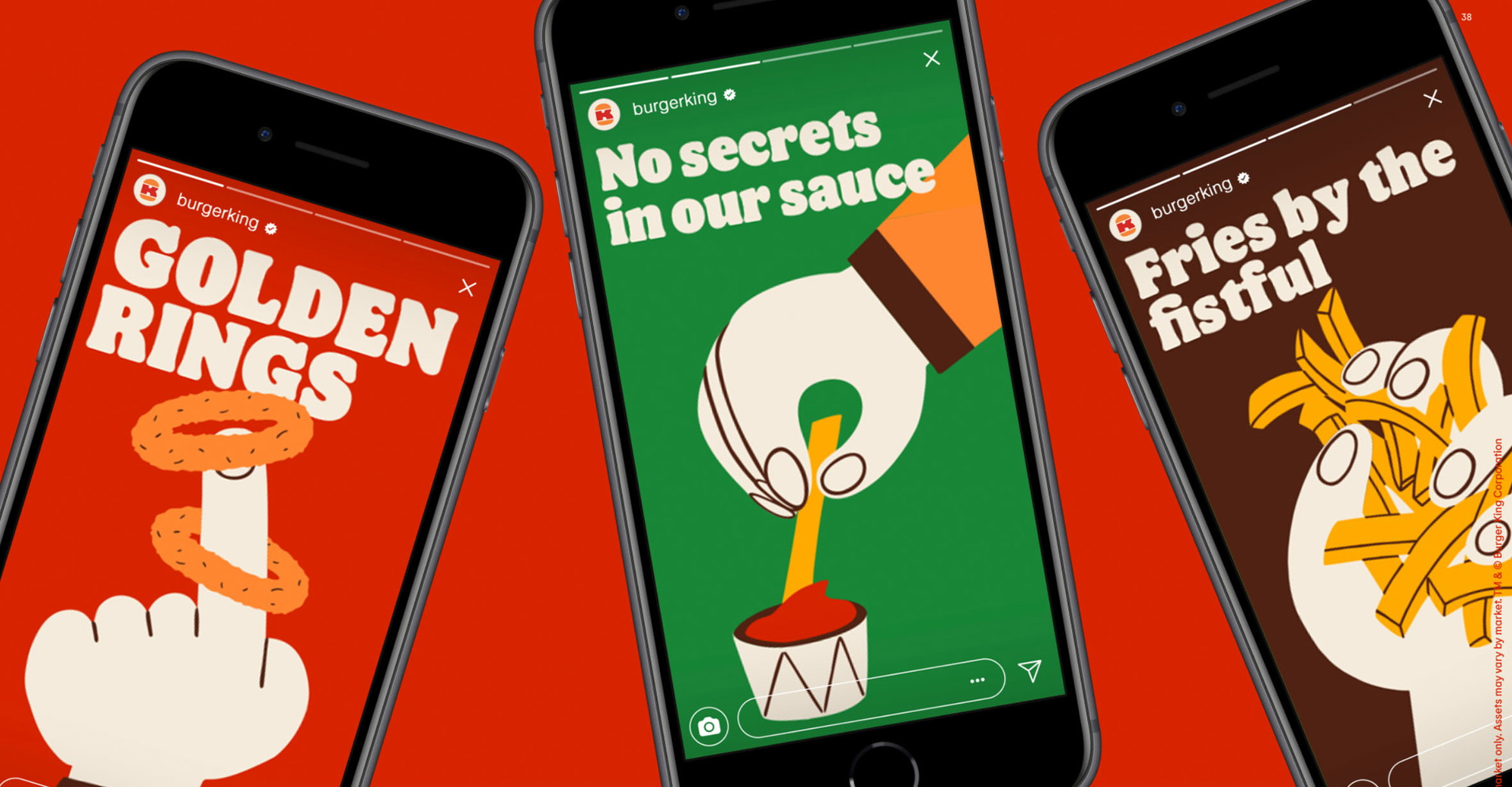
To ensure consistency with offline and online experiences the key is to strip the brand down to the simplest possible recognisable visual expressions. For example, for the recent rebrand of Burger King by JKRGlobal, you can see real-life aspects of the brand, such as packaging and billboards, successfully translated across social media, through animation and typography.
4. The role of photography in branding.
Once your brand’s logo, fonts and colours are locked down, photography is a great way to visually translate your brand’s personality into something more recognisable for your audience. Like we discussed earlier in understanding your target audience and personality, your photography style will need to successfully represent these traits. Bespoke photography will be super effective in engaging your core consumers, but you need to establish a consistent visual style right from the start.
The cosmetic and skincare brand Glossier is a great example of a company that uses photography to highlight their products and appeal to their target audience. Focused on natural, breathable skin and make-up, their brand photography reflects this with their dream-like and glossy models and product shots.

5. Brands that stand for something.
Taking a stand on social issues and not being afraid to align your values to a cause is another way to make your brand memorable, authentic and build customer loyalty. According to a Kantar study, 68% of US consumers expect brands to be clear about their values, with Millennials and Gen Z having the highest expectations of all age groups.
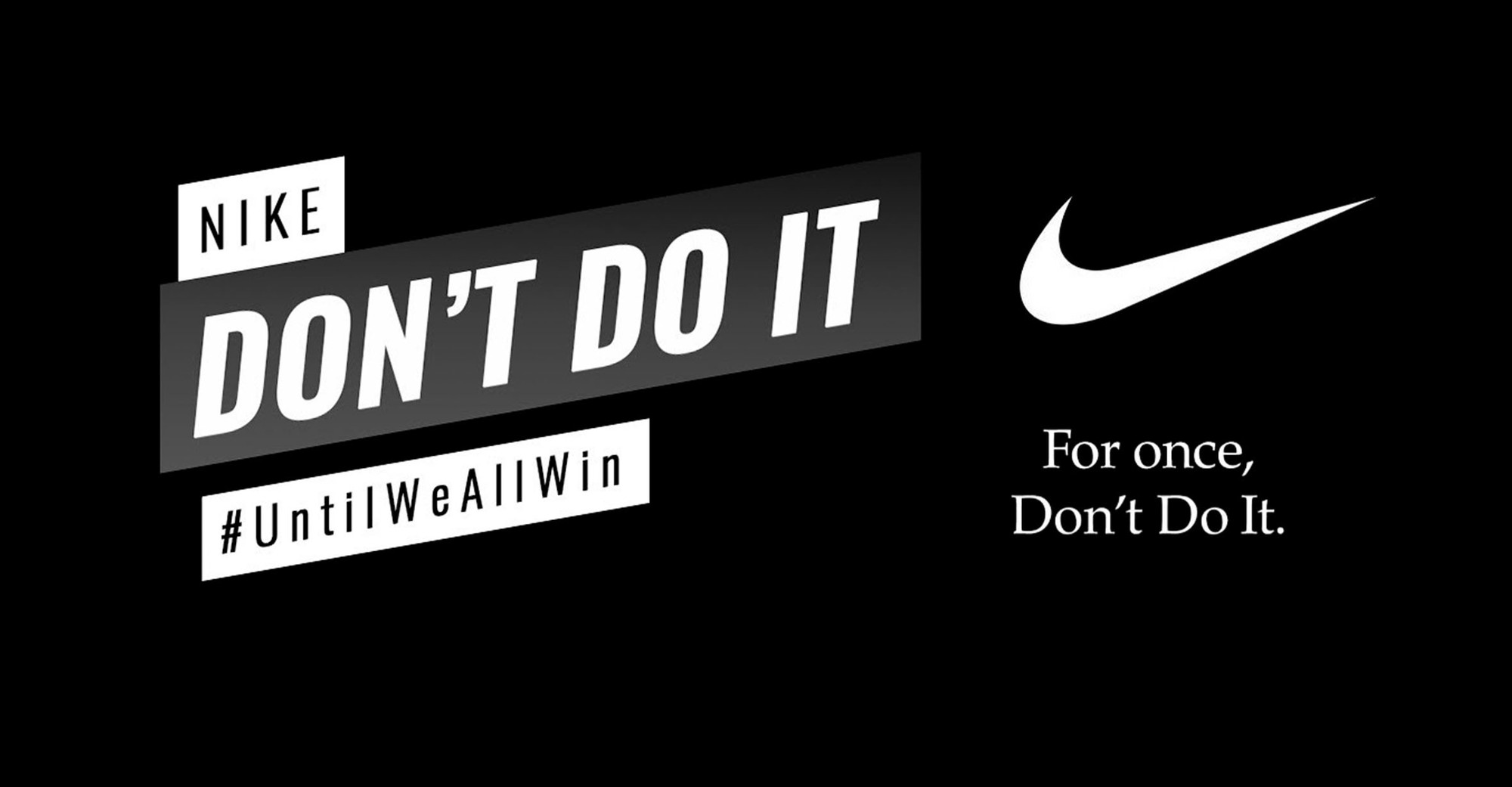
Using Nike again as an example, they often create campaigns in support of social causes like the Black Lives Matter movement. In 2020, a campaign created by Wieden + Kennedy involved a series of statements urgently calling for both consumers and companies to stand together in the fight against racism. Putting a twist on its famous motto, Nike said:
“For once, don’t do it. Don’t pretend there’s not a problem in America. Don’t turn your back on racism.”
Conclusions.
These are some of the important points that you can focus on when trying to build a brand that’s not only memorable but has a strong personality and clear mission. Elements like your logo, colour, typography and photography will help to engage consumers on a visual level, but your values and beliefs will need to support your brand identity to build a loyal consumer base.


Interested in working with KOTA?
Drop us a line at
hello@kota.co.uk
We are a Creative Digital Agency based in Clerkenwell London, specialising in Creative Web Design, Web Development, Branding and Digital Marketing.