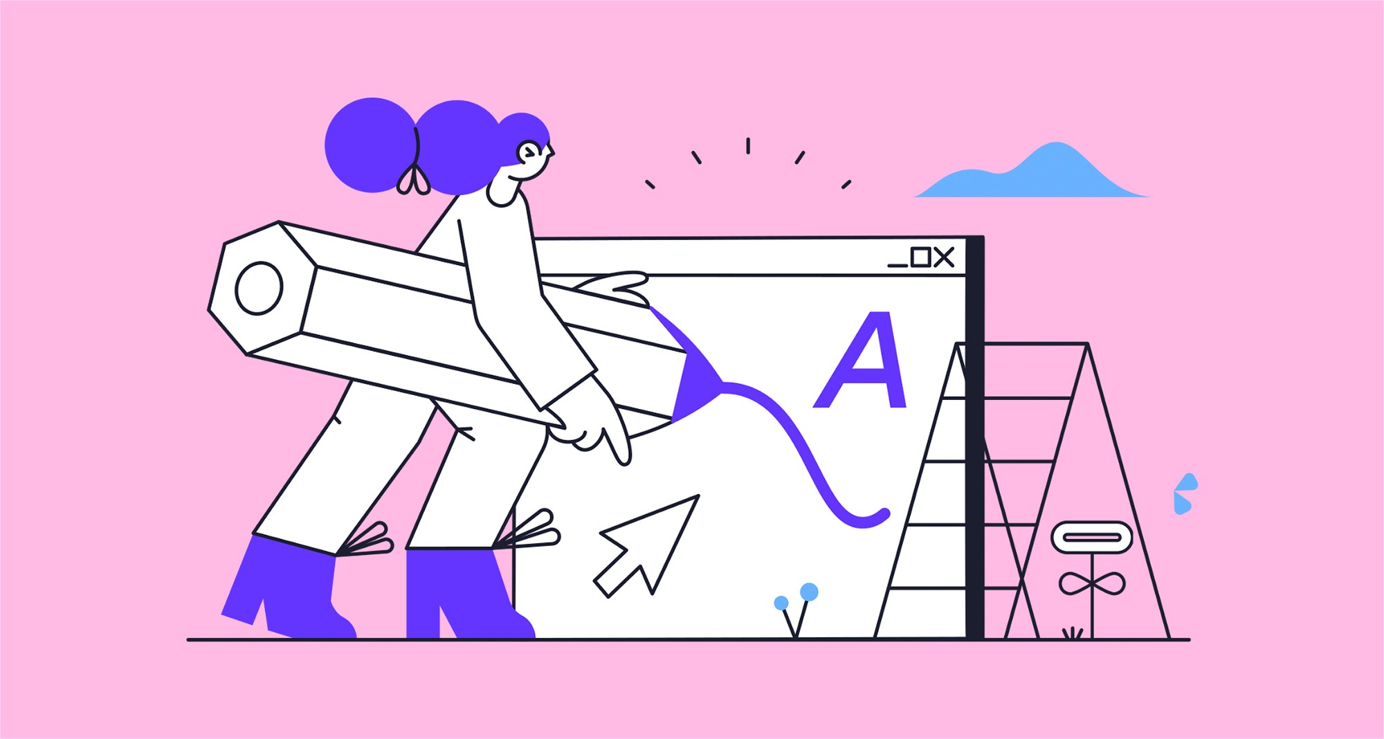
Choosing the right typography for your brand.
February 24th 2022
By KOTA
Introduction.
Choosing strong typography for your business is crucial for engagement and setting the tone and personality for your brand. With an overwhelming amount of choice, from serif to display fonts, we’ll help you break down the best way to choose the right typography for your brand.
1. Understand your brand identity.
Firstly, what is the personality of your brand? Fonts are a great way to communicate the tone of your business so it’s important to understand the feeling certain fonts emit and the unique traits they possess.
For example, serif fonts are the oldest font style, dating back to the 15th century, and are considered to be classy and high end. Take a look at the typefaces used for brands like Vogue and Time Magazine.
Sans serif fonts on the other hand have a more modern and clean look, giving you a minimalistic design. Big brands such as Spotify and Netflix use a sans serif typeface for their logos.
Figuring this out will allow you to make a more informed decision on fonts to best represent your brand.

2. Maintain the typographic hierarchy.
The typographic hierarchy is the way in which you order fonts. Its primary objective is more effective communication, allowing the viewer to understand your brand better. This could look something like:
- Primary type – default typeface that reflects the overall identity.
- Secondary type – complements the primary.
- Tertiary type – can be used for accents.
Using multiple fonts can look great and compliment each other well, to create something visually engaging and exciting. Ask yourself: do they balance each other out in style and appearance? This could be achieved with fonts that contrast against each other, such as a serif and a sans-serif typeface.

3. Make sure it’s versatile.
The typeface(s) you choose must be able to deliver consistent brand expression across all touchpoints, from social media to packaging, to desktop web design and mobile interfaces.
If your logo includes a phrase, it needs to be in a typeface that is legible on a small scale, such as a leaflet, through to a billboard. Selecting a font family with a large range of weights and styles is a good way to ensure brand consistency, as it provides flexibility but within the same typeface.

4. Where to find the best fonts.
There are hundreds of websites online that offer a great choice of typefaces, from a hefty cost to completely free.
A reliable and free source of fonts is Adobe Typekit, which is included in an Adobe Creative Cloud subscription.
Google Fonts is another option for free fonts. It takes care of the licensing and hosting for you, so you can browse over 800 font families!
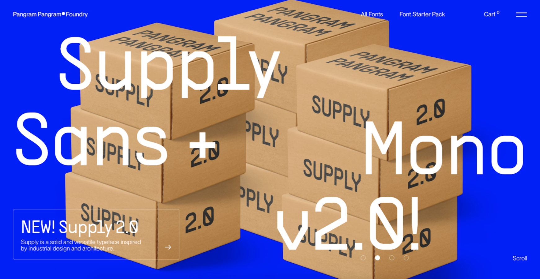
If you’re looking for a slightly more unique and niche set of typefaces, Pangram Pangram Foundry is a great place to look. They have an option to buy a Font Starter Pack, which includes 300 of their amazing fonts!


Interested in working with KOTA?
Drop us a line at
hello@kota.co.uk
We are a Creative Digital Agency based in Clerkenwell London, specialising in Creative Web Design, Web Development, Branding and Digital Marketing.