Error handling: how to keep users happy when things go wrong

March 12th 2025
By Emily
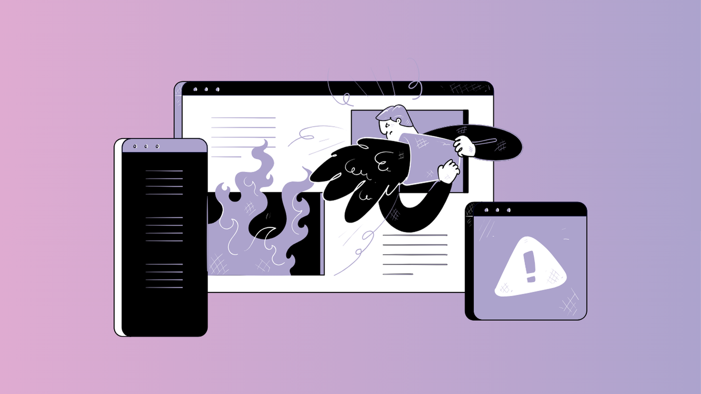
Even the best websites break. Forms fail. Pages vanish. Servers have a meltdown. It happens. But how you handle these inevitable hiccups can make the difference between a frustrated user bouncing off your site and a loyal visitor who appreciates how smoothly you guide them back on track.
Good error handling is all about designing an experience that keeps users confident, informed, and in control. Here’s how to do it right.
Write error messages like a human, not a robot
The fastest way to annoy a user? Hit them with a vague, tech-jargon-filled error message. Error 404. Something went wrong. Invalid input. What does that even mean?
Error messages should be clear, specific, and—where possible—helpful. Tell users what went wrong, why, and what they can do next.
Bad example: Form submission failed.
Better: Oops! Your password must be at least 8 characters long and include a number.
If there’s a fix, tell them how to do it. If something’s temporary (like a server issue), let them know when to try again. And if you want to add personality, go for it—just don’t prioritise charm over clarity.
Validate forms in real time
Few things are more frustrating than filling out a long form, hitting ‘submit’, and then being told you made a mistake. Somewhere. But where?
Real-time form validation solves this by giving users instant feedback. Highlight errors as they type. Use simple, inline messages next to each field to guide them.
For example, when someone enters an invalid email, show a message like: That doesn’t look like a valid email—did you mean name@email.com?
Better still, use soft validation where appropriate. If a user enters their phone number with spaces or dashes, don’t reject it—format it correctly for them. Good form design should feel intuitive, not like a test.
Make your 404 pages useful (and a little fun)
Users hate dead ends. A standard Page Not Found message doesn’t help anyone. If someone lands on a 404 page, they were looking for something—so give them a way to keep going.
A good 404 page should:
- Acknowledge the issue (Looks like this page doesn’t exist anymore)
- Offer solutions (Try searching for what you need below)
- Link to key pages (Or go back to our homepage
You can also use it as an opportunity to inject personality. For example: “Looks like you broke the internet. Just kidding. But we can’t find this page.”
Some brands go all out with clever illustrations, witty copy, or even interactive elements. But don’t let creativity get in the way of usability—function first, fun second.
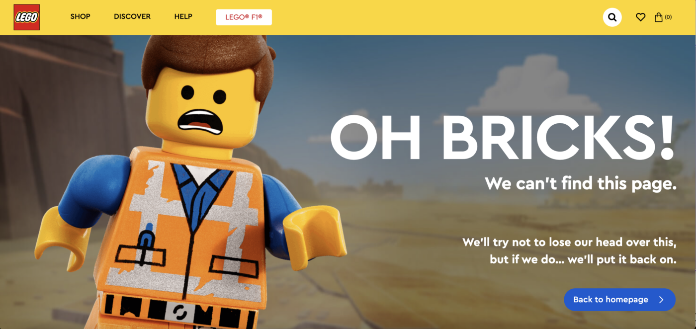
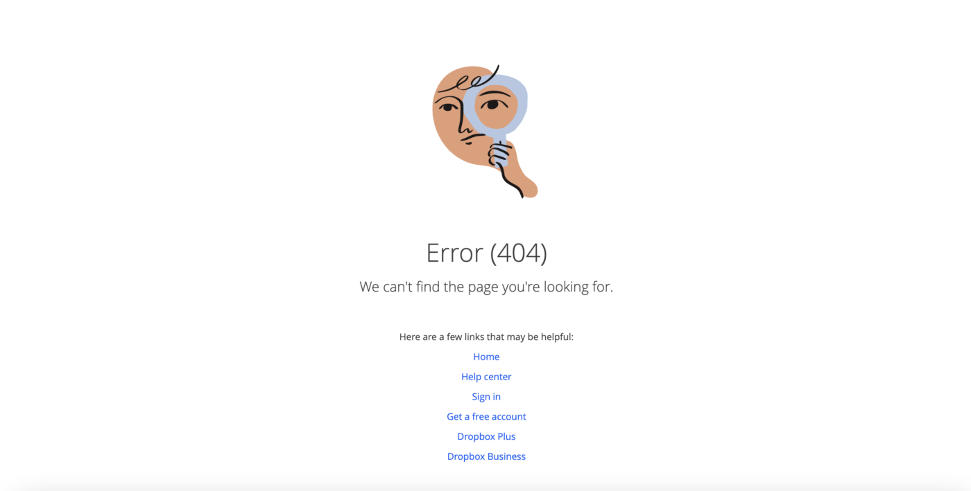
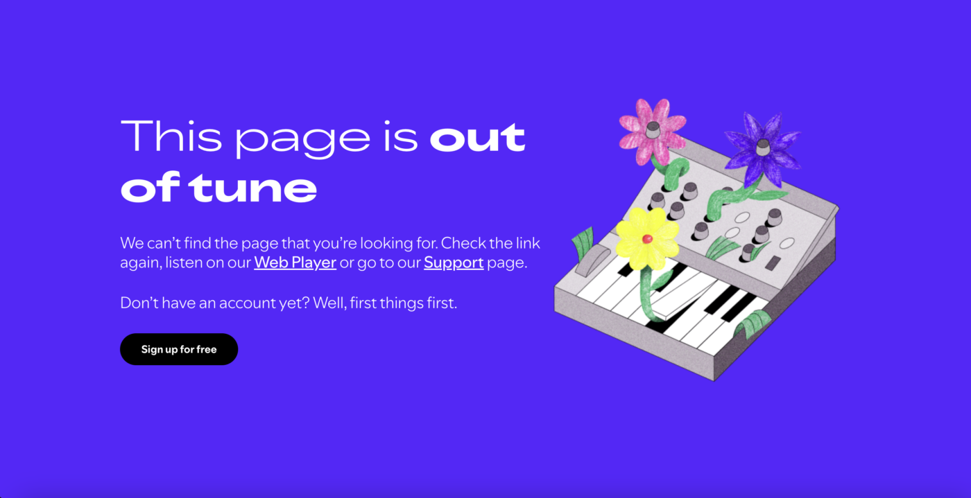
Examples of great 404 pages in action
Lego: A sad Lego character, fun copy, and a handy link back to the homepage.
Dropbox: A playful illustration and simple links make it easy to navigate back.
Spotify: A clever, on-brand message paired with a helpful link to guide users—or (even better!) convert them.
Show users you’re in control
Errors don’t have to feel like disasters. When handled well, they reinforce trust in your site. Thoughtful design, clear communication, and a touch of personality can turn a frustrating moment into a seamless user experience.
Because at the end of the day, a user’s perception of your brand isn’t just shaped by when things go right—but by how well you handle things when they don’t.


Interested in working with KOTA?
Drop us a line at
hello@kota.co.uk
We are a Creative Digital Agency based in Clerkenwell London, specialising in Creative Web Design, Web Development, Branding and Digital Marketing.