Minimalism in brand design: less is more, but is it always better?

Minimalism in design has taken the branding world by storm. But is “less is more” always the best approach?
Let’s break down when minimalism excels, when it falls short, and what you can learn from the successes and missteps of other brands.
The history of minimalism
Minimalism as a design philosophy has its roots in the early 20th century, significantly influenced by the Bauhaus movement. The Bauhaus school, founded in Germany in 1919, emphasised simplicity, functionality, and the removal of unnecessary elements. This movement laid the groundwork for minimalist design, which strips away the non-essential to focus on simplicity, clarity, and functionality.
But! Minimalism as we know it really began emerging in the late 1950s when artists like Frank Stella started to turn away from the abstract/expressionist art of the previous generation. It really flourished in the 1960s and 1970s with innovators like Carl Andre, Dan Flavin, Donald Judd, Sol LeWitt, Agnes Martin, and Robert Morris. It’s characterised by its highly purified form of beauty, representing qualities like truth, order, simplicity, and harmony.
In branding today, this means clean lines, ample white space, and a limited colour palette. The goal? To create a sleek, modern look that communicates a brand’s message simply, clearly and effectively.

When minimalism works best
Strong brand identity
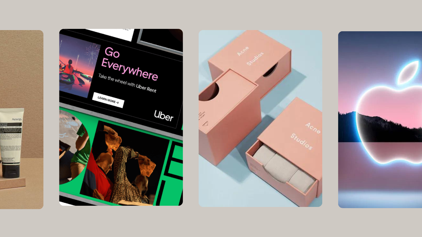
Minimalism works wonders for brands with a strong, recognisable identity. Think of Apple. Their iconic logo and clean design reflect their commitment to simplicity and innovation. By eliminating distractions, Apple ensures that its core message and product quality shine through. It reinforces their brand identity and makes their products instantly recognisable.
Luxury and high-end markets
In the luxury market, less is often more. High-end brands like Acne Studios, Chanel and Calvin Klein use minimalism to convey sophistication and exclusivity. The simplicity of their design implies that the product itself is enough to speak for the brand. This approach leverages the idea that luxury doesn’t need to shout; it speaks softly and carries a big impact.
Tech and modern industries
Brands in the tech industry, like Google, Uber, and Airbnb, often use minimalist design to convey modernity and forward-thinking. The uncluttered design suggests efficiency, ease of use, and cutting-edge technology. For tech companies, minimalism can help communicate that their products are user-friendly and at the forefront of innovation.
When minimalism falls short
Lack of distinctiveness
Minimalism can sometimes lead to blandness. When too many brands adopt a similar minimalist aesthetic, it becomes harder to stand out. Many start-ups fall into the trap of overly simplistic designs that fail to convey their unique value. For instance, if every tech start-up uses a minimalist logo and design, they risk blending into the crowd rather than standing out.
Miscommunication
Minimalism might strip away essential elements of a brand’s identity. If your brand identity is rooted in rich history or a vibrant culture, minimalism might dilute these aspects, leading to a loss of connection with your audience. For example, a heritage brand might lose its charm and authenticity if it adopts a minimalist design that doesn’t reflect its storied past.
Complexity of information
Brands needing to convey a lot of information might find minimalism a tad limiting. Detailed and complex products, such as those in healthcare or finance, often require a more comprehensive design approach to communicate all necessary information clearly. Minimalism can sometimes oversimplify, leading to miscommunication or lack of clarity for complex messages.
Successful examples of minimalism
Apple
Apple’s minimalist design is a benchmark in the industry. Their use of simple, clean lines and a monochromatic palette ensures their products are easily recognisable and visually appealing. This approach reflects Apple’s philosophy of innovation and user-friendly design. By focusing on essential elements, Apple communicates its values and product quality effectively.

Muji
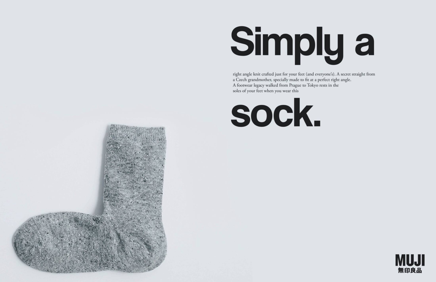
Muji, the Japanese retail company, excels with its minimalist design philosophy. This brand was born in 1980 as a counterpoint to the trend of consumer excess in Japan during the 1970s. Co-founder, Seiji Tsutsumi, envisioned products that had “no brand”, simple functionality, and a reasonable price. This approach reinforces Muji’s commitment to sustainable and practical design. Their minimalist design conveys a sense of calm and order, which appeals to consumers who value functionality and simplicity without any of the fluff.
Less successful examples

Gap logo redesign (2010)
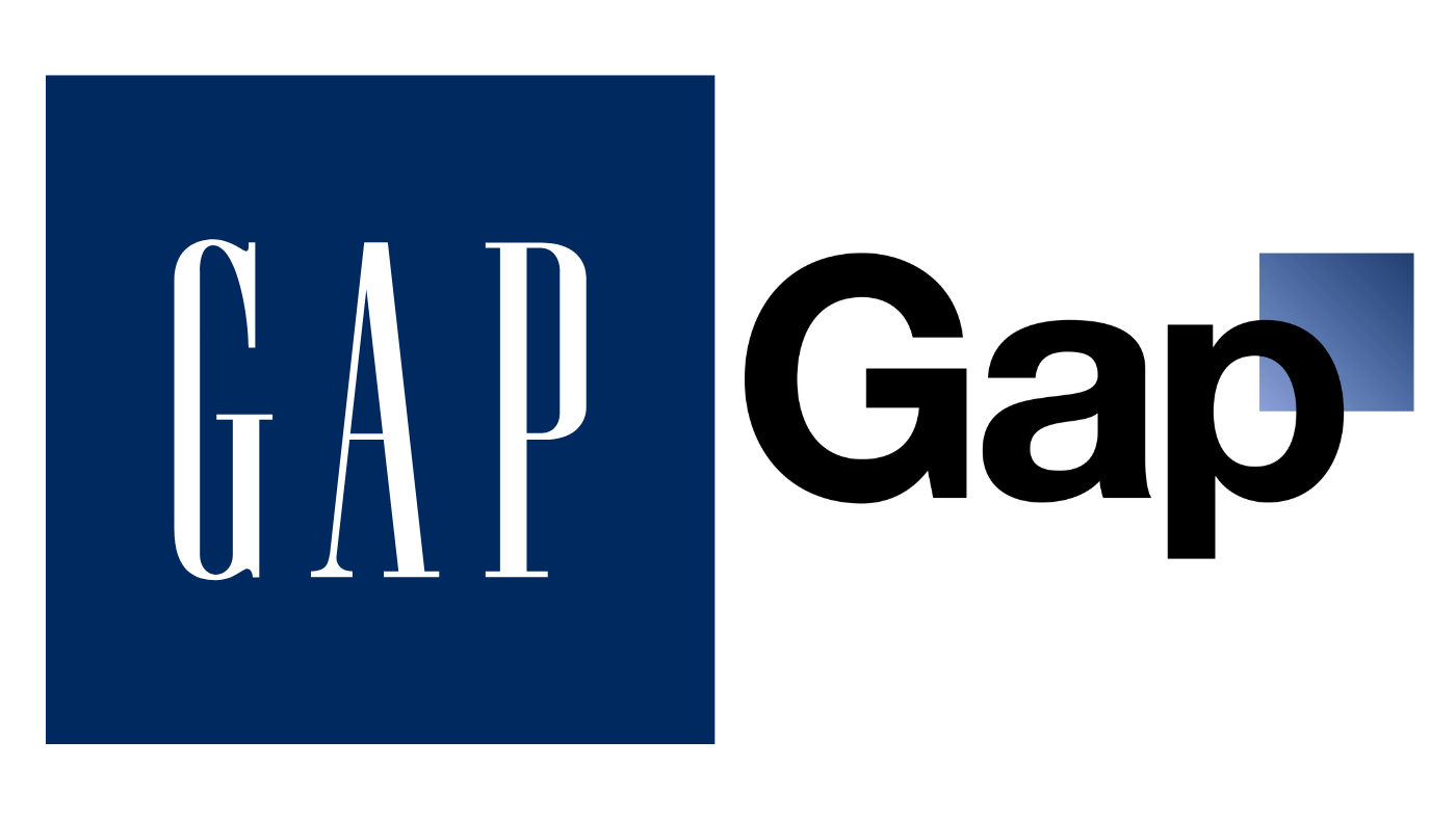
Gap’s attempt to redesign its logo in 2010 is a classic example of minimalism gone wrong. The new logo was overly simplistic and lost the distinctive character of the original. The backlash was so severe that Gap reverted to its old logo within a week – yikes. This really highlights how minimalism can backfire if it erases a brand’s identity.

Tropicana packaging redesign (2009)
Tropicana’s 2009 packaging redesign aimed for a minimalist look but ended up confusing customers, who didn’t even recognise the product on the supermarket shelves. The new design was so stripped down that it lost the recognisable elements, leading to a significant drop in sales. The company quickly reverted to its original design. This case shows that minimalism can fail if it removes key brand identifiers that consumers rely on.
Summing up
Minimalism in brand design can be incredibly effective, but it’s not a one-size-fits-all solution. It works best for brands with strong identities, those in luxury markets, and tech industries. However, it can fall short when distinctiveness, rich brand messaging, or detailed information is needed.
As always, the key is to understand your brand’s unique needs and audience. Whether you opt for minimalism or a more detailed approach, the goal is to create a design that communicates your brand’s essence clearly and effectively.
Ready to find the perfect balance for your brand design? At our branding and web design agency, KOTA, we specialise in creating bespoke digital experiences that resonate with your audience. Get in touch today, and let’s make your brand stand out.
Interested in working with KOTA?
Drop us a line at
hello@kota.co.uk
We are a Creative Digital Agency based in Clerkenwell London, specialising in Creative Web Design, Web Development, Branding and Digital Marketing.


