The science of trust: how tech startups can win over sceptical buyers

May 13th 2025
By Emily
Tech startups have a problem. No, not fundraising (though, sure, that too). The real hurdle? Convincing people to trust them.
Because let’s be honest—buyers have been burned. They’ve seen the hype. They’ve clicked “Start Free Trial” only to be ghosted by onboarding. They’ve sat through SaaS demos that promised the moon and delivered a mildly confusing dashboard.
So if you’re building a new product—especially in B2B—your first job isn’t just making it work. It’s making people believe in you. And you need to start building that trust with your website.
Here’s how.
1. Clarity is credibility
If your homepage still opens with “We leverage AI to deliver scalable synergies”—we need to talk.
Buyers don’t trust what they don’t understand. You don’t win people over with buzzwords. You do it with clarity. Tell them what you do, who it’s for, and what makes you better. Then back it up.
Example? Look at Linear:
Their headline? Linear is a purpose-built tool for planning and building products. Their subheading? Meet the system for modern software development. Streamline issues, projects, and product roadmaps.
A product built for speed, and everything about their brand reinforces that. Clean copy. Fast UX. Zero fluff. You land on their site and instantly get it—and that builds confidence.

2. UX = trust
You can have a brilliant product, but if your website feels clunky or confusing, that trust erodes instantly. People judge your entire startup from your landing page—so every micro-interaction matters.
Here’s what UX signals trust:
- Fast load times. Slow sites = sloppy back end = “Can I trust this company with my data?”
- Clear navigation. If I can’t find product details, pricing, or support within 10 seconds, I assume you’re hiding something.
- Responsive design. If the site breaks on mobile, I’m wondering what else is broken.
- Intentional interactions. Thoughtful microanimations, hover states, scroll behaviour—all small signals that say “We care about the details.”
And let’s not forget onboarding UX. If the first thing I see is a wall of forms or a confusing dashboard, it’s game over. Show, don’t overwhelm. Ease people in.
Look at Pitch. Their site flows like a story—smooth scrolls, smart transitions, and CTAs that feel human. It feels premium without being heavy. That’s trust by design.

3. Show the humans behind the machine
Trust isn’t just about your tech stack. It’s about your team. Who built this? Why? What do they care about?
This is where early-stage brands can shine. You might not have 10 years of testimonials, but you do have a story. Use it. Let your founders talk on LinkedIn. Put real faces on your site. Share the journey—warts and all.
Take Y-Combinator alumni like Tella. Their founders are active online, posting regular updates, giving sneak peeks behind the curtain, owning the mistakes and sharing the wins. It’s not just authentic—it’s strategic. You trust the product because you trust the people building it.
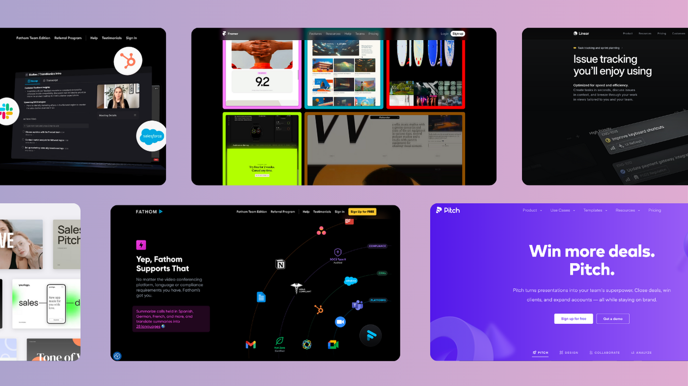
4. Put proof everywhere (not just on a pricing page)
Nobody believes a startup that says they’re the best without receipts. So give them social proof, and weave it throughout the experience.
Don’t just drop logos in a footer and call it a day. Bring proof into your homepage, your CTAs, even your product UI. Real reviews. Community posts. G2 ratings. Live stats.
Fathom is a great example—smart placement of user numbers, reviews, and even Chrome extension ratings, all tied into a cohesive, credible narrative.
Bonus tip: design the proof beautifully. Quotes don’t have to be boxed in grey. Make it visual, interactive, scroll-stopping.
5. Design like someone gives a sh*t
Visual trust is real. Your site doesn’t need to be flashy—but it does need to feel intentional. A great site makes people feel like the product is equally considered. If it looks like an MVP afterthought, you’ve got yourself an instant red flag.
That means:
- Fonts that don’t scream default
- Thoughtful use of space and rhythm
- A brand colour palette that reflects your values (not just “tech blue” because you panicked)
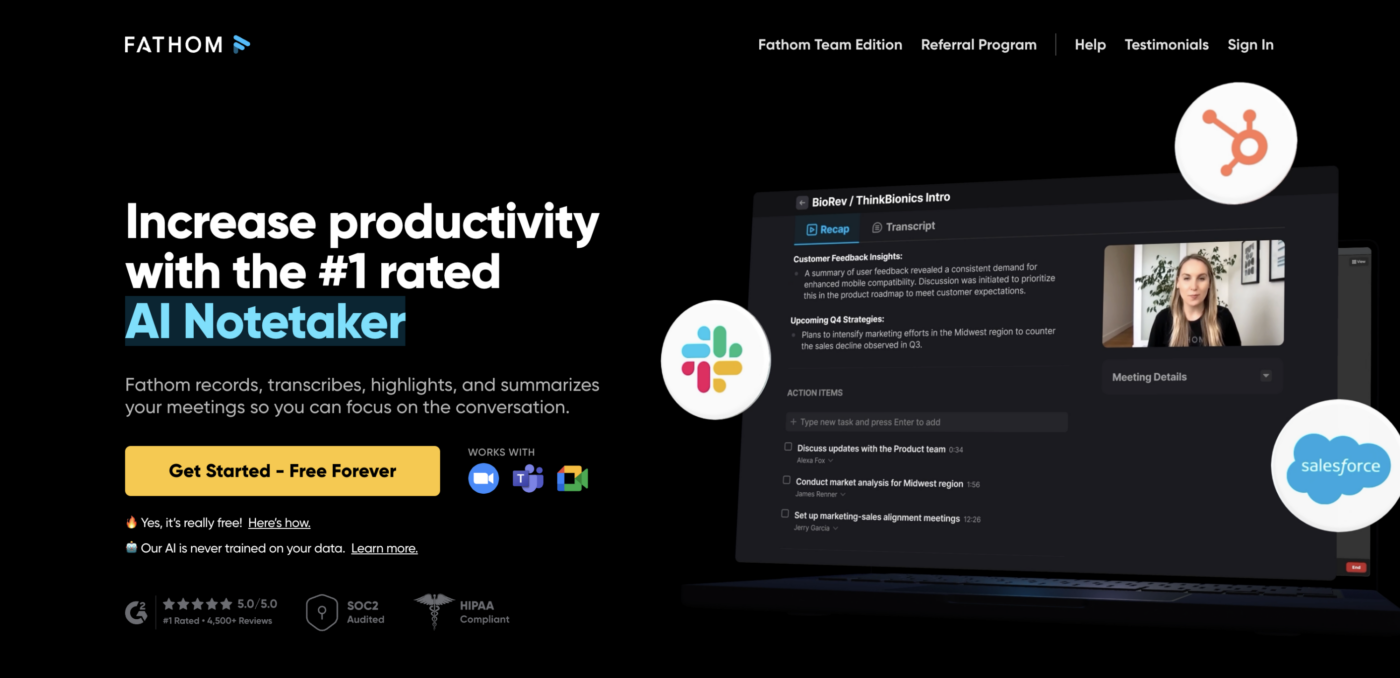
- UI components that feel native, not slapped together
Framer’s site is a fantastic example of trust-by-design. It’s slick. It’s COLOURFUL. It’s joyful to use. You feel like you’re in good hands—even before you try the product.
We’re not talking about overdesign here—we’re talking about intention. Typography that feels thoughtful. UI that doesn’t look like Bootstrap out the box. A tone of voice that isn’t “copy-pasted from ChatGPT 3.5”.
6. Be honest—even when it’s uncomfortable
You’re new. You’re not perfect. And you don’t have to pretend to be.
The best startups build trust by acknowledging the gaps. “We don’t have this feature yet—but it’s on the roadmap.” “We’re currently focused on smaller teams, but we’ll be scaling soon.” That honesty is refreshing in a sea of overpromises.
Trust grows when people feel like they’re in the loop—not being sold a fantasy.
Trust is your real MVP
Before you get users, before you scale, before you raise that next round—your job is to make people believe in you.
Believe that you’ll deliver. That you’re worth the risk. That you’ll still be here in 6 months when their team needs support.
The brands that are winning early are the ones who get this. They don’t just build great tech. They build trust—one clear headline, one human story, one genuine review at a time. And that? That’s the real growth hack.


Interested in working with KOTA?
Drop us a line at
hello@kota.co.uk
We are a Creative Digital Agency based in Clerkenwell London, specialising in Creative Web Design, Web Development, Branding and Digital Marketing.