How fintech brands like Revolut and Monzo use UX to build trust

April 2nd 2025
By Emily
When you’re asking users to hand over personal data, connect accounts, or move their money, you’re asking for more than just clicks. You’re asking for confidence. And that starts with user experience (UX).
In fintech, where the stakes are high and the competition is fierce, brands like Monzo and Revolut have cracked the code. They’ve built global user bases not just through clever site features, but by obsessing over how those features are experienced. UX isn’t a layer on top — it’s the foundation of their brand trust.
If you’re a founder or marketing lead at a high-growth tech company — especially in fintech, SaaS, or AI — this post is for you. We’re diving into how the best in the business turn UX into a trust-building machine, and how you can apply the same principles to your website right now.
1. Trust starts with clarity: kill the jargon, cut the fluff
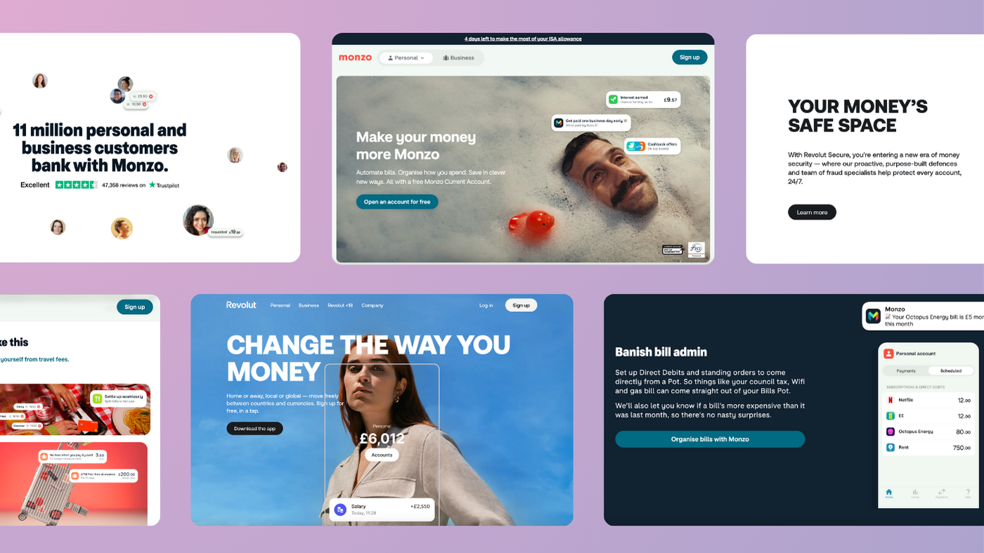
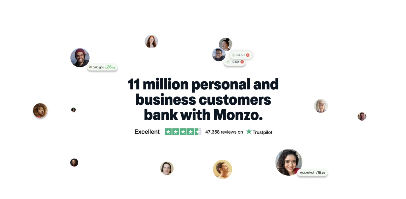
What Monzo does well:
Everything on Monzo’s site and app is designed to feel human. From signup to savings tools, it’s written in plain English, free from industry speak or tech waffle.
Why it matters:
In complex sectors like fintech, clarity breeds confidence. Your audience doesn’t want to “learn the tech” — they want to know what it does for them, fast.
What to do now:
- Rewrite your homepage messaging like you’re explaining it to a smart friend in a rush.
- Avoid acronyms or product names that don’t mean anything outside your team.
- Use bold, clear headlines that focus on benefits, not just features.
2. Frictionless UX = faster trust = more conversions
What Revolut nails:
From their onboarding to their multi-currency exchange flows, every touchpoint is designed for momentum. They minimise friction at every step:
- Short, snackable forms
- Real-time feedback
- Progress indicators and reassurance baked into the UI
Why it matters:
The longer someone hesitates, the less likely they are to sign up. In fintech, that hesitation is often rooted in trust. Make the journey feel seamless, and you’re already halfway there.
What to do now:
- Map your conversion journeys and identify drop-off points
- Strip back unnecessary steps — fewer clicks, fewer doubts
- Add micro-interactions or animations to show progress and control
3. Design with consistency and intent — or risk looking untrustworthy
What both brands do flawlessly:
They don’t just have “a look.” They have a system. Colour, type, spacing, tone — it’s all cohesive, recognisable, and unmistakably theirs.
Why it matters:
Disjointed design feels risky. In sectors dealing with data, privacy, and money, even minor visual inconsistencies can cause subconscious alarm bells to ring.
What to do now:
- Audit your visual identity across web, product, and social
- Build (or refine) a component-based design system
- Make sure your tone of voice is consistent across web copy, support, and onboarding flows
(Hot tip: use our brand audit tool to get started on this!)
4. Surface the security features — don’t just have them
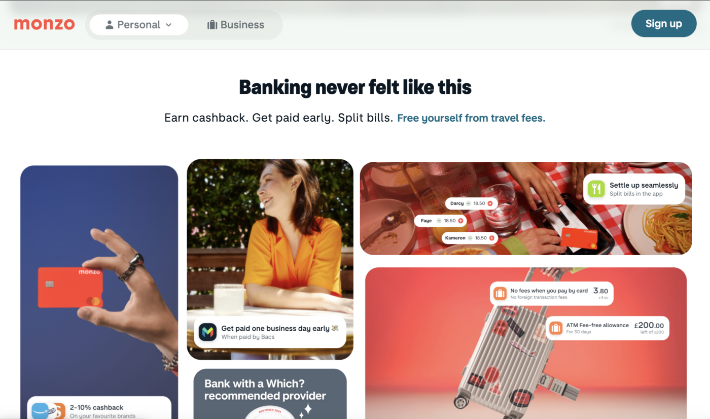
What Revolut and Monzo do:
They highlight security features before users go looking for them — card freezing, biometric login, data encryption. These aren’t buried in footers — they’re part of the core experience.
Why it matters:
In fast-moving tech sectors, especially fintech, your security features are a USP. But if they’re invisible, you’re not giving users what they need to feel safe.
What to do now:
- Add a security assurance section on your homepage or pricing page
- Surface trust signals (ISO certifications, encryption, investor backing, partner logos) early
- Consider UX copy that reassures: “You can change this later,” “Your data is encrypted,” etc.
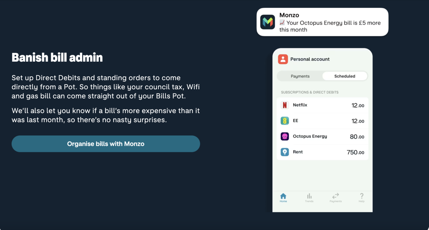
5. Let users see what’s happening — in real time
How Revolut builds confidence:
The app is full of live updates, real-time notifications, and feedback loops. When a transaction happens, the user sees it. When something changes, the user knows.
Why it matters:
UX transparency is more powerful than any paragraph of copy. People trust what they can see, not what they’re told.
What to do now:
- Incorporate real-time feedback wherever possible (confirmation states, progress bars, loading animations)
- Show rather than tell: visualise key processes like onboarding, payments, or API setup
- Use animation with intention — to guide, not distract
6. Social proof is a trust accelerator — use it often
What these brands get right:
Monzo and Revolut both pull in app ratings, customer stories, and media features to create a constant loop of third-party credibility.
Why it matters:
Your audience may not trust you (yet), but they’ll trust other users, investors, or known brands who already do.
What to do now:
- Add testimonial sliders or customer logos throughout key pages (not just one “wall of logos”)
- Include investor quotes or press mentions in strategic areas (e.g. homepage, pricing, careers)
- Embed Trustpilot or G2 ratings with visual cues
7. Your help content is part of the UX — not an afterthought
What Monzo proves:
Their help centre is intuitive, well-written, and human. It’s clearly written by people, for people — not autogenerated SEO fluff.
Why it matters:
Support content isn’t just about solving problems. It’s another moment to build trust. Good UX makes users feel guided, not abandoned.
What to do now:
- Make your help section searchable and user-first
- Use a friendly tone of voice that mirrors your brand copy
- Integrate support within your product or site (chat widgets, in-app guides, dynamic FAQs)
Final thoughts: trust is designed, not declared
Your tech might be revolutionary, but if the UX isn’t pulling its weight, users will never stick around long enough to find out. In fintech and beyond, trust isn’t built with words — it’s built with experience.
So whether you’re heading toward a funding round, scaling fast, or launching something brand new, ask yourself:
- Does our website feel effortless to use?
- Are we reducing uncertainty at every step?
- Does our brand design reflect the credibility we need?
If not — it’s time to make UX your trust strategy.
Need a fintech website that earns user trust?
At KOTA, we help fintech and tech brands build bold, credible, and conversion-savvy websites — fast. We speak fluent tech, think like users, and deliver work that makes investors lean in. Let’s talk.


Interested in working with KOTA?
Drop us a line at
hello@kota.co.uk
We are a Creative Digital Agency based in Clerkenwell London, specialising in Creative Web Design, Web Development, Branding and Digital Marketing.