Why good web design makes or breaks e-commerce success

Originally published September 2020 | Updated June 2025
You wouldn’t open a shop with no signs, confusing aisles and a checkout that hides itself. So why do so many e-commerce sites do exactly that?
A well-designed website isn’t a nice-to-have — it’s your digital storefront. Done right, it helps customers find what they’re looking for, builds trust, and nudges them to checkout. Done wrong, and you’re just another tab to be closed.
So, whether online or instore, a great user experience will get consumers through the shopping process smoothly and thus increase not only customer satisfaction but also the company’s revenue.
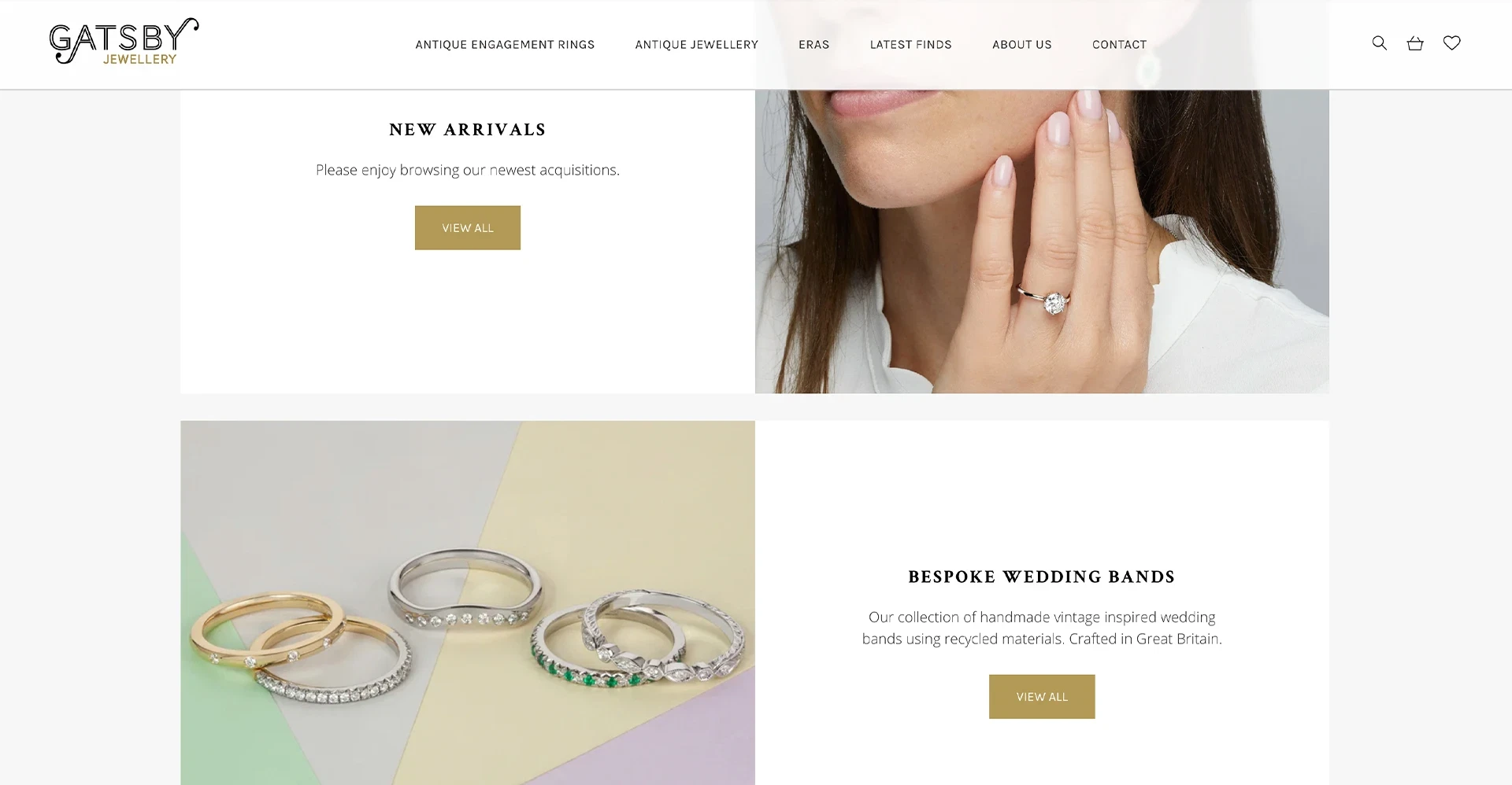
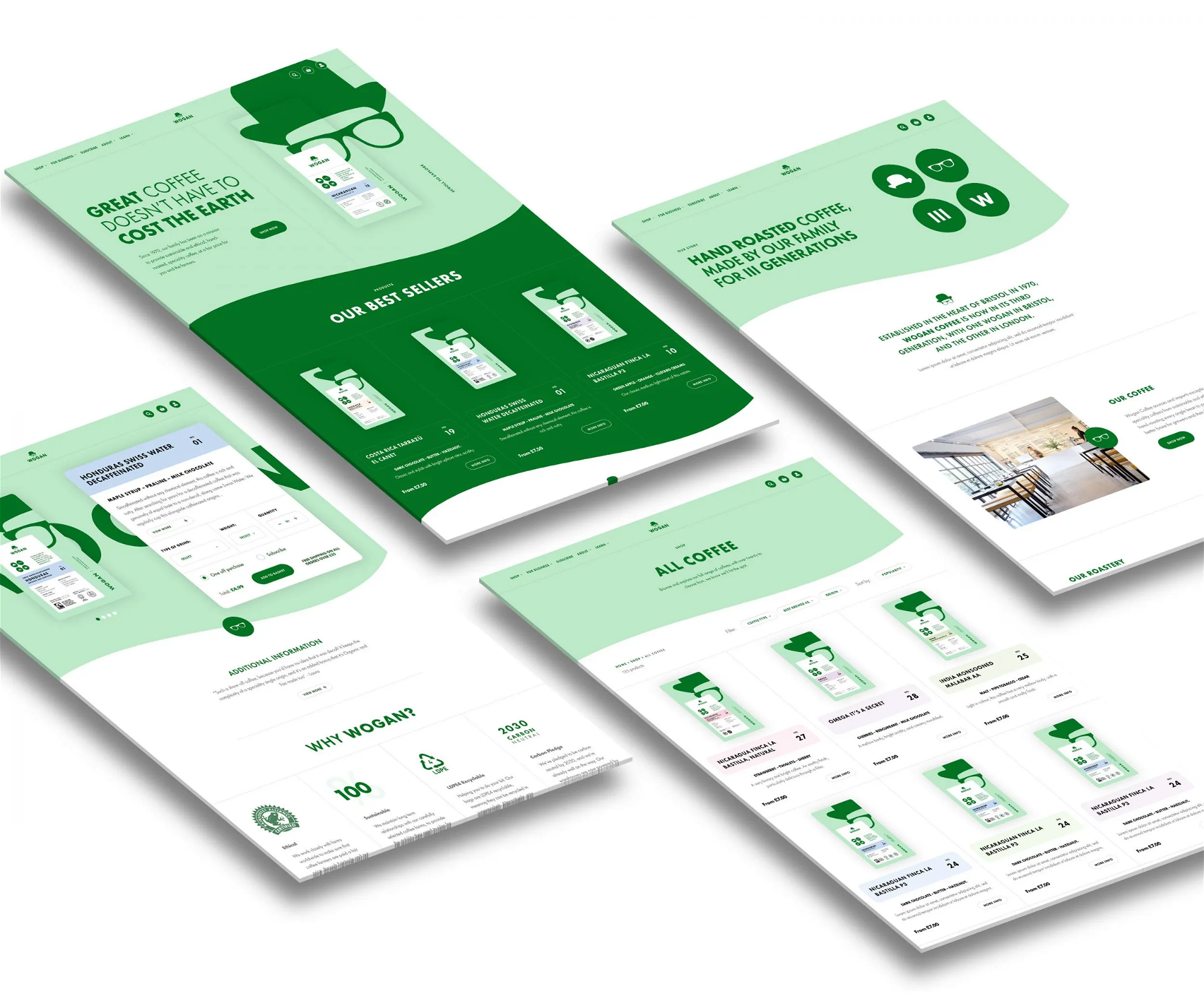
In this guide, we break down the six most important elements of e-commerce web design — based on what we’ve seen work for brands like Gatsby Jewellery, Funky Appliance Co, Aardvark, and Wogan Coffee.
1. Intuitive UX that doesn’t get in the way
Bad UX kills sales. If the journey from product to purchase feels clunky, confusing or too long — you’re asking people to abandon their baskets.
Good UX means:
- Effortless navigation from homepage to product to checkout
- Minimal form fields at checkout
- Smart product suggestions and personalisation
Done right, it should feel like the site already knows what you need. Think fewer clicks, more conversions.
2. Responsive design, always
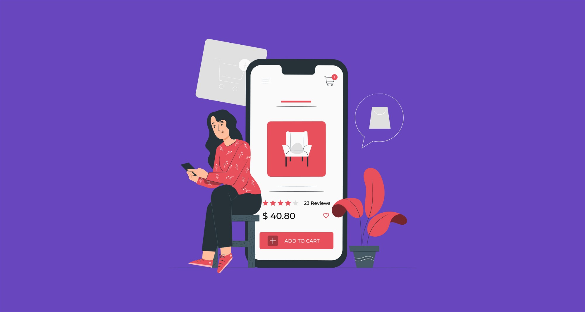
91% of online shoppers buy from their phones. If your site isn’t optimised for mobile, it’s not optimised — full stop.
Make sure your e-commerce design works across all screen sizes, with:
- Simple interfaces
- Fast load times
- Image zoom support
- Clear CTAs (that aren’t hidden under a thumb)
3. Navigation that’s so good it’s effortless
If users can’t find what they’re looking for in under 10 seconds, they’re gone. Your navigation should:
- Surface popular categories and products
- Use logical labels and hierarchy
- Include a prominent search bar
Especially for stores with large inventories, filters and search suggestions are must-haves.
4. CTAs that actually convert
A well-designed CTA is a quiet force of persuasion. It tells your shopper where to go next — without shouting.
To design a better CTA:
- Use high-contrast colours and readable sizes
- Space them well so they’re easy to click
- Match tone and wording to your brand
And always test! A single word tweak or colour shift can make all the difference.
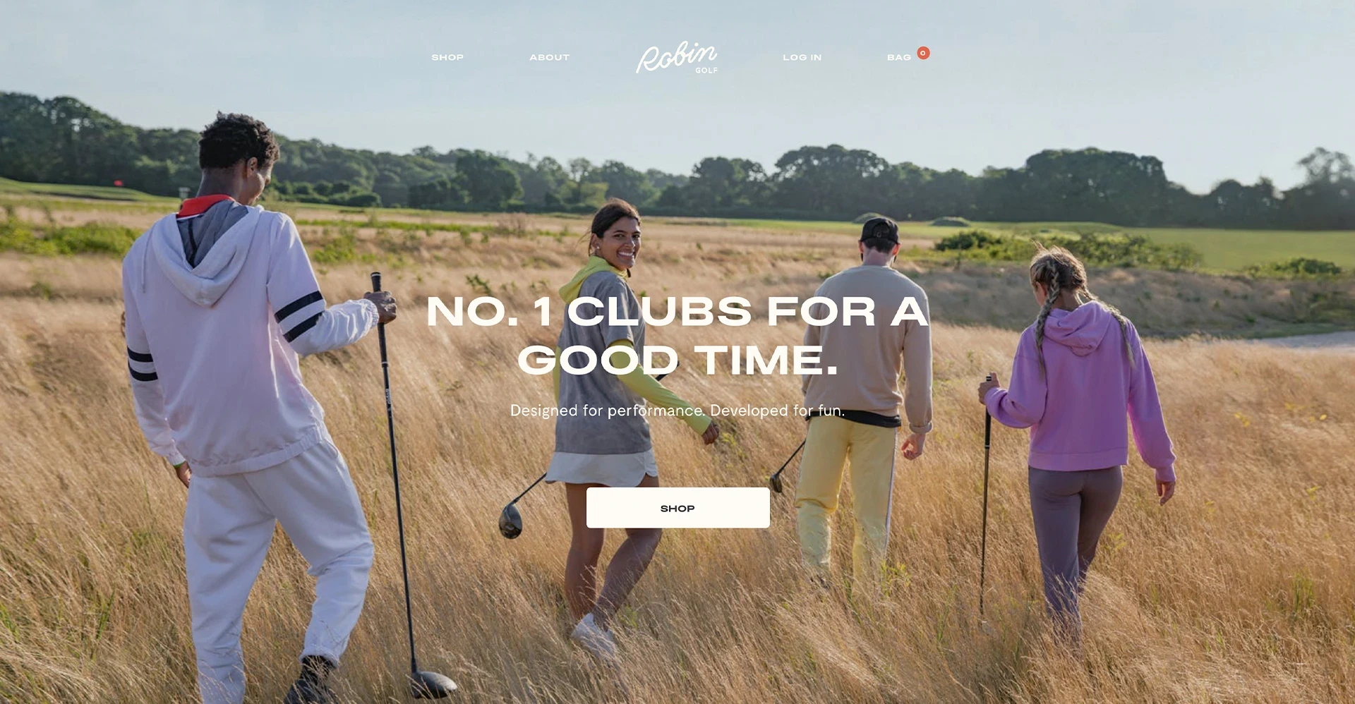
5. Photography that does the selling
In the absence of a fitting room or a demo stand, your product imagery is the experience.
Use:
- High-quality, detailed shots from multiple angles
- Lifestyle imagery to show the product in context
- Consistent styling to boost brand recognition
Bonus points for 360-degree viewers or videos — especially for high-consideration purchases.
6. Copy that’s clear, concise, and on-brand
People don’t want to read essays. But they do want to know what they’re buying.
Strong e-commerce copy:
- Explains product features and benefits clearly
- Matches the tone of your audience (fun? formal? straight-talking?)
- Supports SEO without sounding robotic
Pair short-form highlights with longer specs or FAQs where needed. And always make sure it complements your imagery, not competes with it.
Design is your silent salesperson
Every element on your site should be working towards a single goal — converting browsers into buyers.
There’s no one-size-fits-all layout, but if you:
- Centre the user
- Reduce friction
- Build trust
- Showcase your product clearly
…you’re already halfway to a better-performing store.
At KOTA, we’ve helped e-commerce brands of all shapes and sizes increase revenue through design — from homepage for antique jewellery business Gatsby Jewellery to a Shopify site for The Funky Appliance Company.
Interested in working with KOTA?
Drop us a line at
hello@kota.co.uk
We are a Creative Digital Agency based in Clerkenwell London, specialising in Creative Web Design, Web Development, Branding and Digital Marketing.


