What makes a great landing page?

January 9th 2025
By Emily

Whether you’re driving traffic from a paid ad campaign, an email newsletter, or social media, your landing page only needs to do one thing, but it needs to do that one thing exceptionally well: convert.
But what separates an average landing page from one that drives results? We’ve pulled together a checklist of practical tips to help you design and write a high-converting landing page—along with examples of brands that are nailing it.
1. Start with a clear goal
Every landing page should have one job. Are you collecting email sign-ups, encouraging downloads, or driving purchases? Define your goal from the outset and ensure every element on the page supports that objective.
A clear goal doesn’t just focus your design; it also provides clarity for your audience. According to HubSpot, businesses with well-defined landing page goals see up to a 55% increase in conversion rates. Your goal should be measurable and specific—for example, “Increase newsletter sign-ups by 20% in Q1” instead of a vague “Get more leads.”
Equally important is aligning your goal with your traffic source. If users clicked an ad promoting a free eBook, ensure the landing page reflects that promise immediately.
Key elements of a clear goal:
- A single, focused objective
- Alignment with traffic source expectations
- Clear and measurable outcomes
Tip: Avoid clutter. Remove any distractions or unnecessary links that might steer visitors away from your goal.
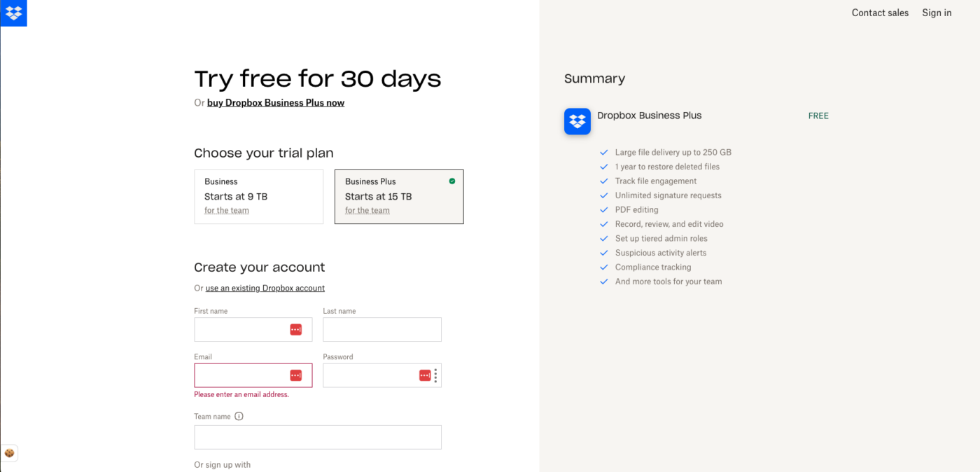
Example: Dropbox‘s “Try free for 30 days” landing page keeps it simple. Every visual, headline, and button points to one clear action: signing up for an account. No fluff, no distractions.
2. Craft a compelling headline
Your headline is the first thing visitors will see, and it needs to grab their attention instantly. It should be clear, specific, and communicate value in just a few words.
Research shows that 8 out of 10 people will read your headline, but only 2 out of 10 will read the rest of your content. A strong headline sets expectations and compels visitors to keep scrolling.
Key elements of a strong headline:
- Clarity and relevance
- Focus on benefits
- Emotional or curiosity-driven hooks
Tip: Test different headline variations to see which resonates best with your audience.
Example: Uber does this really nicely. Skim-able, benefit-led, and still full of their personality.

3. Write persuasive, benefit-focused copy
Your landing page copy should speak directly to your audience’s needs and desires. Avoid focusing solely on product features—instead, highlight the benefits your audience will gain.
Studies show that conversion rates can improve by 86% when landing page copy focuses on customer benefits rather than product specs (Marketing Scoop).
Break your copy into easily scannable sections, use subheadings, and incorporate bullet points for clarity.
Key elements of great landing page copy:
- Benefit-driven language
- Clear and persuasive messaging
- Concise, scannable structure
Tip: Keep paragraphs short, use bullet points for clarity, and avoid jargon.
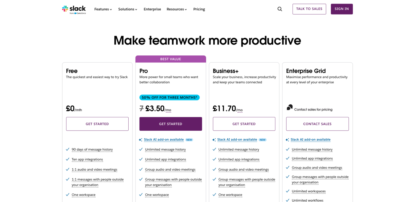
Example: Slack’s landing page copy focuses on how their product solves problems: “Make teamwork more productive” Straightforward, benefit-driven, and easy to digest. It also includes FAQs so we don’t need to navigate anywhere else for more decision-making info.
4. Include a strong call-to-action (CTA)
Your CTA button is arguably the most important element on your landing page. It’s the tipping point between a visitor bouncing and taking the desired action.
Research from 33rd Square suggests that using action-oriented words like “Get Started” or “Download Now” can significantly improve click-through rates.
Key elements of an effective CTA:
- Clear and action-oriented language
- Contrasting colour for visibility
- Strategic placement above and below the fold
Tip: Place your CTA above the fold and repeat it strategically throughout the page.
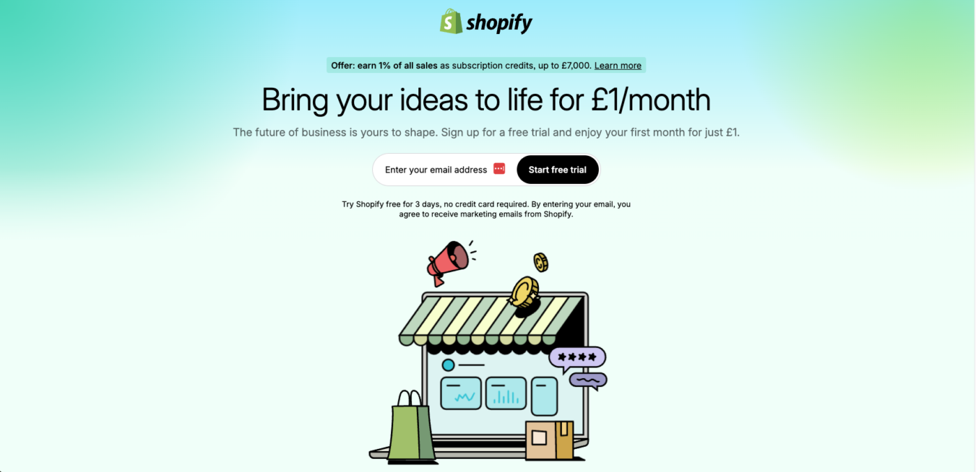
Example: Shopify’s landing page CTA, “Start free trial,” is bold, clear, and visible. There’s no doubt about what action visitors should take next.
5. Use eye-catching visuals
Visuals are a powerful way to communicate your message quickly and effectively. High-quality images, videos, and graphics can significantly improve engagement.
According to Brain Rules, people remember 65% of visual information three days later, compared to only 10% of written content.
Key elements of effective visuals:
- High-resolution images
- Relevant videos or infographics
- Visuals that reinforce the message
Tip: Avoid generic stock photos. Authentic visuals resonate better with users.
Example: Paramount+‘s landing page uses eye-catching film and TV imagery so we know what to expect, and offers scannable, but clear headers. Plus, each fold looks slightly different because of the different backgrounds, creating a more interesting and visually-appealing scrolling experience.

6. Optimise for mobile
With over half of web traffic coming from mobile devices, mobile optimisation is no longer optional—it’s essential.
Research from Hostinger shows that 58% of global website traffic comes from mobile devices.
Key mobile optimisation tips:
- Use responsive design
- Ensure fast loading times
- Keep navigation intuitive
Tip: Test your page across devices to ensure a seamless experience on both mobile and desktop.
Example: Spotify’s mobile landing page is clean, responsive, and fast-loading. It adapts perfectly to smaller screens without losing any functionality.
7. Leverage social proof
Trust is a key driver of conversions. Testimonials, case studies, customer reviews, and logos of reputable clients build credibility.
According to Landingi, 87% of consumers read online reviews before making a purchase.
Key types of social proof:
- Customer testimonials
- Case studies
- Industry recognition or awards
Tip: Use real customer names and photos for authenticity.
Summing up
A successful landing page blends clarity, strategy, and continuous optimisation. Whether you’re promoting a product, collecting leads, or driving sign-ups, every element should be working in harmony towards one clear goal.
Ready to create a landing page that converts? Get in touch, and let’s make it happen.
About KOTA
KOTA is a global branding agency and creative web design studio. Our brand-to-build approach brings strategy, identity, creative web design, development and growth marketing into one connected process. We help ambitious businesses find brand clarity, turn it into creatively confident work and build digital systems that create commercial momentum.
Start crafting better briefs
Dodge miscommunication headaches, scope creep, expectation misalignment, and brand inconsistency.
Download your free brief templateRelated Articles

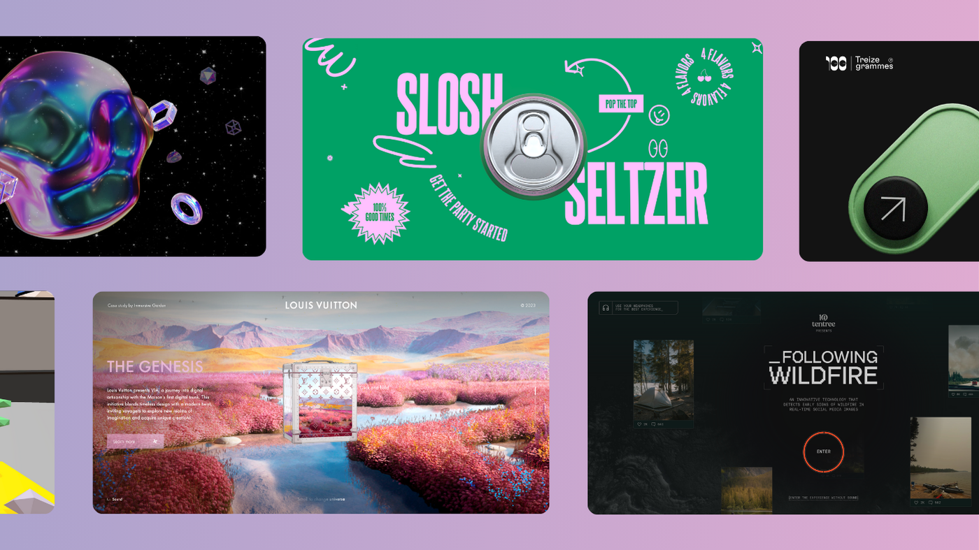

Related Projects

Interested in working with KOTA?
Drop us a line at
hello@kota.co.uk
We are a Creative Digital Agency based in Clerkenwell London, specialising in Creative Web Design, Web Development, Branding and Digital Marketing.