Your Black Friday UX checklist

November 4th 2025
By Emily

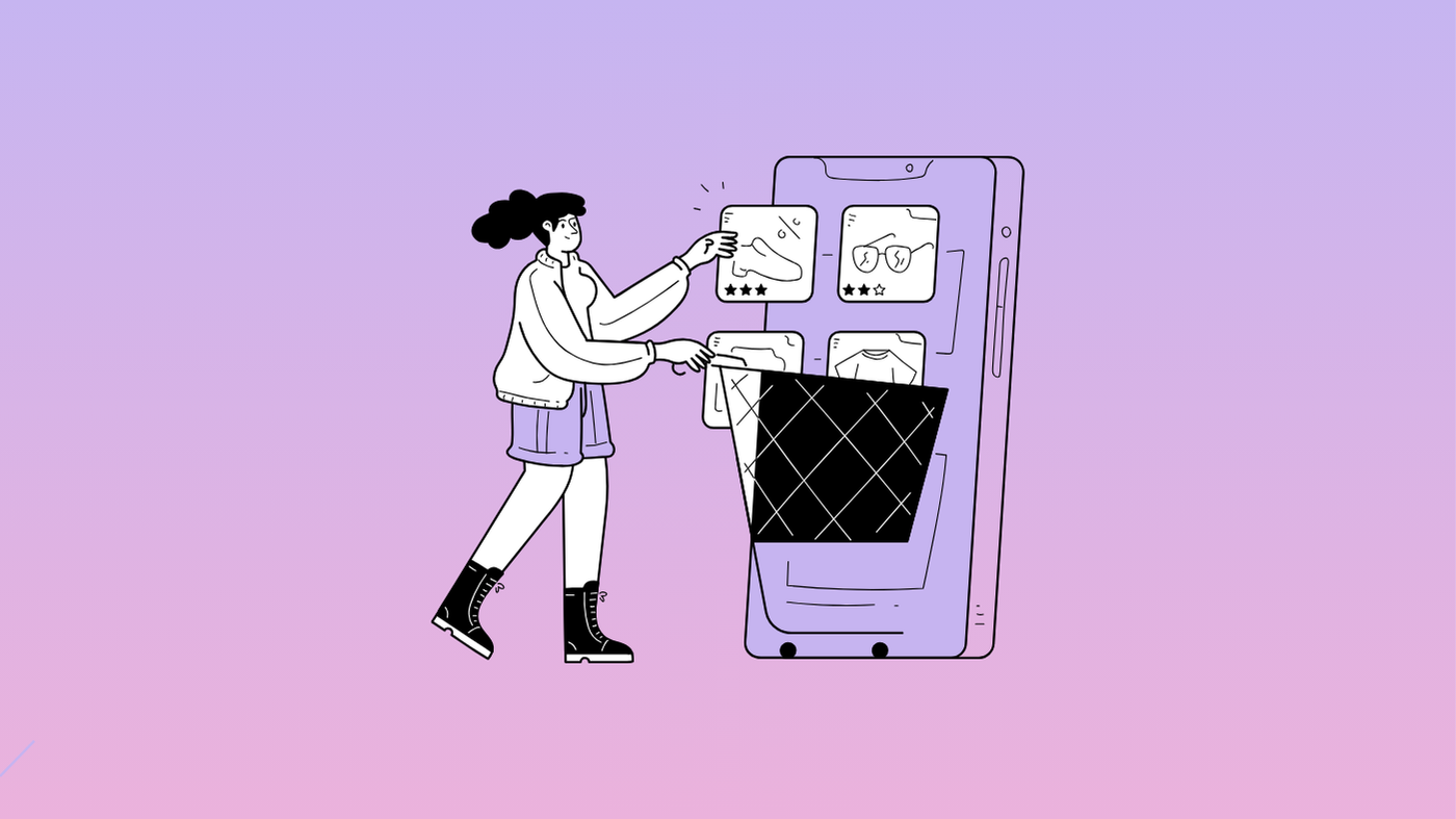
Black Friday. The time of year when every website suddenly turns into a flashing billboard shouting SALE! at full volume.
Consider this your reminder that when everyone’s fighting for attention with the same tricks, subtlety wins. The brands that actually convert aren’t the loudest. They’re the smartest.
Good UX pulls users in — through clarity, emotion, and design decisions that feel like your brand, not a generic ecommerce template in panic mode.
Let’s break down the quick wins and deeper UX tweaks that will help you boost conversions and keep your identity intact this Black Friday.
1. Start with hierarchy
It’s tempting to plaster discounts everywhere. But visual hierarchy — not volume — is what drives action.
- Define one hero CTA. Every page needs a clear focal point. “Shop now”, “Claim 20% off”, whatever your offer is — don’t let it fight five other buttons for attention.
- Make it scannable. Use typography, spacing, and contrast to guide the eye naturally down the page. Users shouldn’t have to hunt for the deal.
- Think mobile-first. If your CTA is buried under a banner stack, it’s game over. Test your layouts on small screens before you finalise the design.
Psychology check: the human eye follows predictable patterns. People skim, not read. Your layout should tell the story even if they don’t read a single word.
2. Use motion to direct, not distract
Animation is your secret weapon if it’s done right.
Micro-interactions — the hover states, button ripples, or cart confirmations — can make the experience feel alive and responsive.
But this isn’t the time to drop in a spinning sale graphic. Keep it brand-led.
- Subtle motion cues help draw attention to key areas (think a gentle nudge on your CTA or product card on hover).
- Speed matters. Anything under 200ms feels instant; over 400ms starts to drag. Users equate slowness with friction.
- Stay consistent. Match your motion language to your brand. Smooth and elegant? Playful and bouncy? Pick one and commit.
Motion should guide emotion, not hijack it.
3. Create urgency without the anxiety
Urgency is the most overused (and misunderstood) conversion tactic in ecommerce. The trick is to make it feel real, not manipulative.
- Show limited stock or timed drops only when it’s true. Users are trained to spot fake scarcity.
- Use progress bars carefully. A countdown that feels like a doomsday clock just creates stress. Try softer phrasing like “Selling fast” or “Ends Sunday”.
- Tie urgency to relevance. Frame your offers as opportunities — “early access”, “exclusive drop”, “first to know” — instead of panic.
Psychology check: scarcity works because it signals value, not chaos. Make users feel lucky, not pressured.
4. Declutter the checkout
No amount of clever UX matters if the checkout is clunky.
During peak season, every unnecessary step is a potential rage-quit moment.
- Guest checkout is non-negotiable.
- Autofill everything. Shipping, billing, address — remove friction at all costs.
- Show total cost early. Hidden fees or surprise shipping costs kill trust.
- Progress indicators give users a sense of control — “2 of 3 steps” feels manageable.
Trust is the real conversion booster. And transparency is how you build it.
5. Keep your brand front and centre
Black Friday shouldn’t feel like a costume party where your brand shows up in someone else’s clothes.
If your tone is calm, don’t suddenly scream in all caps. If your brand leans premium, don’t start blinking neon buttons.
The best UX during sales season feels like your brand turned up a little louder — not someone else’s voice entirely.
- Keep your colour palette, typography, and tone consistent.
- Frame discounts through your brand story — “Thank you sale”, “Seasonal treat”, “Community drop”.
- Don’t sacrifice design craft for speed. Your customers can tell.
When your brand stays intact through the chaos, people remember it long after the sale ends.
6. Test it all, then simplify again
There’s no one-size-fits-all Black Friday UX formula. What works for ASOS might tank for an indie roaster.
The only constant? Testing.
- A/B test your banners, CTAs, and product imagery.
- Use heatmaps to see where users actually click.
- Review analytics daily during sale week.
Then, simplify.
Every time you add a pop-up, ask: does this help someone buy, or just interrupt them?
7. Post-Black Friday UX matters too
Most brands treat Black Friday as a sprint. The smart ones treat it as an onboarding experience.
If your UX feels good — fast, reassuring, and on-brand — those users come back.
Set up thank-you pages, post-purchase recommendations, and follow-up emails that keep the relationship going.
Think of it as the start of loyalty.
TL;DR — The KOTA Black Friday UX checklist
✅ One clear CTA per page
✅ Motion that guides, not distracts
✅ Real urgency, not anxiety
✅ Fast, transparent checkout
✅ Consistent brand identity
✅ Test and simplify
✅ UX that earns return visits
The brands that win Black Friday don’t just discount harder. They design smarter.
And when every click counts, your UX is your conversion strategy — and your brand’s reputation in action.
Want to make sure your site’s ready?
Let’s run a quick UX audit before the chaos hits. Get in touch.


Interested in working with KOTA?
Drop us a line at
hello@kota.co.uk
We are a Creative Digital Agency based in Clerkenwell London, specialising in Creative Web Design, Web Development, Branding and Digital Marketing.