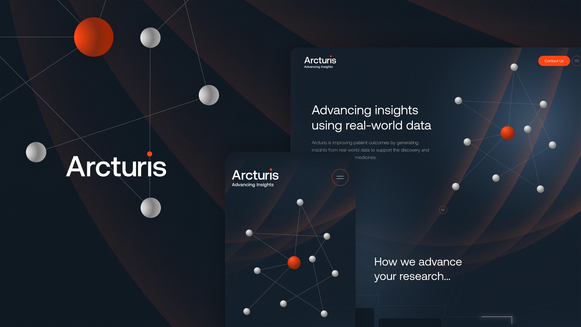
We crafted a brand new website for Arcturis, a real-world data company at the forefront of their industry.


Arcturis are a real-world data company based in Oxford that work alongside clinical and industry experts to support delivery of research across all phases of the clinical development pipeline, covering all conditions and treatment types.
After recently completing their company rebrand, Arcturis contacted us to design and develop their new website from scratch. As part of our process, we further developed their brand allowing us to push the web design even further.
As a result, we’ve built a beautifully animated website that clearly outlines Arcturis’s capabilities and values as a company – whilst standing out from their competitors.
Industry
Healthcare data
Location
London, UK
Brand Development
Arcturis’s rebrand centred around a Greek star named Arktoyros, the name Arcturis is Latinised from Arktoyros and means “The Guardian”. As part of the project, we agreed to develop this rebrand further with the main aim of adding depth to an already well thought-out brand proposition. Once this brand development was complete we would then implement it across the new website and brand touchpoints.
During the first phase of our design process we began experimenting with shapes pulled from Arcturis’s graphic expression – the constellation. This resulted in a collection of smooth gradient background patterns that we could use across the site. Seeing as we were moving away from a flatter look, we agreed the constellation graphic needed further work, so we created further depth by adding drop shadows and radial gradients to the stars.
Another requirement from the client was to not use photography across the site. With that in mind we designed a collection of animated illustrations based on fractal geometric shapes centred around the idea of repetition. The challenge here was to create looping animations in-keeping with the existing constellation look, that seamlessly worked throughout the site with minimal load time.


Web Design
Once the brand development was finalised, we began on the website. The goal of the website was to clearly outline Arcturis’s capabilities and values whilst standing out visually in their industry.
With this in mind, we needed to make sure we balanced the sites creativity with the nature of their work, whilst also making the site easy to manage and add content for the client. We achieved this by designing re-useable components and layouts that the client can use across the pages as the site inevitable grows with the company.
Throughout the website we used bespoke animations, most of these were initially made in Adobe After Effects and then rendered using Lottie. This meant we could use subtle animations across the pages without affecting page load times.
As a result of a collaborative design + development process, we have created a smooth and finessed website that visually has a point of difference in the healthcare data industry.


Have a new project you'd like help with?


