10 stand out examples of tech brand websites

April 23rd 2024
By Emily
From our own creative kitchen to tech’s finest, here’s a curated tour of tech brand website designs that aren’t just changing the game; they’re completely rewriting the playbook.
1. Pison
Starting off strong with some shameless self-promotion!
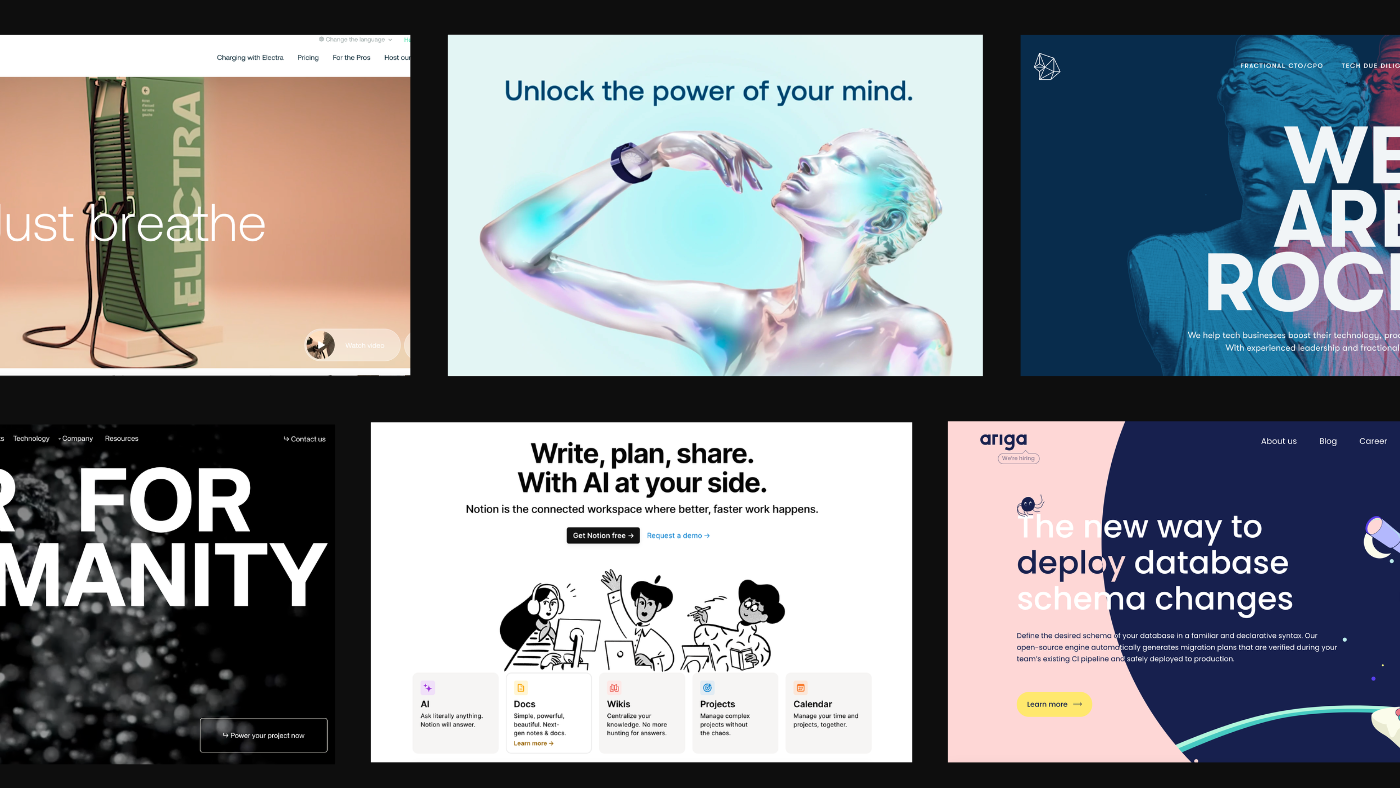
Pison is on a mission to meld sensor technology and AI-infused software, transforming how we interact with the digital world. KOTA were tasked to create a brand and online platform as innovative as their products.
Each product was assigned a distinct colour, brought to life with 3D models that weave through the site. The user journey mimics an effortless e-commerce experience, accentuated by minimalist designs symbolising the brain-device connection. Powered by WordPress and WooCommerce, we’ve given Pison a robust, scalable platform that’s ready for whatever comes next.
2. Rocka
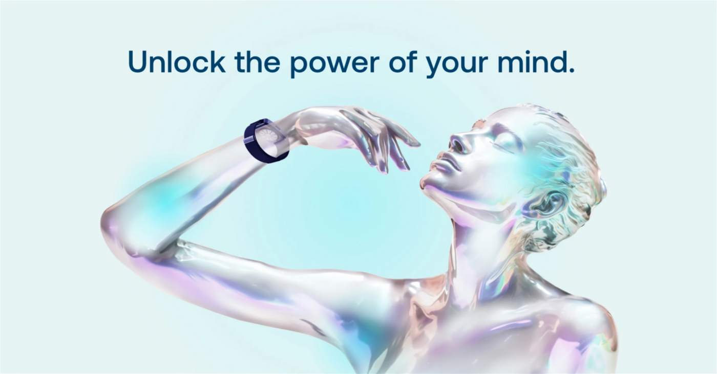
Rocka throws the traditional playbook out the window, opting for a design that’s all about boldness and full-screen flair.
Gone is the white space, replaced by expansive visuals that captivate at every scroll. It’s a harmonious blend of striking photography, punchy colours, and subtle animations that bring geometric elegance to the forefront.
As you wander through their digital landscape, each service and value they champion is vividly brought to life with its own imagery, palette, and ambiance, guiding you effortlessly towards those all-important conversion points—be it signing up for more information or getting in touch.
Rocka’s site stands as a testament to their creative prowess, marrying innovative design with crystal-clear communication. It’s not just about looking good; it’s about making an unforgettable impression and demonstrating the transformative power of digital done right.
3. Genvid Technology
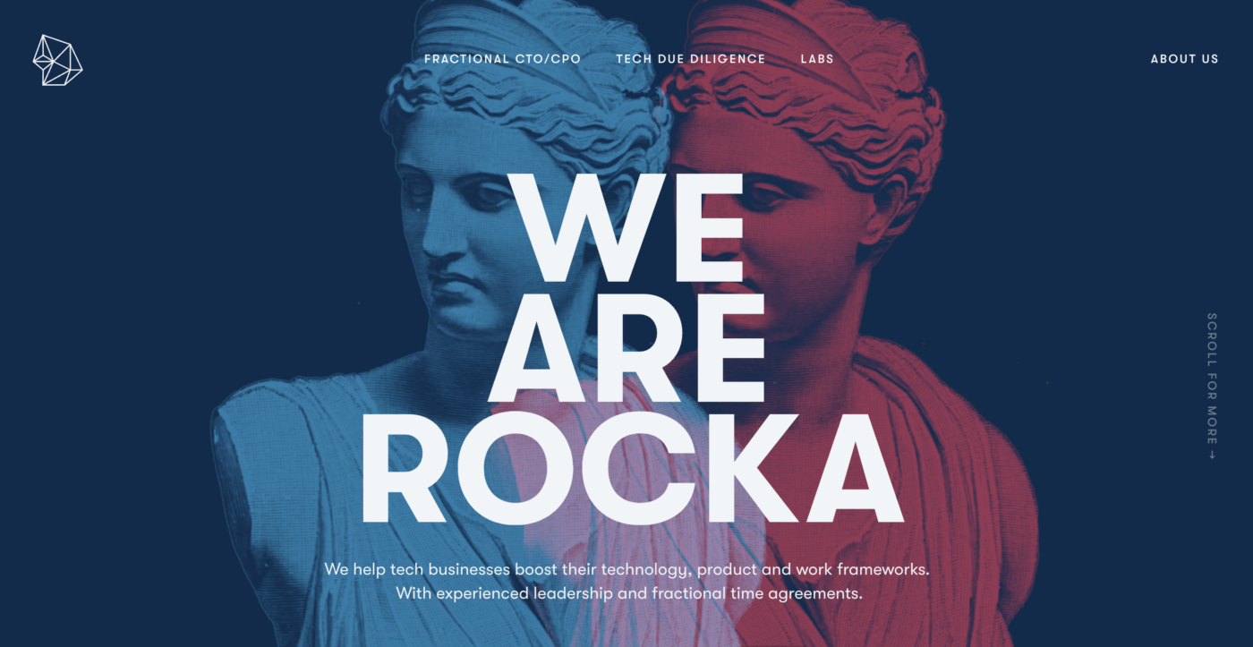
Genvid Technology’s forte lies in crafting Massive, Interactive Live Events (MILEs) that light up the biggest names in gaming and streaming.
The site itself is a playground of interactive animations that respond to your every move, perfectly capturing the essence of their technology’s dynamic nature. It’s not just about looking good; it’s about engaging you in a journey through their digital universe.
The website is cleverly designed with custom infographics and assets that break down how Genvid’s tech weaves its magic, making the complex seem simple. Video content is sprinkled throughout, showcasing the software in action and giving you a front-row seat to the revolution they’re leading in live, interactive events.
Plus, navigating through the site is a breeze, thanks to a crystal-clear layout and strategically placed calls-to-action.
4. Ariga
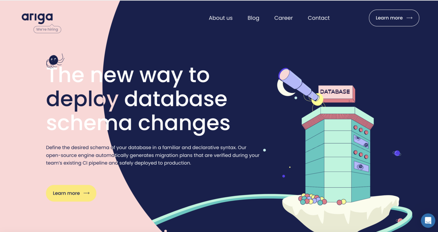
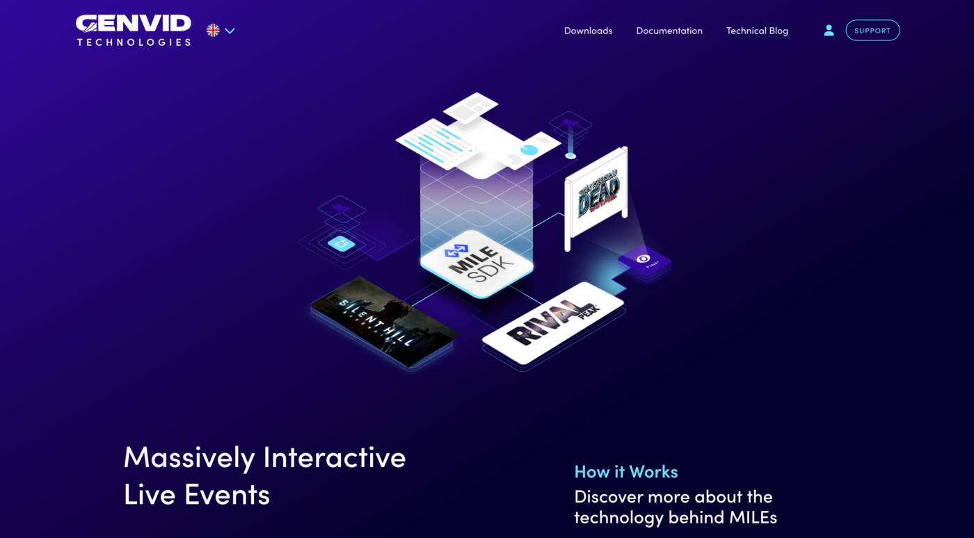
Dive into Ariga.io, and you’re greeted with a visual feast – a beautifully crafted illustration style paired with a colour scheme that sings. But it’s not just a pretty face; this website knows how to play, thanks to an interactive scroll feature that magically transitions the background from a playful pink to a night sky, keeping you engaged and eager to see what’s next.
What sets Ariga apart is its masterful balance of design and functionality. Every call to action is thoughtfully placed, ensuring that the website’s gorgeous aesthetic in no way hinders your journey to find what you need. It’s a rare blend that offers the best of both worlds – captivating visuals and seamless navigation.
And then, there’s the mascot – a charming little spider that adds a dash of personality to the site. Far from your typical digital companion, this spider, along with micro-animations dotted across the site, invites you to explore every corner, making each visit a new adventure.
5. Notion
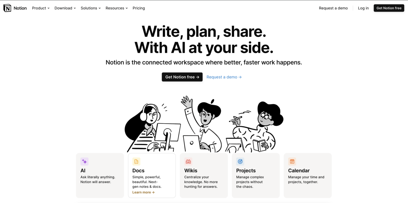
Stepping into Notion’s digital home is like entering a realm where clarity reigns supreme, and warmth greets you at every click. Here, tech jargon is shown the door, making way for clear, straightforward copy that tells you exactly what you need to know, no decoder ring required.
From the moment you land, you’re welcomed by friendly, personality-packed cartoon characters that feel like guides more than mere decorations. They embody Notion’s spirit, perfectly complementing the logo and setting the tone for an unmistakably Notion experience. Right off the bat, you’re invited to dive in with a clear, hard-to-miss call to action: Get Notion free. It’s direct, it’s tempting, and it’s right there.
Navigation is a breeze, with intuitive colour coding that leads you effortlessly to the information you seek. But what truly sets Notion’s website apart in the tech landscape is its refreshing approach to showcasing the product. As you scroll, you’re treated to actual screenshots of Notion in action—no hiding behind scheduled demos or elusive descriptions. This transparency not only demystifies what Notion can do for you but also builds trust from the get-go.
And those charming characters? They’re not just a one-time welcome committee. They’re woven into the fabric of the homepage, popping up in each section with that same friendly vibe, encouraging you to keep exploring and discovering what Notion is all about.
In a world where technology can sometimes feel cold and impersonal, Notion’s website stands out for its friendly and open feel.
6. GenCell
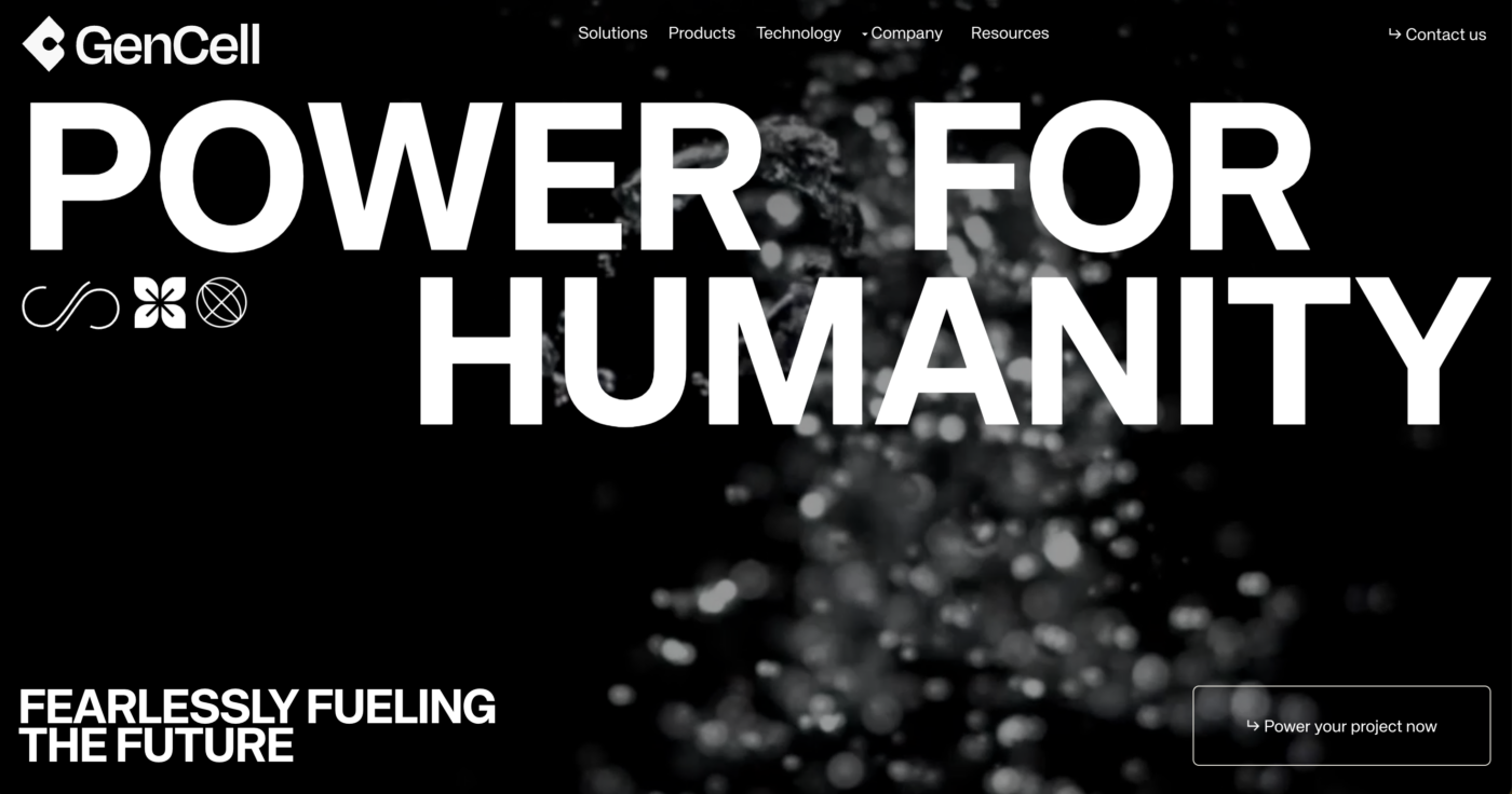
When you land on GenCell Energy’s website, you’re not just visiting a webpage; you’re experiencing a declaration of intent. With bold typography that smacks you in the face you from the get-go, their headline, “Power for Humanity. Fearlessly Fuelling the Future,” isn’t just words—it’s a mission statement, a vision of empowerment through innovative fuel cell technology aimed at fostering climate resilience.
In the background is a video that draws you in, setting the stage for what GenCell Energy is all about. And as you scroll, the website keeps you hooked with micro-animations that add a layer of dynamism to your journey.
But what truly sets GenCell Energy’s site apart is their commitment to inclusivity and accessibility. With an accessibility menu prominently featured, the site welcomes visitors with visual impairments, equipped with tools and a feedback form to ensure everyone can navigate their digital space with ease.
This thoughtful addition makes it feel like their mission statement isn’t just words on a page; they are genuinely dedicated to making the world a better place for everyone. It’s a great example of how your website can show off your brand ethos in small, unexpected ways.
7. Kayenta
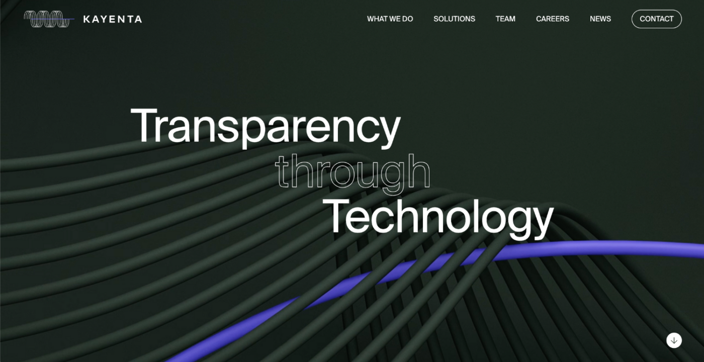
Kayenta’s website is a beacon of how the more conservative B2B tech brands can dazzle their sophisticated audiences—including COOs, CFOs, and Treasury Experts—with flair and finesse. Here, simplicity reigns supreme; the website communicates quickly, clearly, and directly, a strategy that resonates deeply with their target market.
Kayenta’s website is a brilliant example of how to keep things engaging in the often-stiff world of B2B tech. It talks directly and plainly, which is exactly what its audience of COOs, CFOs, and Treasury Experts are after. A particularly lovely feature is the animated purple line that zips around, guiding users through the site and drawing attention to important content and guides as they scroll. This creates a cohesive and engaging user experience that subtly reinforces their brand identity.
And it’s not just about looks—although that sharp Swiss typography and sleek design definitely catch the eye. The purple line ties everything together, making complex info easy to navigate and even easier to understand. It’s like having a helpful guide showing you the ropes, making sure you find what you need without any fuss.
8. 3CORESEC
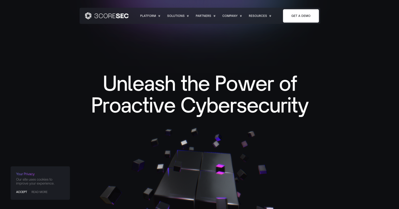
As soon as you land on 3CORESEC’s homepage, you’re greeted with a fun Rubik’s Cube-like animation. This animation is a creative symbol of their platform, building and expanding with more blocks as you scroll – mirroring the layers of protection they build around their clients’ digital assets.
The use of neon accents against a dark backdrop makes everything pop, giving the site a vibrant, futuristic vibe that’s hard to miss. This visual strategy isn’t just for show; it hooks you in, making you want to keep scrolling and exploring what they have to offer. It’s a unique design cleverly mirrors the company’s ethos of advanced, dynamic protection in an online world that’s constantly evolving.
9. Electra
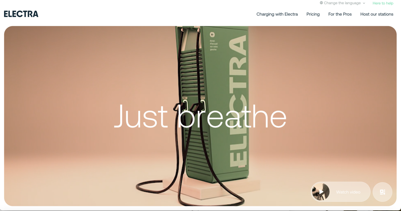
The Electra website is a breath of fresh air, perfectly capturing the essence of their “just breathe” motto. With a modern palette of cool greens and pinks, the design exudes a calm, collected vibe that instantly puts you at ease.
Its layout is beautifully organised in a bento box style, which, combined with subtle, gentle micro-animations that activate as you scroll, enhances the serene experience.
This minimalist and uncluttered approach doesn’t just look good; it feels good too, mirroring the simplicity and peace of mind that Electra aims to bring to electric vehicle charging.
10. Charma
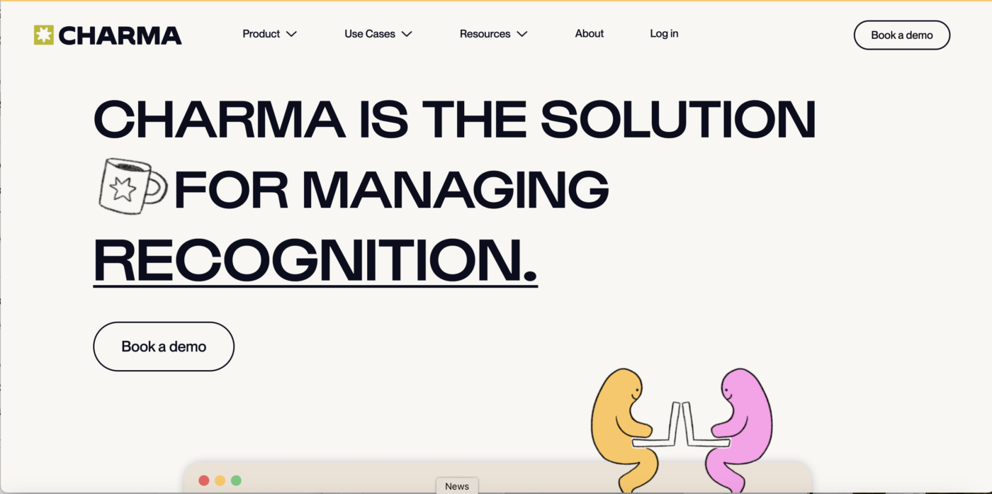
Designed for HR professionals who manage everything from employee recognition to performance reviews, this site uses bold typefaces and a vibrant colour scheme that grabs your attention and doesn’t let go.
But what truly sets Charma’s website apart are the fun little ‘blob’ characters scattered throughout the site to illustrate benefits and features of the platform. These playful little guys add a friendly personality to the often serious business of HR. The animations, bold colours, and whimsical characters all work together to show off their vibrant brand, setting them apart from the rest.
So there you have it—a lineup of digital wonders that not only tick the aesthetic box but also push boundaries, making the web a playground for creativity. Which one’s your favourite?


Interested in working with KOTA?
Drop us a line at
hello@kota.co.uk
We are a Creative Digital Agency based in Clerkenwell London, specialising in Creative Web Design, Web Development, Branding and Digital Marketing.