Creative inspiration: Digital worlds we’d happily get lost in.

March 23rd 2026
By Emily

Some websites give you the information and get out of the way. Others pull you in by the collar.
They create atmosphere, build tension, and make you curious enough to keep going. You stop scrolling like you’re clearing a task and start exploring like there’s something worth finding.
That’s the kind of work we keep coming back to. The sort of digital experience that feels considered from the first second, because it knows what it wants to be, and it commits.
Here are five digital worlds we’d happily lose an afternoon to.
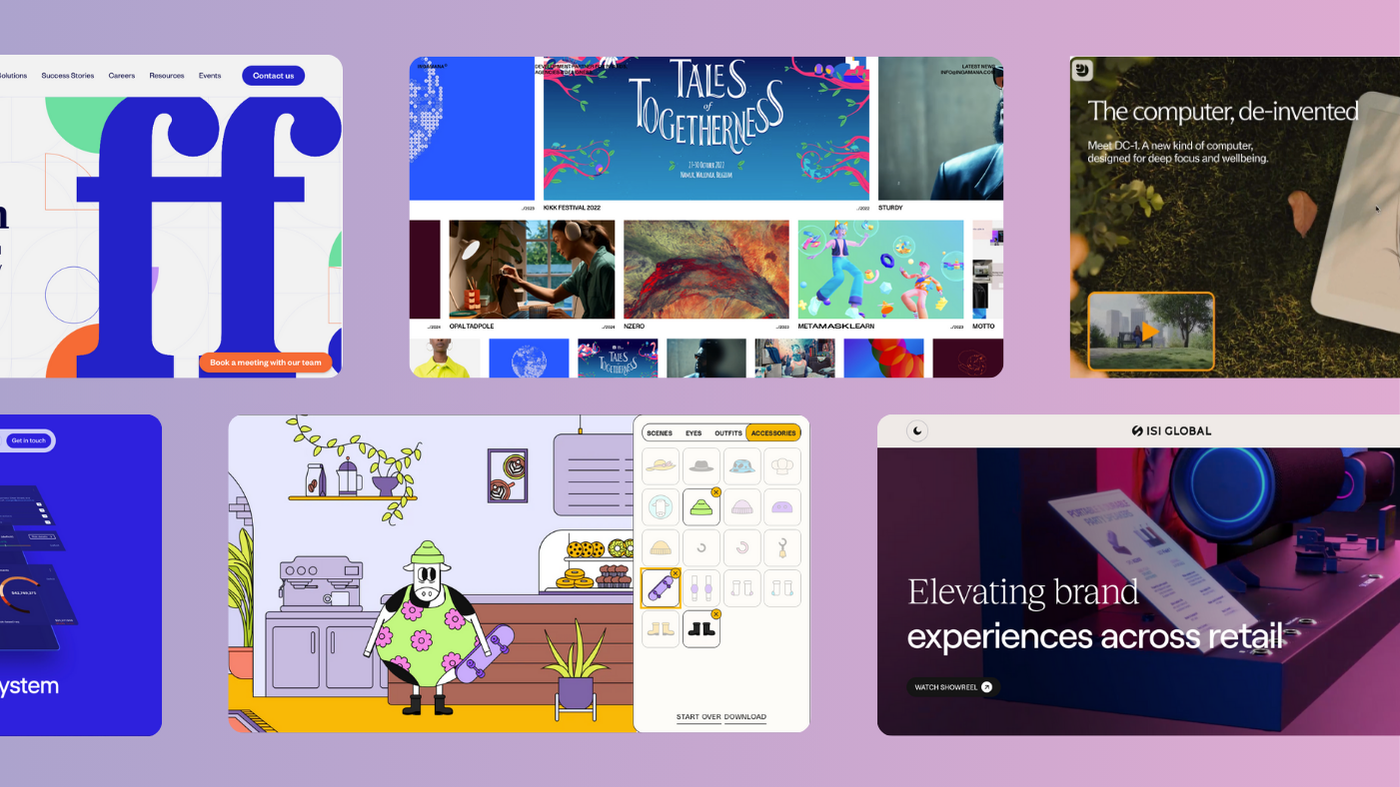
Ponpon Mania
Ponpon Mania feels gloriously unbothered by convention.
You land there and immediately get the sense that someone made a creative decision, then backed it all the way. The site unfolds more like an illustrated storyworld than a standard browsing experience. It has chapters. It has a point of view. It lets mood lead. That kind of confidence goes a long way.
Too many sites rush to explain themselves. Ponpon Mania understands the power of intrigue. It gives you enough to step inside, then trusts the world it has built to carry you forward. That takes restraint, but it also takes nerve.
We love work like this because it feels authored. Every choice has intention behind it. The pacing. The visual language. The feeling that you’ve entered something a bit odd, a bit playful, a bit off to one side from everything else online. Essentially, it sticks because it has a pulse.

Shopify Editions Winter ’26
Shopify’s Winter ’26 release arrives as The Renaissance Edition, and the design commits to that idea straight away. The page frames the launch as “A new world of commerce” and wraps 150+ product updates in a visual language that feels theatrical, painterly and slightly absurd in the best way (the skateboarding angel is my favourite).
Instead of presenting the updates in a flat product-marketing format, Shopify gives them a world to live in. The Renaissance framing adds humour, character and a sense of occasion. It makes the experience feel less like documentation and more like a curated release. Grand, a little surreal, and very deliberately styled. That energy carries the whole thing forward.
When you have this much to say, presentation matters. A lot. Shopify uses strong art direction, clear category structure and a sense of movement to stop the page collapsing under its own weight. Sections like Sidekick, Online, Retail, Marketing, Checkout and Developer feel easy to move through because the framing is doing its job from the start.
The Checkout section is a good example. As you scroll, one of the Renaissance-style background figures flips a bright pink card while wearing a beanie — a weird little visual beat, but a great one. It keeps the page feeling alive. It gives the art direction some movement and stops the whole concept from becoming too stiff. It’s polished, yes. But it’s also a bit mischievous.

Pasqua Wines
Pasqua goes full atmosphere and gets rewarded for it. From the moment you land, the experience feels rich, moody and cinematic. Sound, movement, pacing, chapter-like navigation. It all creates a strong sense of entering the brand’s world rather than simply visiting its website. That matters, especially in a category where so much visual language starts blending together.
Pasqua has no interest in fading politely into the background. It leans into feeling and drama. Into the idea that brand perception is shaped by tone as much as information. You move through the site and get a real sense of texture, heritage, experimentation and identity. It feels alive.
We’re drawn to projects like this because they understand immersion as a strategic tool. The world around the product shapes how the product is understood. Give people a flat experience and you flatten the brand with it. Pasqua gives its story room to breathe.
And yes, I did try to ‘pet’ the tiger.

Lusion
Lusion goes hard on interaction, and it pays off. The whole site feels alive under your cursor. Mouse-hover moments give the experience its pace. Things shift, reveal themselves, respond. That constant sense of movement makes the work feel immediate, like the site is inviting you to play with it rather than just pass through it. That kind of control changes the energy completely.
You can feel how tuned the studio is to motion, composition and flow. The featured work lands with confidence because the interactions carry so much of the personality. It’s slick, but not sterile. Expressive, but still precise. Lusion describes itself as a digital production studio focused on visually captivating design and interactive experiences, and the site backs that up straight away.
Then you get to the spaceman at the end, which is just incredible.
It’s one of those closing moments that gives the whole experience a bit more lift. Memorable, slightly surreal, and exactly the sort of visual flex that sticks in your head after you leave. That’s what this site does well. It shows off the craft, but it also knows how to leave you with a feeling.

Champions for Good
Champions for Good has some incredible on-scroll movement in it (check out the bow and arrow bit!), but the real hook is momentum. A lot of mission-led platforms rely too heavily on the message and forget to make the experience compelling. This one understands that people engage more deeply when the digital world has shape, personality and pace. The cause gets more force when the delivery carries conviction.
That’s what stood out to us here. The sense of energy. The sense of invitation. The feeling that the site wants you in, and knows how to keep you there.
Purpose needs presence. This has it.

Why these sites stay with us
All five of these website projects create a distinct world, and each one gets there differently.
Ponpon Mania leans into weirdness and authorship. Shopify turns product communication into an experience people actually want to explore. Pasqua builds mood with serious conviction. Lusion shows what happens when craft and creative ambition move in sync. Champions for Good proves that energy and community can shape a digital experience just as powerfully as aesthetics.
That’s the thread. Not sameness. Not trend-chasing. Not empty spectacle.
Direction.
These sites know what they’re trying to make people feel. They know where they want to lead the eye. They know how to hold attention. That clarity gives them weight.
Looking to create something like this? Get in touch!


Interested in working with KOTA?
Drop us a line at
hello@kota.co.uk
We are a Creative Digital Agency based in Clerkenwell London, specialising in Creative Web Design, Web Development, Branding and Digital Marketing.