How bad UX can kill even the most beautiful website

February 2nd 2026
By Emily

A beautiful website can still fail. Quietly. Expensively.
You can spend months perfecting the visuals. You can land the photography. You can dial in the brand. You can win compliments in meetings and likes on LinkedIn, and still see users hesitate, stall, and leave.
It happens more often than teams like to admit. Sites that photograph beautifully, launch with confidence, and then struggle to convert. Design does its job in catching attention. The experience determines what happens after.
The strongest work holds both. It earns the click and supports what follows. It looks considered and behaves intelligently. Beauty and UX work best when they reinforce each other, rather than trying to fill gaps elsewhere.
Beauty earns attention. UX shapes outcomes.
People arrive on your website with a job to do
That job varies. Sometimes it’s practical: finding information, comparing options, building confidence, moving towards a decision. Sometimes it’s less concrete: understanding craft, absorbing complexity, forming belief, or getting a feel for whether something is right.
Good UX starts by recognising that difference. It isn’t a fixed set of rules or patterns. It’s an attempt to understand what the user needs at that moment, and to remove friction that gets in the way of that need.
The brands that perform well tend to make this feel natural. Their sites answer the right questions at the right time. What is this? Who is it for? Why should I trust it? What happens next? The tone and pacing may differ, but the experience remains coherent.
Bad UX blocks those jobs instantly
Problems arise when friction appears in the wrong places.
Important information isn’t visible when it’s needed. Users are asked to work things out before they feel confident enough to do so. Simple actions take more effort than expected. Progress feels slower than it should.
When that happens, momentum drops. People don’t usually analyse why. They sense resistance and move on. There’s no complaint, no feedback loop — just quiet abandonment.
Most UX failures look “fine” in isolation
This is part of what makes them difficult to diagnose. Navigation works. Forms submit. Journeys technically complete. Looked at individually, nothing feels broken. Taken together, the experience feels heavier than necessary.
On the other end of the spectrum, we have GOV.UK. It’s visually restrained, of course, but that restraint is on purpose. Language is precise. Structure is clear. Decisions have been tested against real-world stress, urgency, and confusion. People use it when they are under pressure, and it still holds up.
The difference is in how closely the experience aligns with the situation users are in. Small issues rarely fail a site on their own. They accumulate.
Visual polish can hide structural weakness
High production values can sometimes mask deeper experience problems. Transitions feel elegant but slow progress. Layouts prioritise atmosphere over orientation. Storytelling delays answers users are actively looking for. Motion adds texture but competes with clarity.
Nothing feels wrong in isolation. The site feels premium. But decision-making takes longer than expected, and effort builds where it shouldn’t.
That’s absolutely not a critique of expressive design, by the way! After all, that’s what we love to create here at KOTA. It’s just a reminder that expression still needs structure underneath it (which is what we do best).
When atmosphere is the experience
A good example of this working well is the site KOTA built for Universal Production Partners.
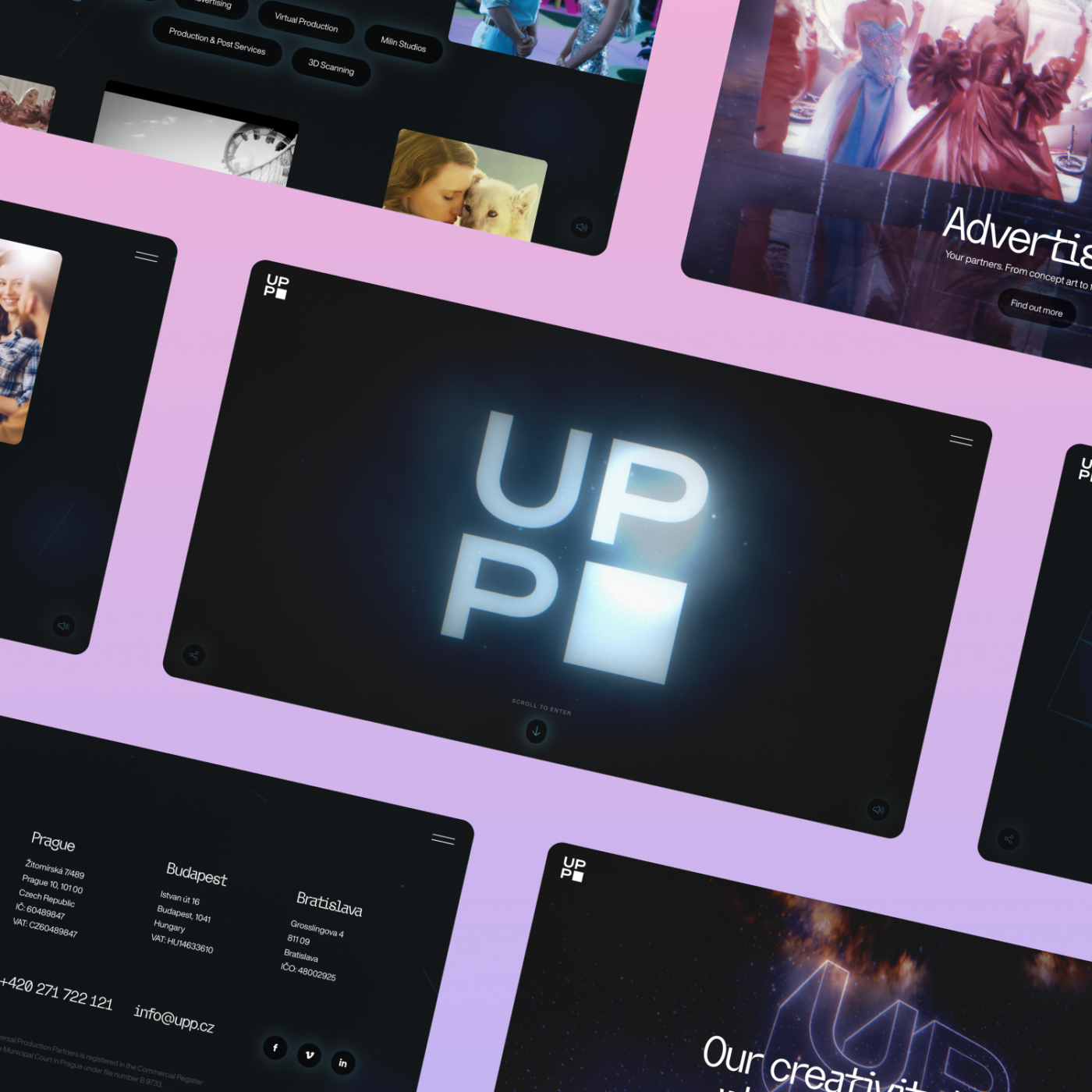
UPP’s website’s primary job isn’t to funnel users as quickly as possible to a form. The job is belief-building: communicating craft, scale, and credibility in a highly competitive, visually literate industry.
The experience reflects that. Cinematic pacing, immersive transitions, and controlled friction are used deliberately to slow users down and let them absorb the work. Orientation arrives early enough to anchor the experience, while atmosphere does the work of signalling quality and confidence.
In that context, immersion isn’t a distraction from UX. It is the UX. The experience aligns with the intent users arrive with, rather than fighting it.
Problems only arise when sites borrow that language without the same clarity of purpose — when they ask for patience without offering orientation, or atmosphere without first establishing trust.
The goal isn’t to strip sites back
Aesthetic quality matters. It signals care, sets tone, and shapes perception. Some experiences are deliberately immersive. They slow people down, build anticipation, and create space to understand craft or credibility before asking for action. In those contexts, atmosphere is part of the job the site is doing.
Problems tend to appear when a site asks for patience before offering orientation, or emotional investment before establishing trust. When structure and intent are clear, expressive design strengthens the experience rather than distracting from it.
The strongest work composes both.
Bad UX damages trust before you even speak
Trust forms quickly, often through behaviour rather than messaging. Does the site respond when expected? Does it behave consistently? Does it guide without confusion? Does it feel reliable?
When those signals wobble, users rarely articulate it as a usability issue. They register discomfort. In commercial settings, that discomfort translates into caution.
That’s part of why Monzo resonates with people. The interface feels steady and predictable. Information is explained clearly. Visuals support that sense of calm rather than trying to replace it.
Trust is experienced before it’s stated.
Performance is a UX issue. Always.
Speed isn’t a technical concern users consciously think about. It’s an expectation they notice when it isn’t met.
Delays interrupt flow, increase effort, and introduce doubt. They subtly change how a brand is perceived. No amount of visual refinement fully offsets that feeling.
Amazon understood this early. Incremental improvements in performance delivered measurable commercial impact because they reduced hesitation, not because they changed how the site looked.
Performance shapes experience more directly than most visual decisions.
UX dictates whether your strategy ever meets reality
Strong positioning and clear messaging still rely on delivery.
If users struggle to find proof, understand the offer, compare options, or move forward with confidence, even well-considered strategy remains abstract.
We’ve seen this on projects where the brand thinking was solid, but the experience layer wasn’t supporting it. In one case, early gains came not from visual overhaul but from restructuring navigation around real user intent, tightening hierarchy, removing unnecessary steps, and prioritising speed. Conversion improvements arrived before the final polish.
Good UX feels inevitable
The best experiences rarely draw attention to themselves. They feel straightforward in use, predictable in behaviour, and calm under pressure. Looking back, the choices seem obvious.
Think about how often you notice Netflix’s interface. Usually, you don’t. The focus stays on the outcome, not the mechanics that enable it.
When performance drops, it’s tempting to reach for visual change. New layouts, new motion, new layers of brand expression. That often treats symptoms rather than causes.
A more reliable sequence is to clarify user intent, map the real decision path, remove friction, improve responsiveness, and then elevate the visual layer. Design strengthens an experience that already works. It doesn’t resolve underlying tension on its own.
Final thought
A beautiful website can (and should) do more than attract attention. When experience and craft are aligned, it can hold attention, build confidence, and support action.
If a site looks strong but underperforms, aesthetics are rarely the first place to look. The more useful question is how the experience behaves, moment to moment, for the people using it. That’s where performance is shaped. Quietly, and over time.


Interested in working with KOTA?
Drop us a line at
hello@kota.co.uk
We are a Creative Digital Agency based in Clerkenwell London, specialising in Creative Web Design, Web Development, Branding and Digital Marketing.