How we built our new website

Introduction
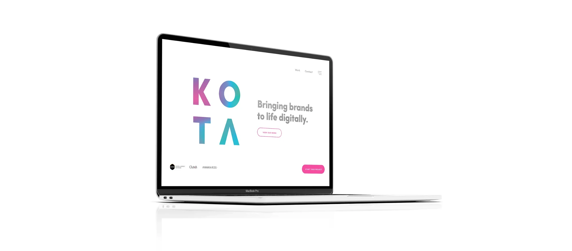
At the end of 2019, we decided to refresh our website. Always keen to push the boundaries, especially when it comes to our own platform, we also used our analytical eye to create a site that was visually engaging and also optimised for maximum performance.
Technical motivations behind the new website
The primary motivation, aside from a visual refresh, was to increase the crawlability and visibility of our website to search engines.
Having learnt some valuable lessons from the previous incarnation of our website – a React single page application with a prerendering layer – we built our new site on the JAMstack principals, allowing us to prerender the entire site ahead of time, and deploy it as static files to a global content delivery network.
The JAMstack is not about specific technologies. It’s a new way of building websites and apps that delivers better performance, higher security, lower cost of scaling, and a better developer experience.
The new site leverages WordPress as a headless CMS, serving a GraphQL endpoint via WPGraphQL. The frontend of the website is built in the React framework Gatsby. The headers of the site feature WebGL-based flowmap distortion effect build on top of OGL, a minimal WebGL library. We built and deploy the site via Netlify. The ‘start your project’ form feeds directly into Hubspot via their API.
What are the benefits of building our website this way?
To list a few:
- “Blazingingly fast” load times thanks to Gatsby’s internal tooling, such as highly optimised images, lazy loading of assets, and preloading pages when links are visible within the window.
- All the flexibility of a WordPress backend paired with the latest frontend technologies
- Increased security from having a totally isolated frontend with only statically built files (no web server).
- A beautiful developer experience; React helps us think more in components and atomic design/development. Javascript tooling is really coming into its own – gone are the days of spending weeks on that Webpack configuration.
Design motivations behind the new website
Design-wise, our motivations were two-fold…
1) To refresh our visual style in line with the brand strategy and identity we had been working on at the end of 2019. We had unified our brand marks and colours into a stricter application, streamlined our company values, and refined our brand proposition. With this came a clearer vision which we wanted to emulate in our online presence. We did this by creating clearer headline messaging and user journeys within a minimal but creative layout. We added new components such as the values carousel and made our services and case study pages easier to digest both visuals and written content.
All the new UX principles were balanced with a couple of creative components to showcase our artistic side and keep some character from the previous platform. The flowmap distortion effect in the headers of the main pages is a great touch to add a little interactivity without distracting from the functions of the site. We added video loops to project thumbnails for some extra movement. We also kept the interactive mouse effect on the contact page, because let’s face it, it’s just fun to wiggle around like a worm for a bit.
2) The second motivation was to add more relevant content that was easily searchable and found by our clients. We looked at writing content that was concise and informative, and that explained exactly what services we offer in web design, web development, branding and marketing, and what challenges we have overcome for clients such as Jamie Oliver, Comptoir Libanais, Opta Pro, Penhaligon’s and British Red Cross. We added more of our brand proposition to explain why KOTA are the agency you should be partnering with, and we looked at the areas we do most of our great work in such as Property and Architecture, B2B, Hospitality, Film and Television. With the use of better-positioned headlines and user journeys that navigate intuitively through related content, we have fundamentally created a website that gives users the information they need to make informed decisions, whilst also wowing them visually with our previous work.
We set ourselves a fairly ambitious timeline for the new website, right after the Christmas break no less, and we are really pleased to usher in 2020 with a new website that we’re all proud of.
Interested in working with KOTA?
Drop us a line at
hello@kota.co.uk
We are a Creative Digital Agency based in Clerkenwell London, specialising in Creative Web Design, Web Development, Branding and Digital Marketing.


