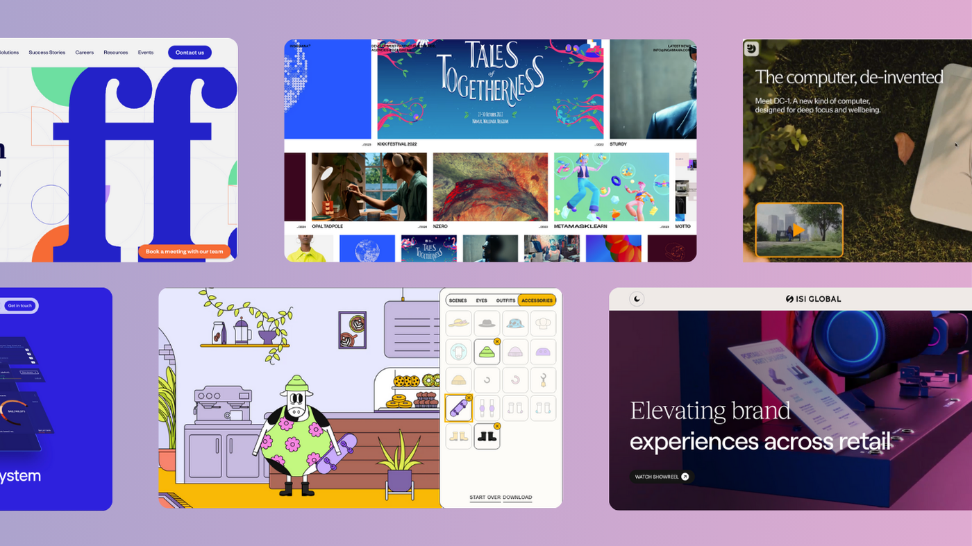
Rebellious typography: the importance of the humble font

Originally published April 2024. Updated May 2025.
Typography isn’t just a design choice. It’s a brand statement.
And yet, fonts rarely get the credit they deserve. Logos steal the limelight. Colour palettes get all the attention. But fonts? They’re the quiet rebels, setting the tone of your brand before a single word is read out loud.
Typography is more than legibility. It’s a gut feeling. A visual mood. A whisper in your brand’s voice. The right typeface can make your brand feel bold, human, irreverent—or even rebellious.
Let’s unpack what that really means.
Fonts aren’t just fonts. They’re feelings.
Ever wonder why some brands feel trustworthy or edgy or playful at a glance? Often, it’s down to typography.
Fonts do much more than simply display text; they evoke emotions and set the tone of your message. Each typeface carries its own personality, from the authoritative and trustworthy feel of a robust serif to the clean, modern simplicity of a sans serif. The curves, weight, and spacing of letters can convey warmth, excitement, formality, or whimsy:
-
Serifs suggest heritage, intellect, and credibility (think: The New York Times)
-
Sans serifs feel clean, modern, and efficient (think: Spotify’s Circular)
-
Display fonts shout for attention—great for attitude and impact
-
Scripts or hand-drawn fonts can add intimacy or quirk
💡 Typography is tone of voice you can see.
By choosing the right font, you can subtly influence how the reader feels about your words, creating an emotional connection that enhances the impact of your message.
This makes typography a powerful tool in shaping our experience and perception, ensuring that the sentiment we want to convey is felt.
Let’s look at some brands getting it right.
Brand examples
-
Spotify — Circular
A custom sans serif that’s smooth, modern and warm. Spotify’s Circular typeface echoes its product: slick, personal, and seamless. No distractions, just vibes. A strategic play to vibe with their ethos of simplicity, innovation, and connection. -
The New York Times — Cheltenham
Cheltenham doesn’t just look classic—it feels journalistic. Sophisticated, rooted, and confident. A smart way to blend history with authority. -
Airbnb — Cereal
Friendly, rounded, and polished, Cereal feels inviting. But it’s still clear and versatile. Airbnb’s type choice reflects their values: belonging, trust, and a sprinkle of whimsy.
How to choose your font
Now, before you dash off to flip your brand’s font to Comic Sans in the name of nonconformity, remember: rebellion has its rules.
The key is to blend distinctiveness with purpose. Your typeface should be a rebel with a cause, pushing boundaries while staying true to your brand’s soul.
Here’s how to choose a rebellious typeface with purpose:
-
Start with your brand personality.
Are you rebellious or refined? Playful or premium? Your type should align with the feeling you want people to associate with your brand. -
Don’t be afraid to break rules—selectively.
If everyone in your sector uses a clean sans serif, consider a strong serif or a distinctive display font to stand out. Just make sure it doesn’t sacrifice readability. -
Create contrast, not chaos.
Use a bold font for headers, paired with a neutral body font. Let the rebellion live in the right place. -
Consistency is the real hero.
Once you commit to a typographic direction, stick with it. Inconsistency kills brand trust—even if your font is killer.
Takeaways for brands who want to stand out
-
Fonts speak before your copy does. Make sure they’re saying the right thing.
-
Be brave, but be intentional. Rebellion without purpose is just noise.
-
Typography can be the difference between blending in and being unforgettable.
So, the next time you’re thinking about how to leave your digital mark, remember: a little typographic rebellion might just be the secret ingredient you’ve been searching for. Let your fonts do the talking, and watch as the world listens.
Want some help?
At KOTA, we build visual identities with character—from rebellious fonts to cinematic websites. If your brand is ready for a refresh, drop us a line.
Interested in working with KOTA?
Drop us a line at
hello@kota.co.uk
We are a Creative Digital Agency based in Clerkenwell London, specialising in Creative Web Design, Web Development, Branding and Digital Marketing.


