The anatomy of a high-converting landing page.
July 9th 2021
By KOTA

Originally published July 2021 | Updated June 2025
Imagine walking into a shop, ready to buy — and being greeted by a confusing maze, no signage, and a bored assistant pointing vaguely at “the back.” That’s what a bad landing page feels like.
A good one? It’s more like a personal shopper with psychic powers. Clear. Focused. Frictionless.
In this guide, we’re breaking down exactly what makes a landing page convert — from structure and messaging to design and psychology. We’ve built countless pages for clients across B2B, eCommerce, SaaS, and everything in between, and we’re sharing what works (and what to skip).
Types of landing pages.
Not all landing pages are born equal. Here are the three most common types — and when to use them.
1. Integrated landing pages
These sit within your main website structure, with standard navigation and consistent design. They’re often used for sector-specific content or SEO-focused campaigns.
Pros:
- Easy to maintain
- Boosts overall site authority
- Good for organic discovery
Cons:
- Easier to get distracted by other nav elements
- Not always optimised for conversion
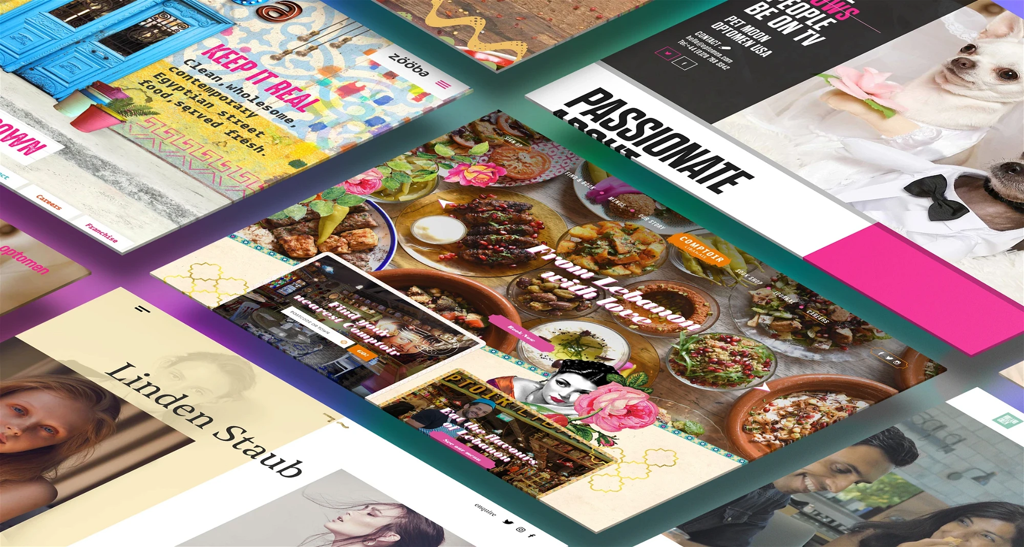
Example: Take a look at one of our own landing pages to see what we mean: Media & entertainment, B2B Tech, Software & SaaS and Healthcare.
2. Campaign landing pages
Standalone pages stripped of distractions (like nav bars) and designed to drive one very specific action — usually tied to paid ad traffic.
Pros:
- Hyper-focused on conversion
- Easier to test and iterate
Cons:
- Not great for top-of-funnel users
- Requires constant updating to stay relevant
Example: The Scorecard page we created for ContractPodAi is a great example of a campaign landing page. Users can complete a questionnaire to find out the state of contract management in their organisation; a great interactive way to engage prospective clients, and the page simultaneously acts as a lead generation tool for ContractPodAi.

3. Microsites
Multi-page, branded destinations built outside of your main website. Great for awareness campaigns, complex narratives, or multi-audience messaging.
Pros:
- More room to educate or inspire
- Highly customisable
Cons:
- Needs its own SEO strategy
- Can dilute authority if not linked properly
Example: We partnered with British Red Cross to deliver the One Kind Thing campaign. A fully bespoke microsite tailored to audience types and campaign goals — resulting in over 3,000 meaningful user actions in just seven weeks.
BRC was able to customise the content on the microsite to different types of audiences they chose to target with their digital advertising campaigns.

In short, there is no right or wrong landing page type to use, you just need to think long-term about where your campaign is likely to go, how long it’ll last, and the overarching goals.
What actually makes a landing page convert?
Once you’ve picked your page type, here’s the anatomy of a high-performing landing experience.
1. CTA placement that makes sense
Yes, “above the fold” is common advice — but context matters. If someone needs education before action, your CTA might come later.
Golden rule: place your CTA where the decision happens. Not before.
2. A headline that earns the scroll
You’ve got eight seconds. Maybe less. Your headline needs to:
- Tell them what you offer
- Say why it matters
- Do it in under 10 words
Use your subheading to back it up with value or detail. Clarity beats cleverness every time.
3. Message match from click to page
If your ad promises a free demo, don’t bury it three scrolls down. Align your CTA, headline, and offer — otherwise, you’ll lose trust and conversions.
4. Audience-first design
Your audience’s habits should shape everything: page length, copy tone, visual layout. A time-poor CTO needs skimmable proof. A wellness shopper might want an emotional story arc.
Ask: how are they arriving here — paid ad, email, social? What do they already know? What’s going to stop them scrolling?
5. Fast, mobile-first performance
Slow pages kill conversions. According to Google, a 1-second delay on mobile can slash conversions by up to 20%.
Speed matters. So does layout, legibility, and making sure your CTA isn’t hiding behind a pop-up.
6. Trust signals everywhere
People don’t part with info or money unless they trust you. So:
- Show clear contact info
- Include testimonials (with real names + photos if you can)
- Display security/privacy reassurances
- Use social proof like client logos or case studies
79% of people trust online reviews as much as recommendations from friends. Don’t let that stat go to waste.
7. Channel-specific experiences
Tailor the landing page to the traffic source.
- Search ad traffic? Be direct. They’re solution-seeking. Put your USPs and CTA up top.
- Social retargeting? Assume some familiarity. Lead with product or benefits. Use visuals.
Every channel = different headspace. Match the message to the moment.
Final thought: no magic formula, but a strong blueprint
There’s no universal perfect landing page. But there is a proven way to stack the odds in your favour: clear value, fast load, strong CTA, and a deep understanding of who you’re speaking to.
Need help building a landing page that actually converts? We’ve built high-performing pages for brands like ContractPodAi, British Red Cross, and Florence. And we can help you, too.


Interested in working with KOTA?
Drop us a line at
hello@kota.co.uk
We are a Creative Digital Agency based in Clerkenwell London, specialising in Creative Web Design, Web Development, Branding and Digital Marketing.