The evolution of website design: From flat to immersive experiences

April 7th 2025
By Emily
Remember when a good website just had to load quickly and not break on mobile? Same. But digital expectations have evolved—and fast.
Today’s users want more than information, they want fun. They want experiences. Interactivity. A reason to stay, explore, and connect. And brands that understand this shift are building websites that feel less like brochures, and more like virtual worlds.
Let’s take a look at how we got here—and where the future of digital engagement is heading.
The flat design era: clean, simple, and everywhere
Flat design dominated the early 2010s. It was a response to the skeuomorphic clutter of early web interfaces—shadows, gradients, bevelled buttons. Skeuomorphic design refers to design elements that mimic the look and feel of real-world objects—often unnecessarily—just to make digital interfaces feel more familiar.
Think: A trash icon shaped like an old-school metal bin. Or buttons with bevelled edges and shadows to make them look like they’re popping out of the screen.
The idea was to help users understand digital interfaces by referencing physical things they already knew. It was big in the early days of iOS (remember the leather stitching and paper textures?), but fell out of fashion in favour of flat design, which favoured simplicity and function over visual mimicry.
It’s kind of the digital design equivalent of adding fake wood grain to your car dashboard. Familiar, but not always necessary.
Flat design stripped all that back to the essentials: colour blocks, clean icons, and typography-led layouts. It was fast, functional, and mobile-friendly. But it also became formulaic. When every brand used the same icon packs and the same off-white backgrounds, websites lost their edge. They worked—but they didn’t wow.
The shift: interactivity, movement, and memory
As technology evolved and browser capabilities expanded, a new wave of web design emerged—one that prioritised experience over layout. What was once constrained by bandwidth and browser limits suddenly became a playground for creative expression.
Animations, 3D graphics, WebGL, scroll-triggered transitions, hover states that respond like muscle memory—it all moved from “nice to have” to “why wouldn’t you?”
The web was no longer just a place to look. It became a place to feel.
This shift wasn’t just about adding movement for movement’s sake. It was about designing with intention—using interactivity to guide users, signal brand personality, and create moments that stick.
Designers started thinking like storytellers, carefully crafting visual and narrative arcs. Developers became experience builders, using code like choreography to lead the user through a journey. Every interaction became a chance to surprise, delight, or reassure.
Websites transformed from static pages into immersive brand environments. The goal? To build emotional connection. Because memory isn’t built on information—it’s built on how something made you feel. And in digital, that means smooth flows, intentional interactions, and visuals that echo the brand’s tone in motion.
Where we are now: immersive design done right
Immersive design doesn’t mean throwing in every trick in the book. It’s about thoughtful interactions, seamless storytelling, and intentional motion. It’s where form meets function—with feeling.
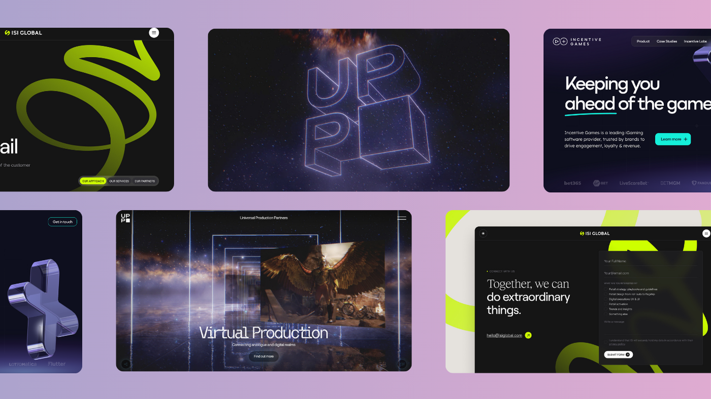
Case in point: UPP
We recently partnered with Universal Production Partners (UPP), the VFX powerhouse behind some of Hollywood’s most visually stunning blockbusters, including Barbie (2023), Blade Runner 2049 (2017), Nosferatu (2025), and Conclave (2024).
We wanted UPP’s site to reflect the cinematic depth, artistry, and innovation that define their work. It had to be an immersive, seamless, and boundary-pushing website—one that transports visitors into their world from the moment they land. They didn’t need a cookie-cutter agency site. They needed something as visually captivating as the work they produce—and as technically sharp.
So, we built them an interactive 3D website that feels more like stepping into a digital universe than clicking through a nav bar.
- Cinematic storytelling drives the entire experience, with changing time-of-day details and smooth transitions.
- Game-inspired UX adds playful elements that encourage users to explore.
- A custom backend gives them flexibility and control without compromising on design integrity.
The result? A site that doesn’t just showcase their work—it feels like their work.
Next up: Incentive Games
At the other end of the spectrum, we worked with Incentive Games—a B2B company creating free-to-play games for the sports gaming industry.
Their previous site was functional but didn’t reflect their momentum, energy, or growing global reach.
We reimagined it from the ground up:
- Playful 3D elements inspired by their brand mark bring motion and personality to every page.
- Microinteractions make CTA buttons and hover states feel tactile and alive.
- A future-proof CMS empowers their team to scale, iterate, and expand without bottlenecks.
It’s immersive, but strategic. Every design choice supports performance, lead generation, and product clarity.
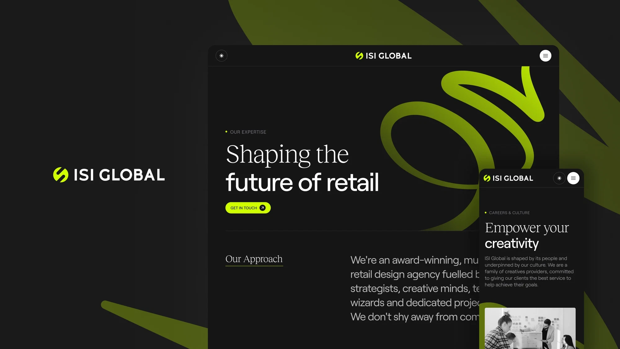
And then: ISI Global
ISI Global specialises in creating physical brand experiences—retail environments, activations, and spatial storytelling for some of the world’s biggest names. But their digital presence wasn’t doing that scale or creativity justice.
Our goal? Bring the same sense of craft, energy, and immersive storytelling into their online world.
- Scroll-triggered animations play a key role—copy and imagery reveal themselves at just the right moment, guiding users through the site in a way that feels intuitive, not overwhelming.
- Thoughtful motion adds a tactile feel to the journey. Every interaction, from section reveals to project transitions, is designed to feel deliberate and polished.
- Modular layouts showcase the breadth of their offering, backed by a flexible CMS that gives their team full control to evolve the site as they grow.
- An elevated design system ties it all together—sophisticated, modern, and globally-minded.
The result is a sleek, editorial-inspired platform that feels just as experiential as the environments they create. Strategic, immersive, and full of personality.
Read the full case study here!
What’s next: the future of engagement
We’re not saying every brand needs a full-blown 3D cinematic web experience. Not every business is a VFX studio, and not every site needs to feel like a short film. But what users want—and expect—is evolving.
They’ve seen what’s possible. They’re used to seamless apps, scroll-triggered animations, sites that adapt to them in real-time. So when they land on a website, they’re no longer just looking for information—they’re looking for signals. Signals that tell them who you are, what you stand for, and whether you’re worth their time.
They want brands to show who they are, not just say it. That means intuitive user journeys that don’t make them think. Visual storytelling that’s rooted in personality, not templates. Interactive moments that feel considered—not thrown in for flair.
This shift is strategic, not just aesthetic. Because the brands that win attention are the ones that create connection. If a site feels clunky, templated, or emotionally flat, users won’t stick around. But if it flows effortlessly, reflects brand personality, and feels alive? You’re already ahead.
TL;DR? Here’s the evolution of web design in five beats:
- Flat – The era of clean lines and simplicity. Born from the need for speed and clarity, flat design stripped away embellishment to prioritise usability—especially on mobile. Think basic colour blocks, icon-based navigation, and minimal textures. It set the foundation for responsive design but often lacked personality.
- Functional – As UX principles matured, websites became smarter. Navigation patterns, conversion funnels, and performance optimisation took centre stage. Content was clearer, journeys more streamlined, and design served one primary goal: getting users from A to B efficiently.
- Expressive – Brands started to push back against cookie-cutter templates. Bold typography, unconventional layouts, and visual storytelling became tools to carve out identity. The web became a canvas again—this time with a strong sense of brand voice and individuality.
- Interactive – Motion entered the mix. Animations, microinteractions, hover states, and scroll-triggered reveals made websites feel more alive. Interactivity became a way to guide attention, enhance usability, and reward engagement. The experience itself became part of the brand.
- Immersive – Where we are now—and where we’re going. 3D visuals, gamified UX, atmospheric transitions, and cinematic storytelling are reshaping how users engage. These sites don’t just inform; they invite exploration. Built with performance, scalability, and emotion in mind, immersive websites blur the line between digital and experiential.
Whether you’re a VFX powerhouse like UPP or a high-growth B2B company like Incentive Games, the brief is the same: create a digital space that doesn’t just look good—create one that feels right.
That’s the real future of web design: emotionally intelligent, strategically led, and built for lasting engagement.
Need help crafting yours? You know where to find us.


Interested in working with KOTA?
Drop us a line at
hello@kota.co.uk
We are a Creative Digital Agency based in Clerkenwell London, specialising in Creative Web Design, Web Development, Branding and Digital Marketing.