Why your site’s pace (motion, transitions, rhythm) matters more than ever

October 30th 2025
By Emily

Your audience is here one second and gone the next. The internet has become a blur of motion, noise, and micro-moments. Every scroll is a split-second audition for their focus. And in this landscape, it’s not enough to design what people see. You have to design how it feels to move through it.
The slow death of static website design
Once upon a time, a well-designed homepage could stop someone in their tracks. Now, users arrive mid-scroll, thumb half-tired, brain half-elsewhere. They’re not “reading” your site in order — they’re darting between sections, switching tabs, swiping away at the first sign of friction.
The old rules — hero, headline, CTA — still matter. But they’re not the whole story anymore.
A site’s success now depends on its pacing: the rhythm of motion, the choreography of transitions, and those micro-moments that build trust before a single word is read.
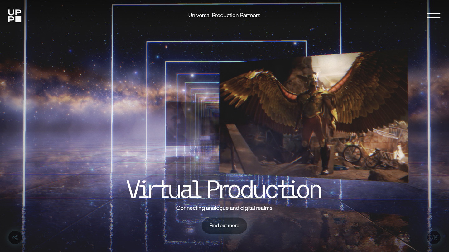
In practice, that could mean a seamless fade between sections instead of a hard cut. A button that responds with subtle elasticity when clicked. A pre-loader animation that isn’t wasted time, but a tone-setter — think the loading sequence on Awwwards-winning sites like UPP or Phantom Studio. These small cues tell users: this brand cares about experience.
When movement feels deliberate, users relax. They give you their attention because they sense you’ve earned it.
Motion as narrative
Motion is a bit of nice decoration, yes. But it’s also direction.
Every scroll, hover, and fade acts like punctuation — guiding, pausing, emphasising. A well-timed transition can signal confidence; a delay can build anticipation. Done right, motion becomes invisible storytelling.
Think of motion cues like stage lighting. On UPP VFX, for example, we used transitions that mimic cinematic fades to black — moments of visual breath that reflect the brand’s filmic world. Each scroll triggers a reveal, not a dump of information. The result is rhythm.
At KOTA, we treat websites like cinematography. Your cursor becomes the camera. The journey is a sequence of shots — some wide and expansive, some intimate and slow. It’s about balancing momentum and stillness, velocity and calm.
When rhythm is off, users feel it immediately. Pages drag. Animations stutter. Content jumps before the eye is ready. But when rhythm is right, you create flow — a kind of digital gravity that pulls people deeper without them realising why.
The psychology of pace
Attention is fragile, but not random. It responds to rhythm — our brains are wired for it. A 2025 study found that animation speed has what researchers call a convex effect on perceived waiting time. In plain English: both extremes — too fast and too slow — make users feel like they’re waiting longer.
When animations are too fast, the brain doesn’t register them properly, so users perceive the interface as jumpy or glitchy — like it’s rushing them. When they’re too slow, it feels like the system’s lagging behind.
The sweet spot sits in the middle: motion that’s quick enough to feel responsive, but long enough for the eye to follow. That’s where interfaces feel fluid, confident, and alive — not mechanical.
When a site moves with intention, it communicates authority. When it hesitates, over-animates, or clutters transitions, it breaks trust.
Pacing design is all about emotional regulation. You’re leading the user’s nervous system. A snappy micro-interaction signals energy; a lingering transition signals composure. Even a well-timed fade can subconsciously tell users, this brand knows what it’s doing.
Fast doesn’t always mean better. Sometimes it’s the pause — the half-second before an image resolves or a line of text animates — that creates tension and impact. That’s the cinematic instinct: use restraint as rhythm.
Designing for attention and action
Speed matters. Always has. Always will.
But in the attention recession, speed alone isn’t enough — it’s what you do with that speed that counts. Performance and pacing aren’t enemies; they’re co-stars.
A fast site gets you in the door. A well-paced one keeps people exploring.
The goal isn’t just to load quickly, it’s to flow seamlessly. That means:
- Preloaing assets smartly so transitions never stutter.
- Animating through CSS or lightweight JavaScript, not heavy video loops.
- Balancing movement and stillness so the user’s eye always has somewhere to rest.
- Building rhythm into navigation — a delay before a page shift, a parallax hint that there’s more to scroll.
Good design turns navigation into discovery. Motion and micro-interaction become cues — subtle signals that tell users, you’re on the right path, keep going. When your site’s rhythm feels natural, people don’t just visit. They wander. They play. They stay.
Cinematic web design isn’t at odds with performance; it’s powered by it. When transitions are optimised and animation is purposeful, you create a flow that’s both beautiful and functional — the sweet spot between storytelling and speed.
The new creative brief
The new question isn’t how does this look? It’s how does it move?
Ask yourself:
- How does this page invite interaction?
- What emotion should the scroll evoke — energy, calm, intrigue?
- Does the site build momentum or drain it?
- How can motion reinforce brand tone instead of fighting it?
Your brand’s story should unfold, not unload. Motion, colour, and type should work together to nudge people forward — not force them.
A cinematic experience doesn’t mean overproduction. It means pacing like a director: quiet moments, controlled reveals, deliberate rhythm. This is where brand and build finally meet — when visual identity is expressed through pace, transition, and flow.
The brands that move best, win
Attention is fleeting, but curiosity is learnable. When your site feels alive — fast, fluid, and responsive — people notice. They click. They explore. They feel your brand before they consciously understand it.
So, direct your site like a film. Use motion to guide, not to show off.
Because in the attention recession, the brands that master rhythm don’t just win clicks.
They win time. And time means connection, exploration, and immersion. Which is the rarest luxury online today.
About KOTA
KOTA is a global branding agency and creative web design studio. Our brand-to-build approach brings strategy, identity, creative web design, development and growth marketing into one connected process. We help ambitious businesses find brand clarity, turn it into creatively confident work and build digital systems that create commercial momentum.


Interested in working with KOTA?
Drop us a line at
hello@kota.co.uk
We are a Creative Digital Agency based in Clerkenwell London, specialising in Creative Web Design, Web Development, Branding and Digital Marketing.