How motion design boosts website engagement & time on page

October 8th 2025
By Emily

Engagement time is the silent killer of underperforming websites. You can have a beautiful interface, perfect copy, and all the right CTAs — but if people don’t stick around, it’s game over.
Motion design is one of the fastest ways we’ve found to keep people scrolling, clicking, and exploring. It pulls people in, guides their eyes, and makes the whole experience feel alive.
From subtle hover states to full-blown cinematic transitions, motion is one of the most powerful tools we have to create connection. Done right, it guides attention, builds emotion, and gives your site a rhythm that makes people want to explore instead of bounce.
We’ve seen the numbers first-hand. Motion isn’t just eye candy. It’s measurable.
Why motion matters
Think about how you move through a physical space. The glow of a sign draws you closer. The hum of activity keeps you moving forward. The shift of light tells you you’re somewhere new.
On the web, motion does exactly the same thing — it orients you.
It bridges the gap between static design and real-world experience, giving users the same kind of visual cues they’d rely on instinctively in physical environments.
Here’s what that looks like when done well:
- Guided navigation – Motion directs the eye. Animated scroll indicators, fades, or parallax effects can subtly cue users to move down or across, reducing friction in navigation.
- Built emotion – A cinematic transition, soft easing, or ambient animation builds tone. Whether you want something bold and futuristic or calm and trustworthy, motion sets the mood before a word is read.
- Reinforced hierarchy – Animation helps key messages stand out. It tells users what matters most, shaping a visual hierarchy through motion, not clutter.
- Rewarded interaction – Micro-interactions — hover states, button ripples, or animated confirmations — are small dopamine hits. They keep things playful and signal responsiveness, especially on mobile.
That’s the real magic: motion guides behaviour without needing to shout for attention. It’s UX psychology in motion (literally).
The KOTA proof
We design it, test it, and watch the analytics light up.
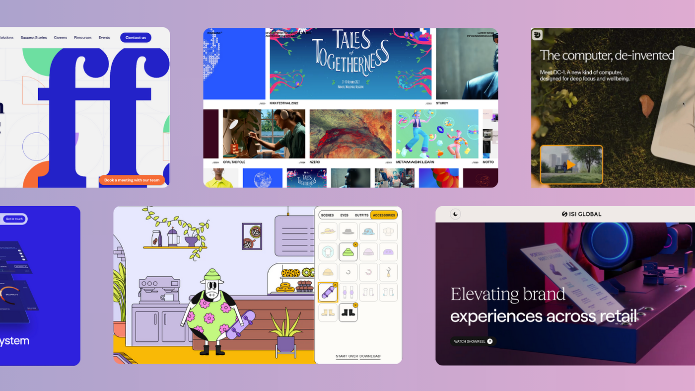
UPP (Universal Production Partners)
Hollywood VFX meets digital craft. UPP’s site is a living, breathing environment — a time-of-day WebGL experience that mirrors the changing light outside their Prague studio. Morning golds, midnight blues, and everything in between.
The result? A +150.6% increase in user stickiness. Visitors didn’t just browse their showreel; they stepped into their world. And the bonus? That engagement time helped give them an SEO boost too (+44.8% increase in sessions from Google).
Incentive Games
For this gaming tech brand, static wasn’t an option. We injected bold 3D shapes and high-energy sequences to echo the spirit of gameplay. Every movement had purpose — a visual reflection of how their software rewards engagement.
The outcome? A +48.3% increase in page engagement.
The Goat Agency
To bring The Goat Agency’s new site to life, we layered in parallax typography, interactive image treatments and custom carousels. And across key pages—from the homepage to the Work section—we wove in rich video content to showcase Goat’s world through sight, sound and movement. And it resulted in +63.8% increase in user engagement after 1 month.
Different industries. Different tones. Same story: when motion is intentional, engagement follows.
Motion that means something
Motion done badly is noise. It’s the flashy, unnecessary stuff that slows your load speed and makes users dizzy. Motion done well? It’s invisible — it just feels right.
The key is aligning every animation with purpose:
- For UPP, motion was storytelling — a digital reflection of light, time, and craft.
- For Incentive Games, it captured the brand’s energy.
- For The Goat Agency, it channelled their pace. Quick cuts, bold transitions, and kinetic movement that mirrored the speed and creativity of influencer culture.
This is where too many sites go wrong. They treat animation like decoration — something added at the end, instead of a UX layer baked into the journey. But the best websites feel choreographed. Every scroll, every transition, every hover has intent.
Motion should always serve story and user flow. Anything else is fluff.
The SEO layer nobody talks about
Search engines don’t “see” animation — but they measure what animation does. When motion keeps people engaged longer, it sends a chain reaction of good signals:
- Higher average session duration → Google reads this as quality engagement.
- Lower bounce rate → Users aren’t leaving; they’re exploring.
- More internal page views → Search engines recognise depth of interest and site structure.
That improved user experience boosts engagement — the kind of behaviour Google loves. When people scroll deeper, click more, and stay longer, those actions signal to search engines that your site’s worth surfacing.
The result? Better visibility, better rankings, better brand equity.
Motion and accessibility: the balance act
Here’s the other side of it. Motion isn’t just for visual flair; it must be inclusive. Too much, too fast, or poorly timed animation can overwhelm users with sensory sensitivities.
We always design with control in mind:
- Subtle easing instead of harsh transitions.
- Respecting “prefers-reduced-motion” browser settings.
- Avoiding continuous looping animations that fatigue focus.
Good motion design should never exclude anyone. When accessibility and artistry meet, you get fluid, universal experiences.
Why time on page matters
Let’s get clear: time on page isn’t a vanity metric. It’s a proxy for attention.
Attention is the scarcest resource on the internet, and every second counts.
- The longer users stay, the more of your story they absorb.
- The deeper they go, the more trust they build.
- The more trust they build, the higher the likelihood they convert — whether that’s an enquiry, a demo, or a sale.
When you combine performance, motion, and story, you turn your site from a one-way broadcast into a two-way experience. That’s what keeps users coming back (and telling others about it).
The takeaway
Motion design isn’t a finishing touch. It’s a growth lever.
When it’s strategic, it:
- Increases time on page
- Improves usability and flow
- Builds emotional connection
- Makes complex ideas effortless to grasp
- Turns passive viewers into active explorers
We’ve seen it work for global tech giants, creative studios, and service brands alike. When your motion matches your story, your engagement metrics tell you everything you need to know.
If your site feels flat, maybe it’s not the copy. Maybe it’s not the design.
Maybe it just needs to move.
About KOTA
KOTA is a global branding agency and creative web design studio. Our brand-to-build approach brings strategy, identity, creative web design, development and growth marketing into one connected process. We help ambitious businesses find brand clarity, turn it into creatively confident work and build digital systems that create commercial momentum.


Interested in working with KOTA?
Drop us a line at
hello@kota.co.uk
We are a Creative Digital Agency based in Clerkenwell London, specialising in Creative Web Design, Web Development, Branding and Digital Marketing.