A new brand, website and app for the service using science to make the world healthier and happier.

Bellsant help build the strongest version of you by slowing the pace of aging across 11 key health systems. They approached KOTA to help them build their brand from scratch and apply it across every touch point, from their website to their app.
Industry
Health and Wellbeing
Location
USA


Website
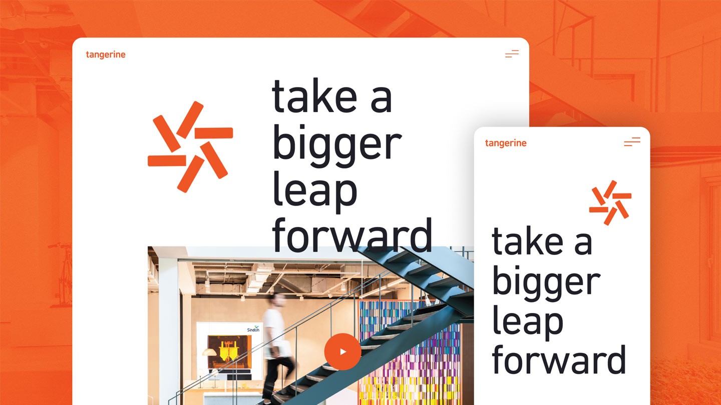
We designed and built a new website allowing Bellsant to bring their brand story to life. We utilised lots of beautiful animated elements, autoplaying videos and app animations to showcase key app features.


Brand
We developed a new logo and brand identity for Bellsant based on flowing natural shapes symbolising health, prosperity and support. We used a leaf icon in the word mark to bring this to life and also created a set of natural flowing 3D background elements for the wider brand. We utilised a colour palette that felt scientific and clean, but added flourishes of vibrant colours to punctuate the light backgrounds. Alongside these key elements, we crafted a series of bespoke animated 3D icons to represent each of the services monitored health systems. Each icon was based on an abstract scientific concept connected to the health system.


App
We helped the Bellsant team bring their app to market for the first time by applying their exciting new brand elements across the entire set of app screens. We worked across both the UX and UI of the app to make sure it not only looked great but was intuitive and simple to use.


Have a new project you'd like help with?